Clean & Sharp Logo for Athletic Equipment & Clothing Line
Prize → $300
Contest Designs


Design Brief
| Contest title: | Clean & Sharp Logo for Athletic Equipment & Clothing Line |
| Sub title: | Meister |
| Category: | Logo Design |
Brand Name: |
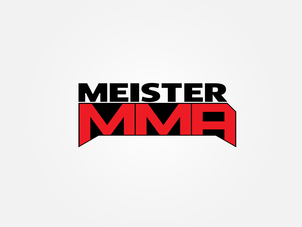
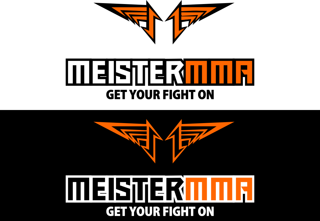
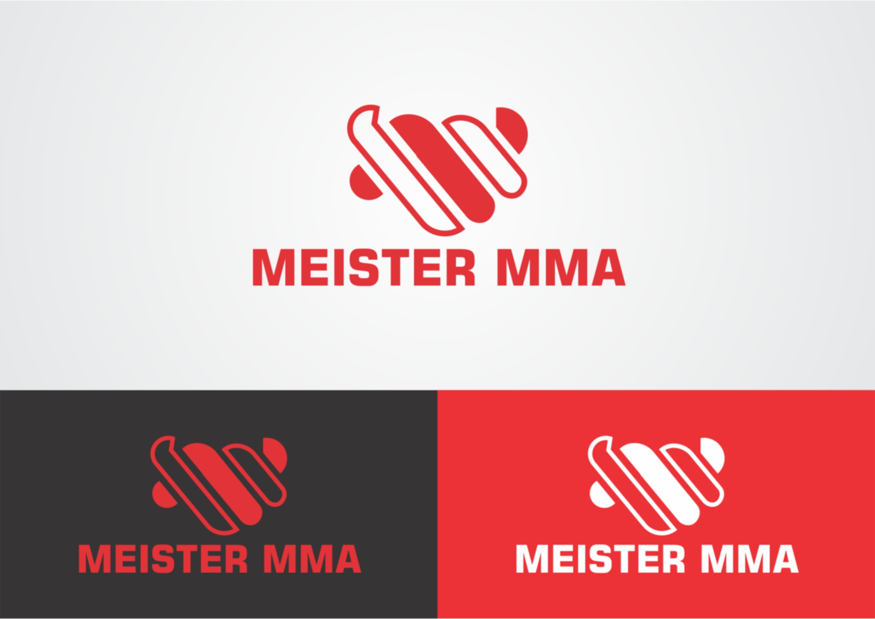
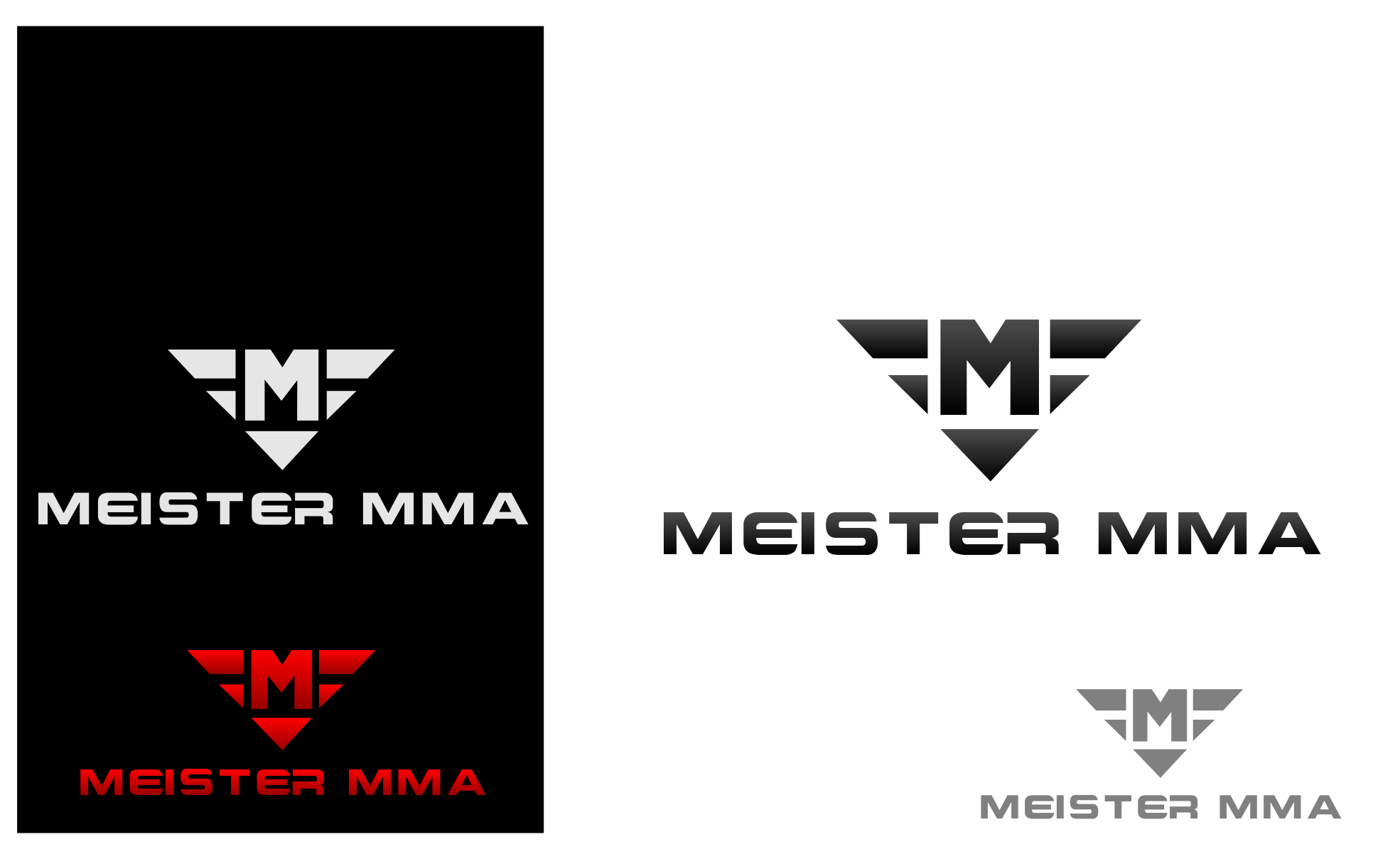
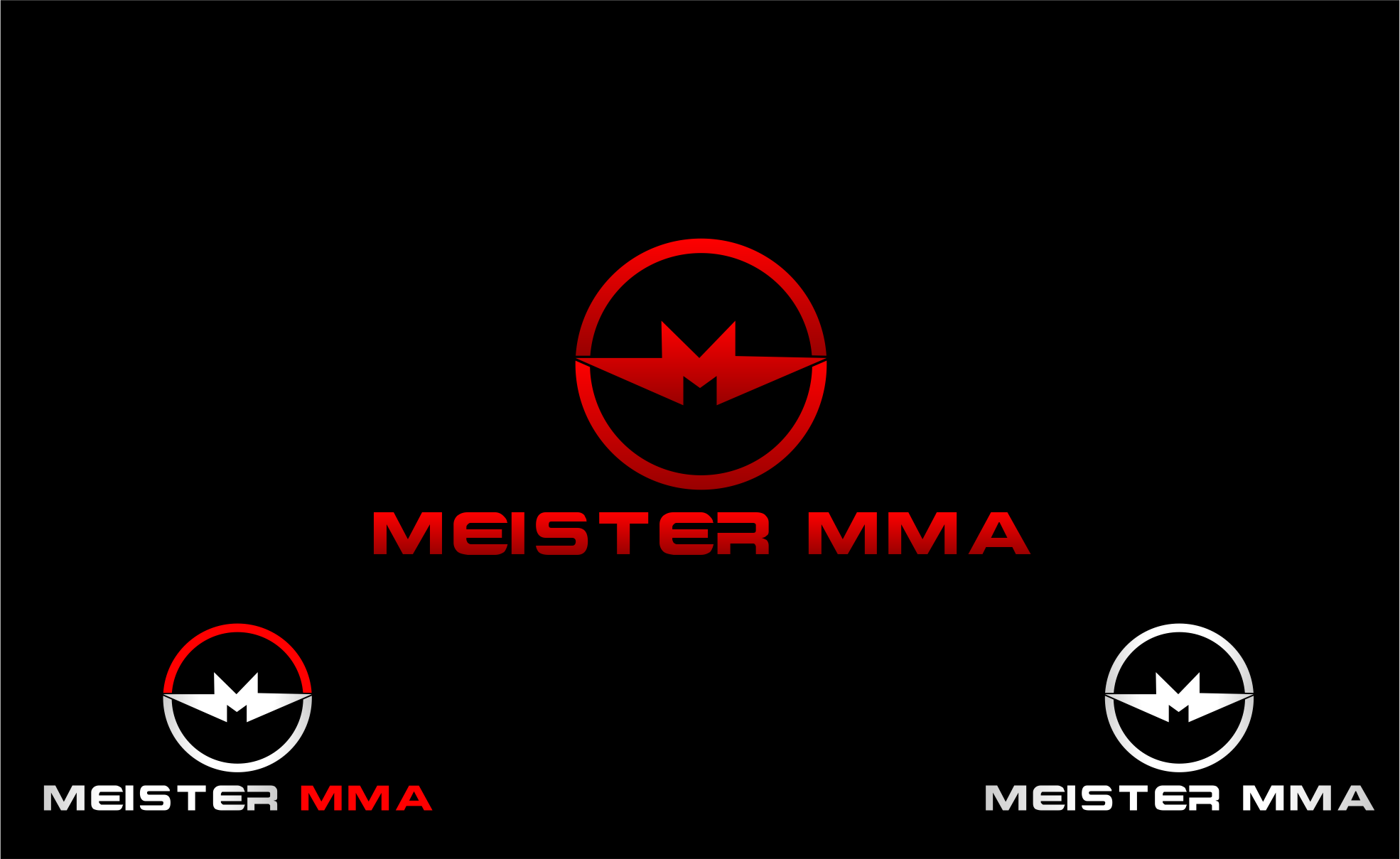
Meister MMA |
| Summary: | Our company sells athletic equipment and apparel, most of it related to Mixed Martial Arts (MMA) and Exercise/Fitness equipment. We are looking for a logo that captures the following attributes:-
We are looking for original ideas and creativity. |
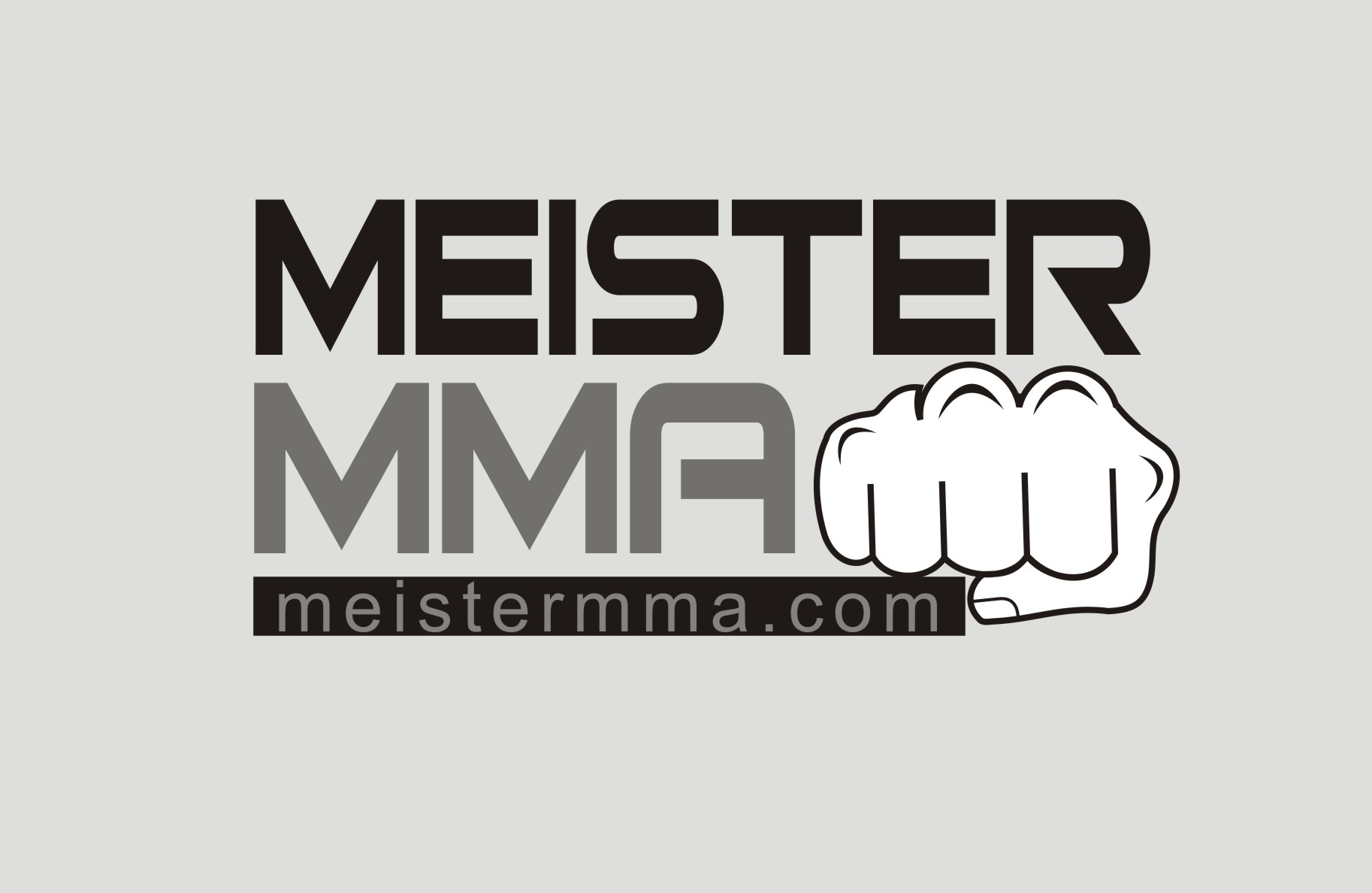
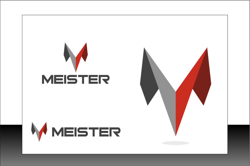
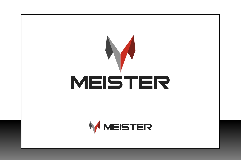
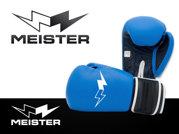
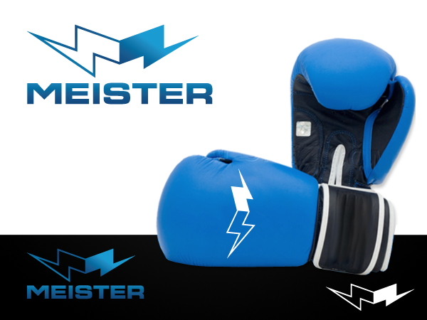
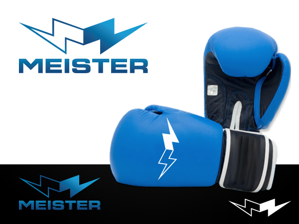
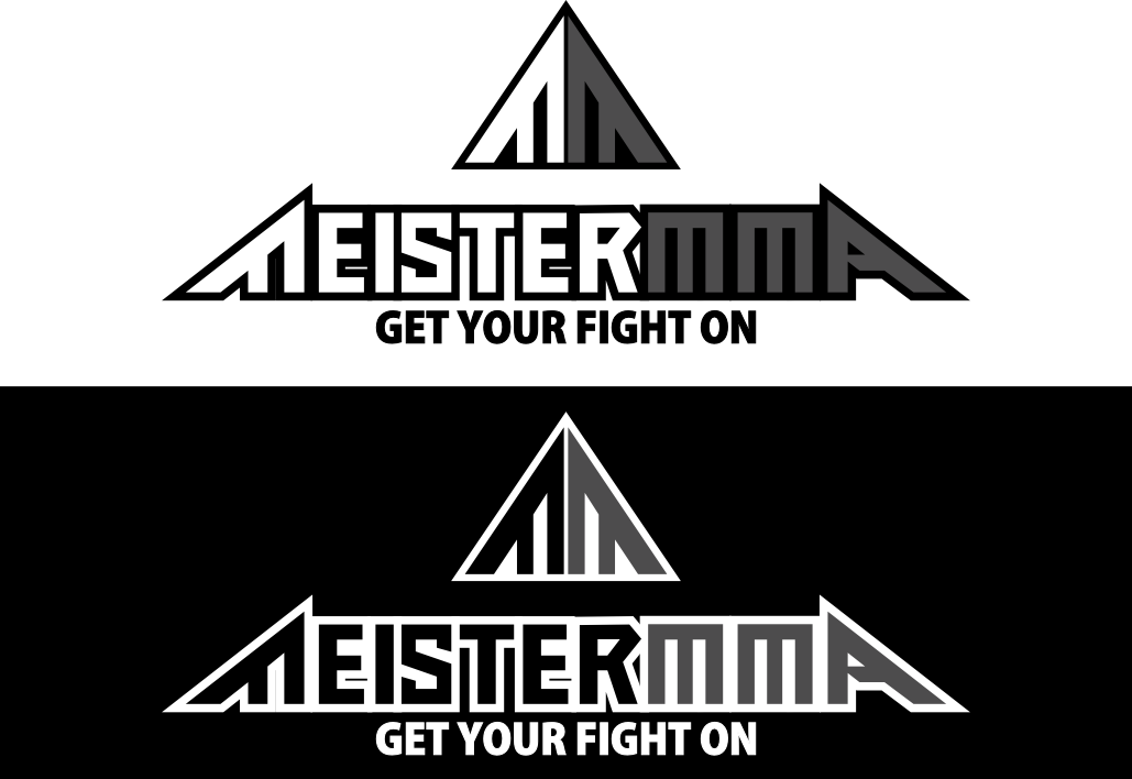
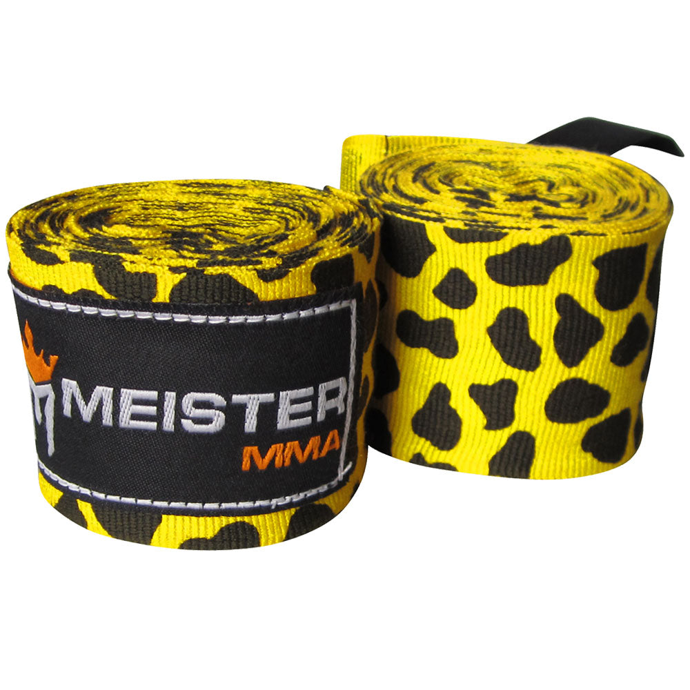
| Description: | Our company name is Meister MMA (meistermma.com). We have a couple different logos currently and I don't like any of them. You can see the current logos on our site or on a couple of the products: http://www.meistermma.com/images/mma_hand_wraps_180_inch_leopard_spot.jpg http://www.meistermma.com/images/weight_lifting_straps_black.jpg I am looking for a logo that can just say "Meister" but also add "MMA" in the logo sometimes if the product is specifically an MMA product. (simply show versions with MMA separately in small area) Here are a few points to note : 1- The logo of course needs to say "Meister", but I want to be able to use part of it as a symbol. That could be a symbol in the logo or a graphic letter in the logo (like the M). The "CROWN" logo here : http://thelogofactory.x10.bz/ is a good example where the symbol is part of the logo but could be used by itself. So, ideally the logo wouldn't be just words, or just a symbol, but the two sort of intertwined. 2- Regarding colors, I think the main logo should be mostly neutral colors - black, white, gray, silver. But if an accent is needed in the logo, a yellow or orange could maybe work. 3- These logos here : http://thelogofactory.x10.bz/ most closely resemble what I'm looking for: CROWN, GREATWORX, REVIEWCODE, SMOKIN BRANDS. The name is clearly understandable and there is a strong symbol within the logo that represents the feel of the brand in all of these. 4-The "Meister" brand should really represent Strength, Fighting Spirit, High Quality, Athleticism. The word "Meister" means "Master" in German, so it should represent a "premium" brand of athletic equipment. It shouldn't be a "fun" logo, but more of something serious and bold yet still creative. |
| CH Wants: | Color preferences : Mostly neutral colors - black, white, gray, silver The logo needs to say "Meister". Bold, professional and creative design is what I'm looking for. |
| CH Don't Wants: | It shouldn't be a "fun" logo, but more of something serious and bold yet still creative. |
Contest Attachments
Contest material, sample files and attachments for the contest uploaded by Contest Holder.
No attachments yet!
About Contest
| Industry: | |
| Created on: | Sun, 11 Mar 2012 20:21:36 +0000 |
| Ends on: | Wed, 21 Mar 2012 20:21:36 +0000 |
| Status: | Closed |
Prize(s)
| 1st Prize: | $300 |
Comments
Admin
110designs.com
http://www.osakafightgear.com/product_images/uploaded_images/rival-boxing-mma-logo.png
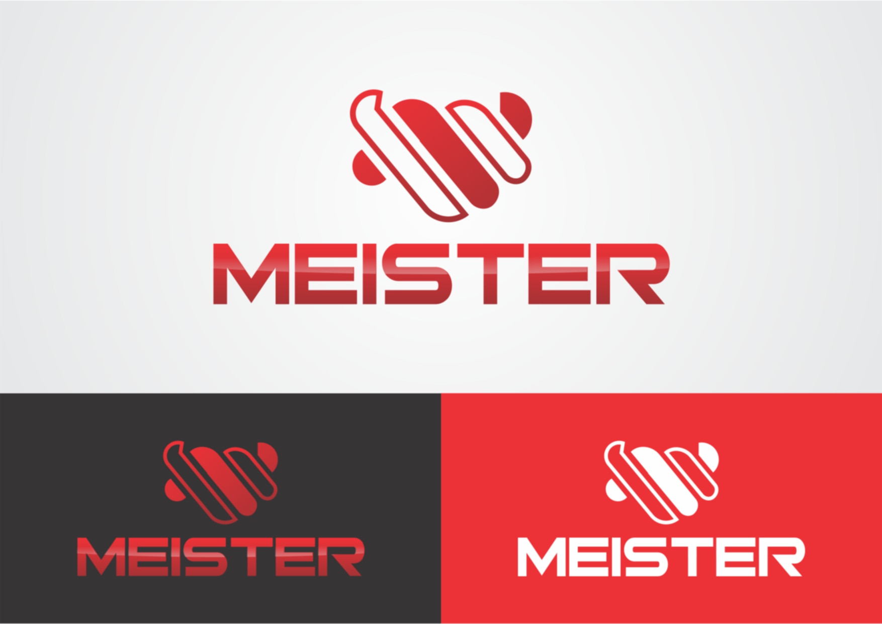
-* Different color combinations - I'm not a big fan of red but I do like the contrasting colors. I really like the 2-tone idea that you have going. And we should also try with other backgrounds as well since we'll be using on different color products
-* Somehow integrate the M symbol into or behind the MEISTER wording. The best solution may be to have the M above the lettering as you have it, but I'm interested if you're able to somehow link the two a little bit more
-* Try skewing the M a little bit - maybe make it look less symmetrical (eg one side of the M is higher than the other slightly), could maybe even follow the contour of words somehow. Not sure if this will look better than the current symmetrical symbol - which looks good - but worth a try
-* I like the current font, but could maybe test out a couple other similar bold fonts
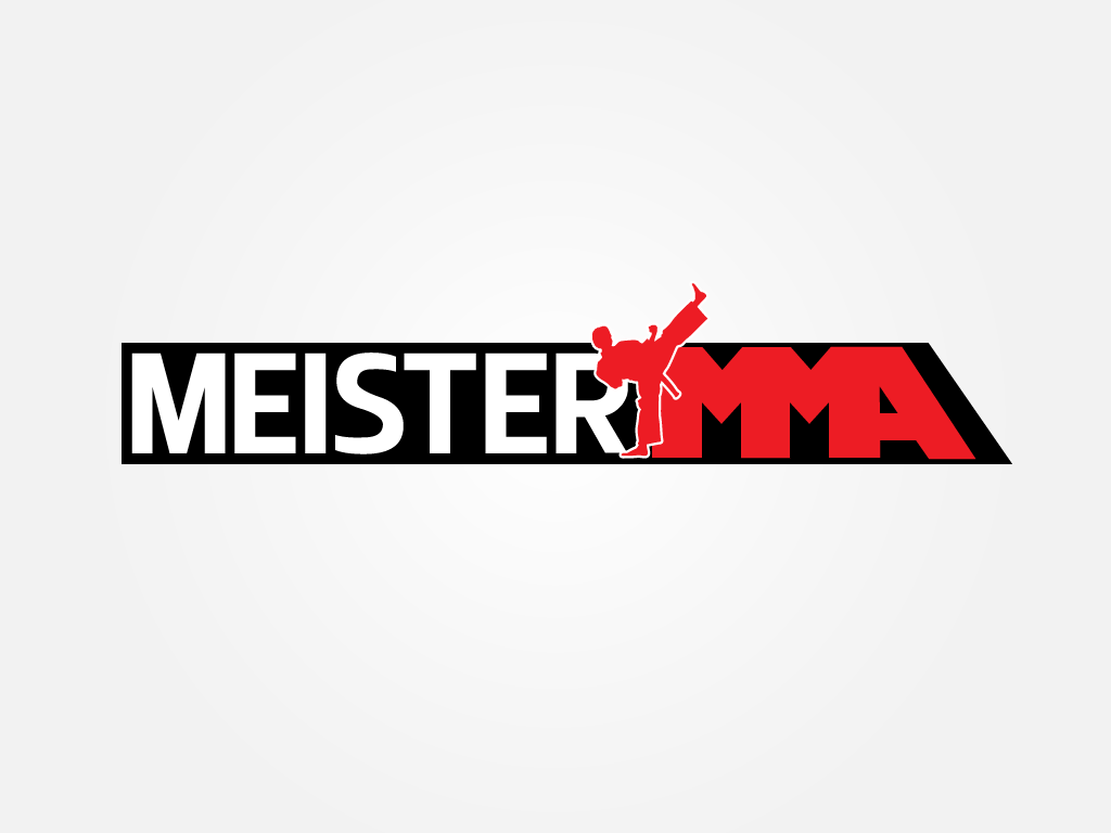
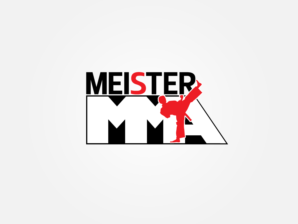
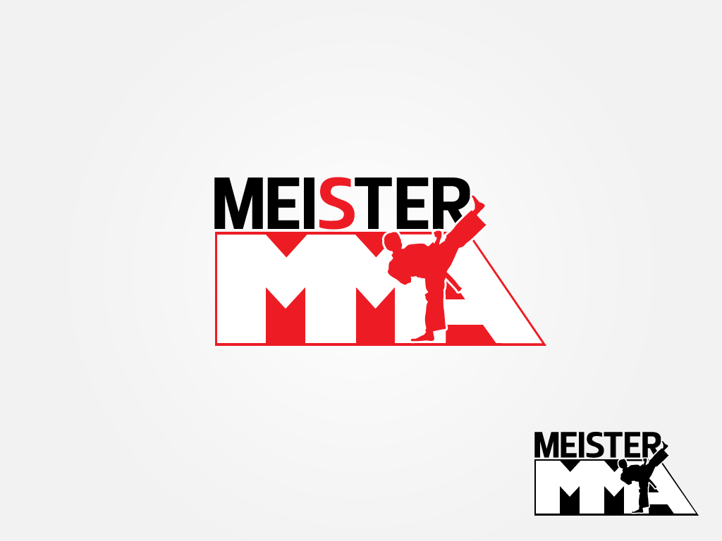
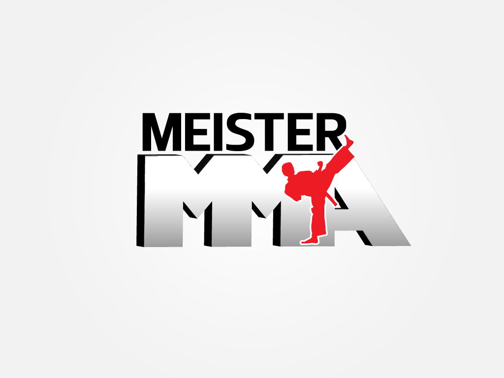
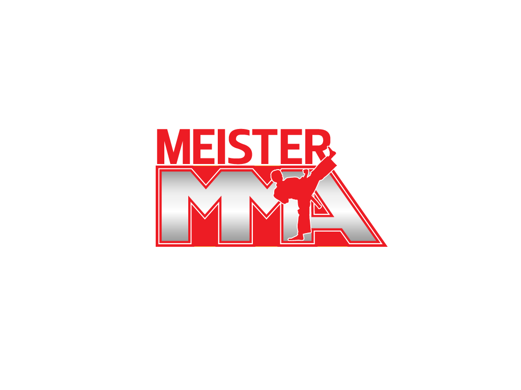
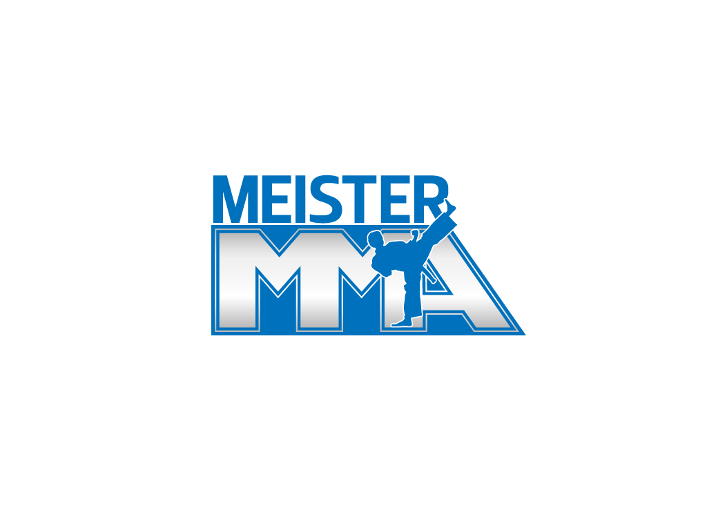
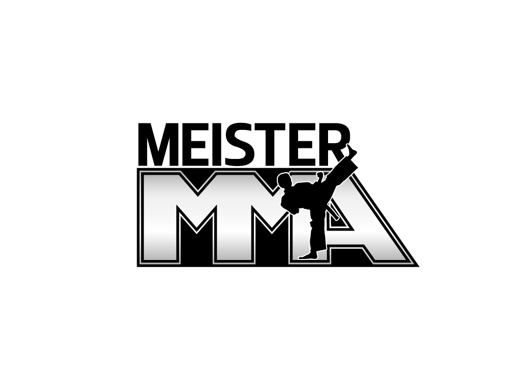
So the karate uniform and karate kicker are just not the image we're going for. The shadow/mirror effect on #12 wouldn't work for us in putting the logo on our products - it needs to have more clearly defined edges. The fonts in both are good, strong, bold fonts. But I think any kind of human/person symbol in the font isn't going to work.
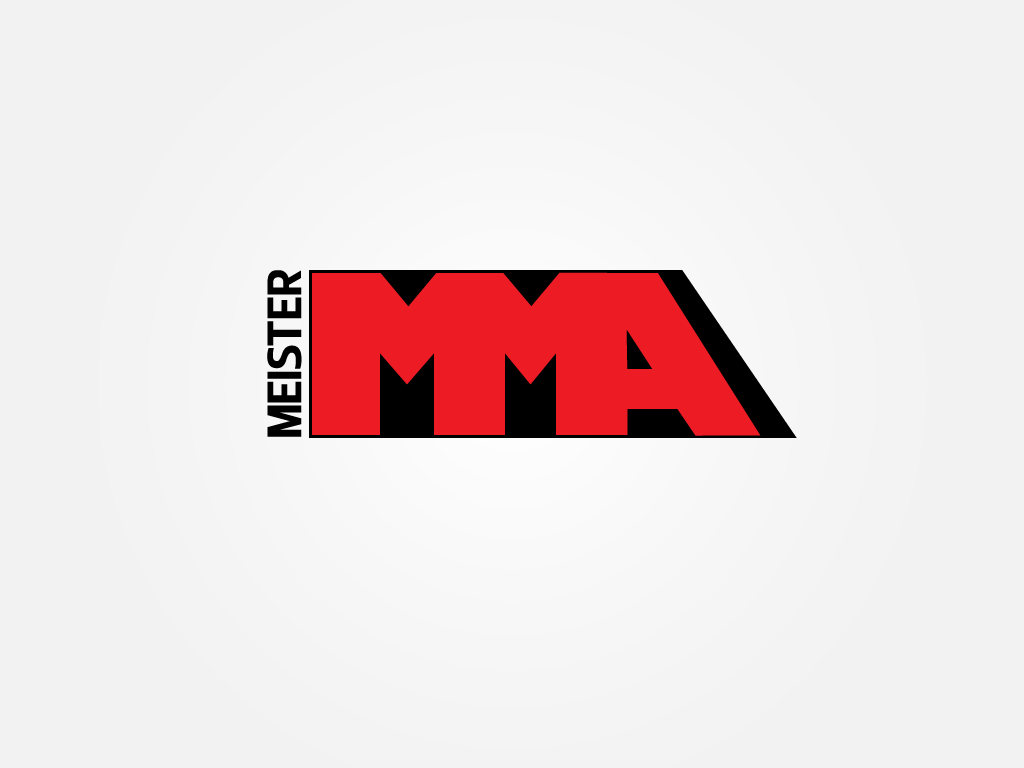
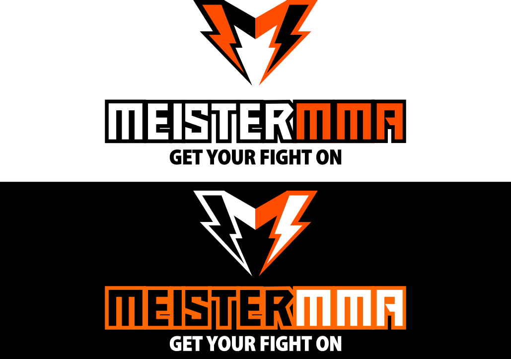
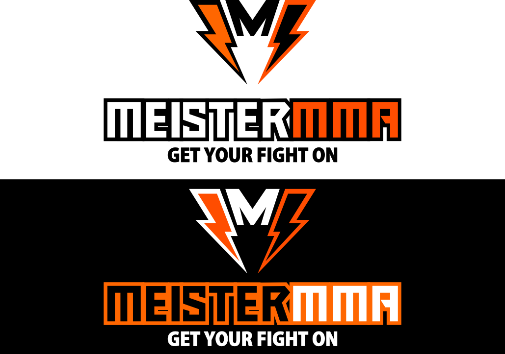
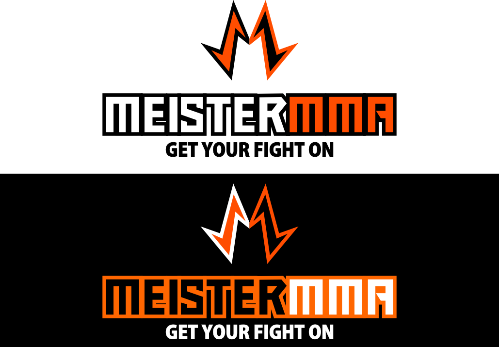
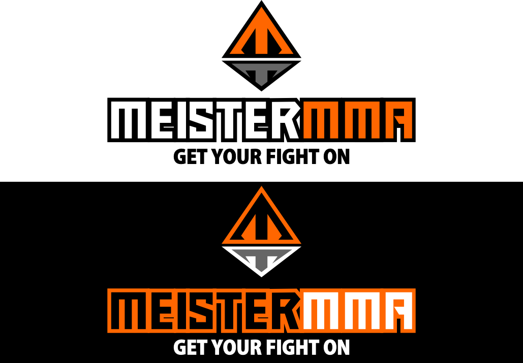
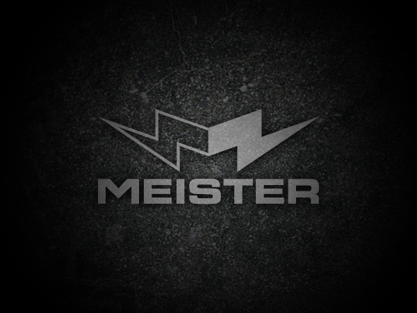
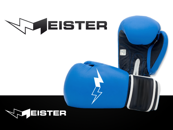
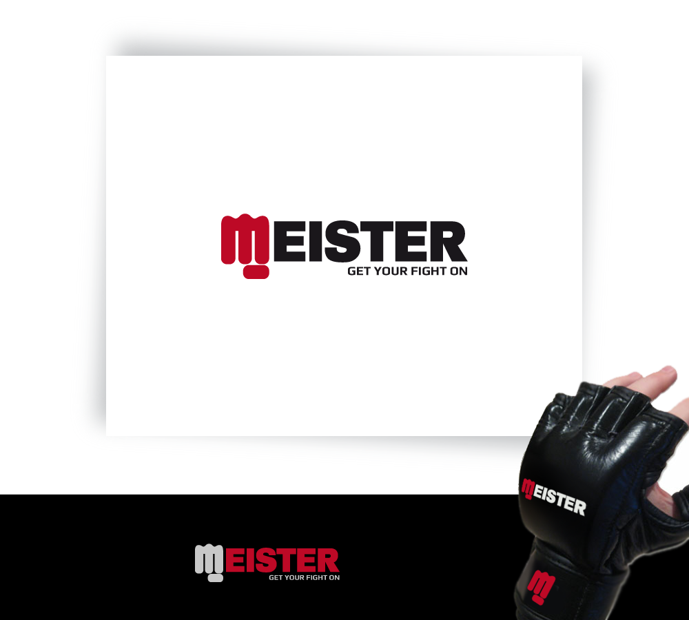
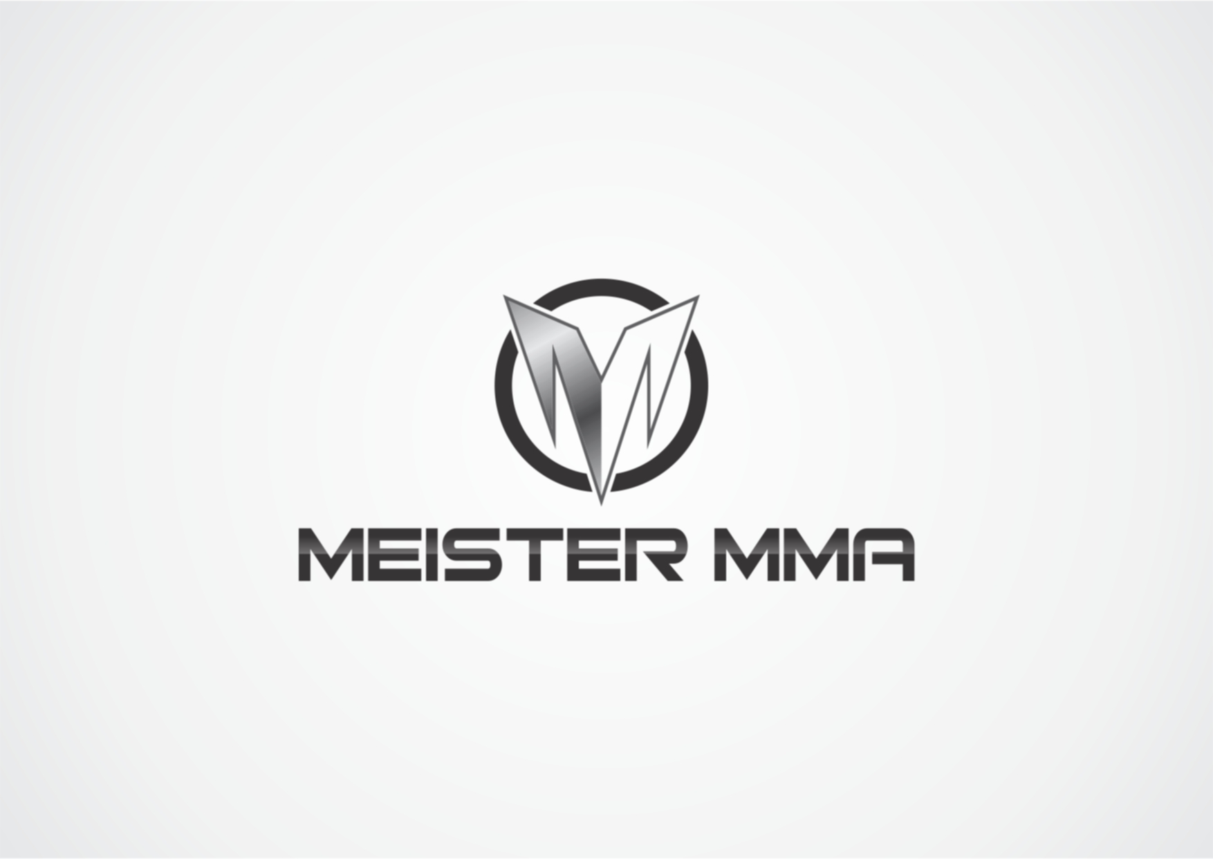
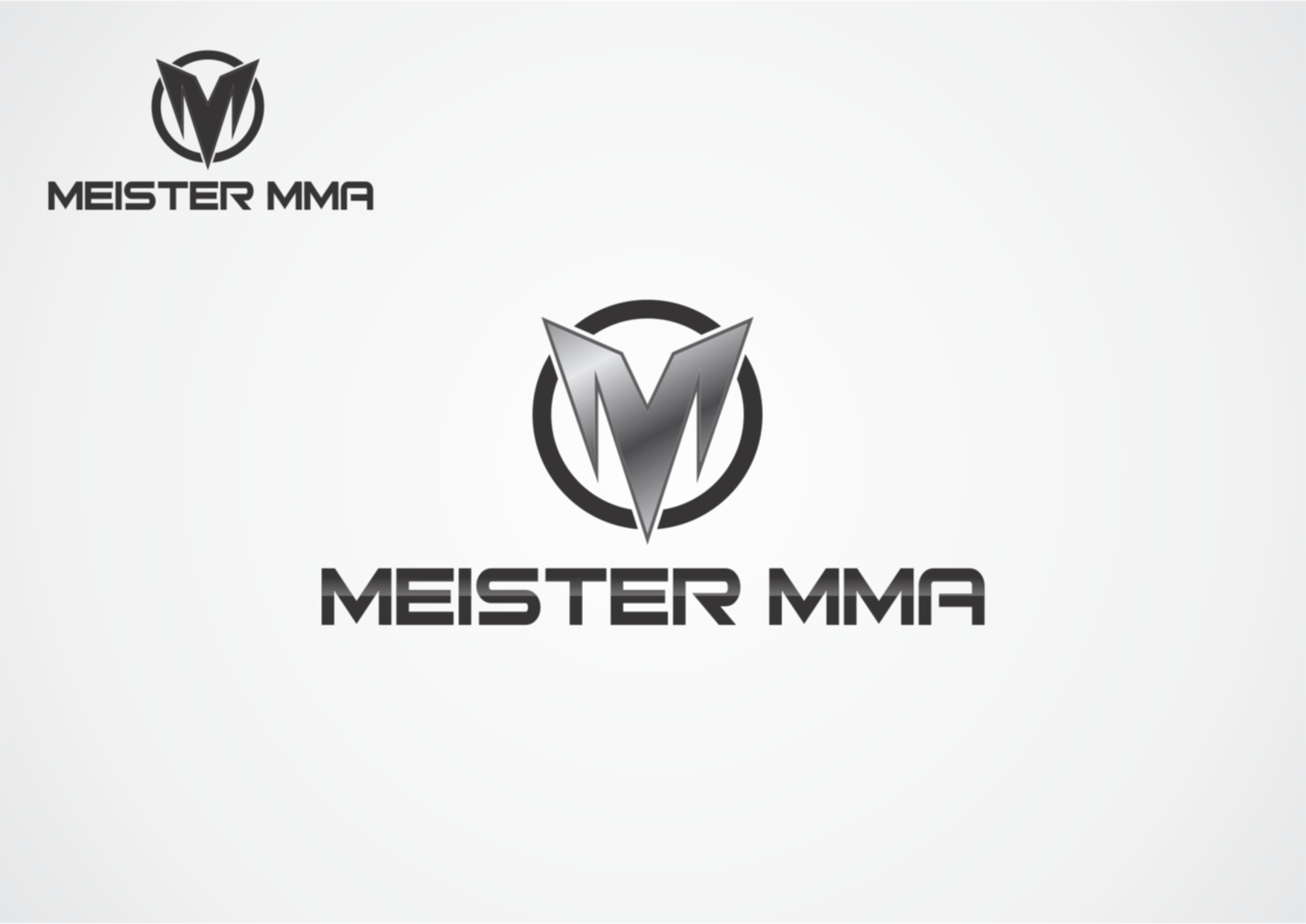
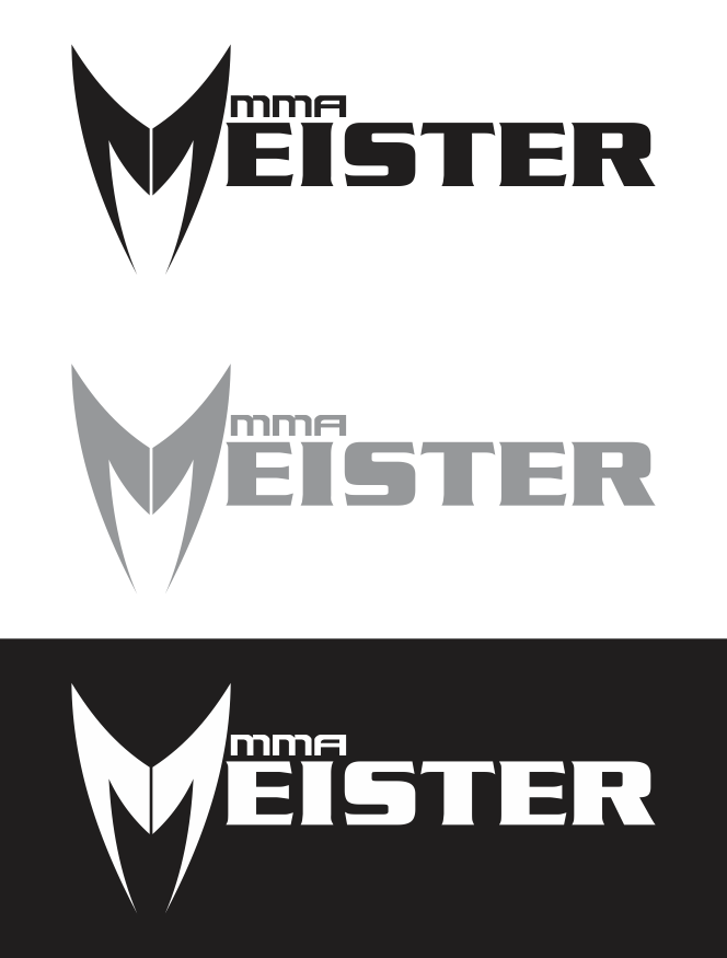
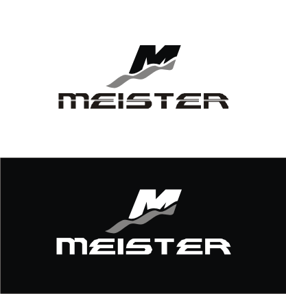
#6: cool design and I really like the "M" design. I think that symbol could be used by itself and really look good. I think where it could be improved would be either to somehow integrate that M and the words "MEISTER", or to make the "M" design perhaps somehow more closely resemble an identifiable object. I'm not sure if it would actually be better to have it tweaked to resemble some real object or if it's better obscure as is... The font is good for the wording, but maybe could be slightly improved? I'm not sure how - it's pretty good. We could probably start with just "Meister" before we add either the "MMA" or the "Get your fight on" tagline. I think this logo is the best start.
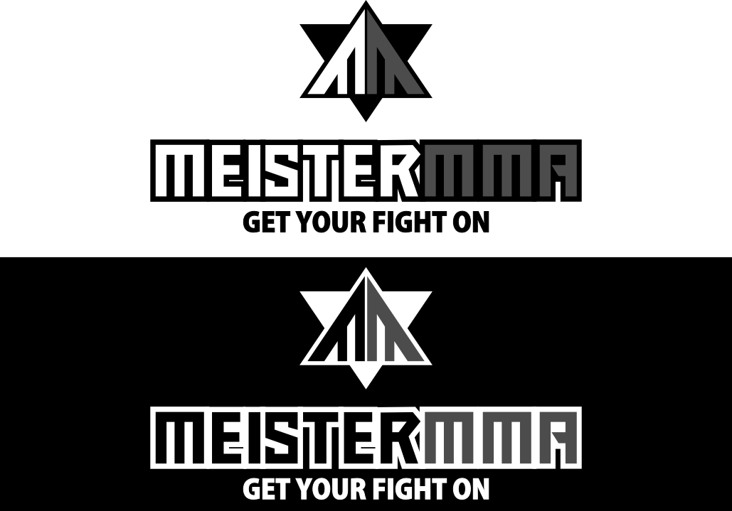
#7 , #3, #4, #5 - I don't like much about this design
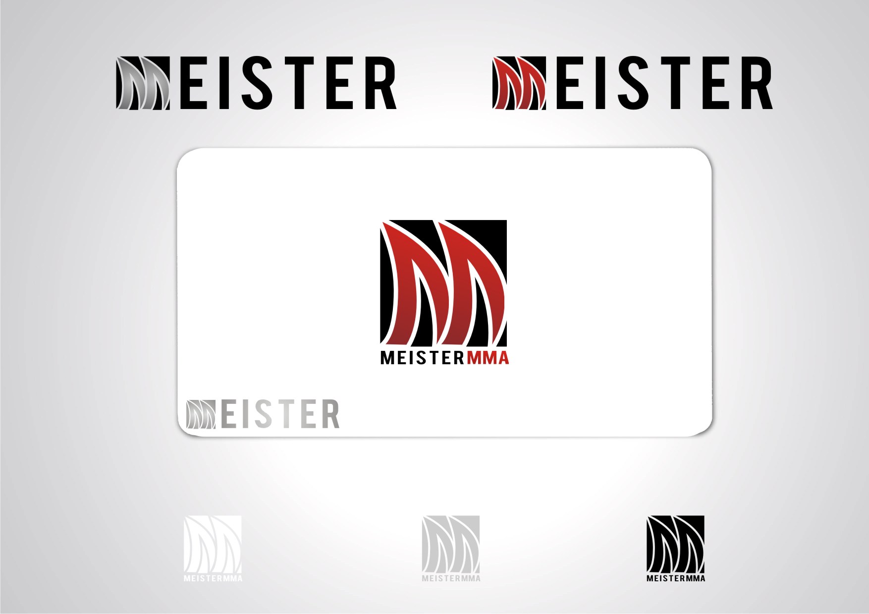
#8 - This is probably my second favorite design. I like the originality of the barbell logo. I think it may be a little bit too weightlifting-specific though. Several of the things we carry in the "Meister" brand are weightlifting related, but I would really like it to be able to be used for almost anything athletic related. I don't have any recommendations on what would be more general to use but I think I would know it when I see it. The font isn't quite strong (bold?) enough - but it is still a pretty good look. I like the creativity and logo style - but the barbell is a bit too specific.
#11 - I'm not sure what the intended feel of the design is - but I'm not quite getting it.
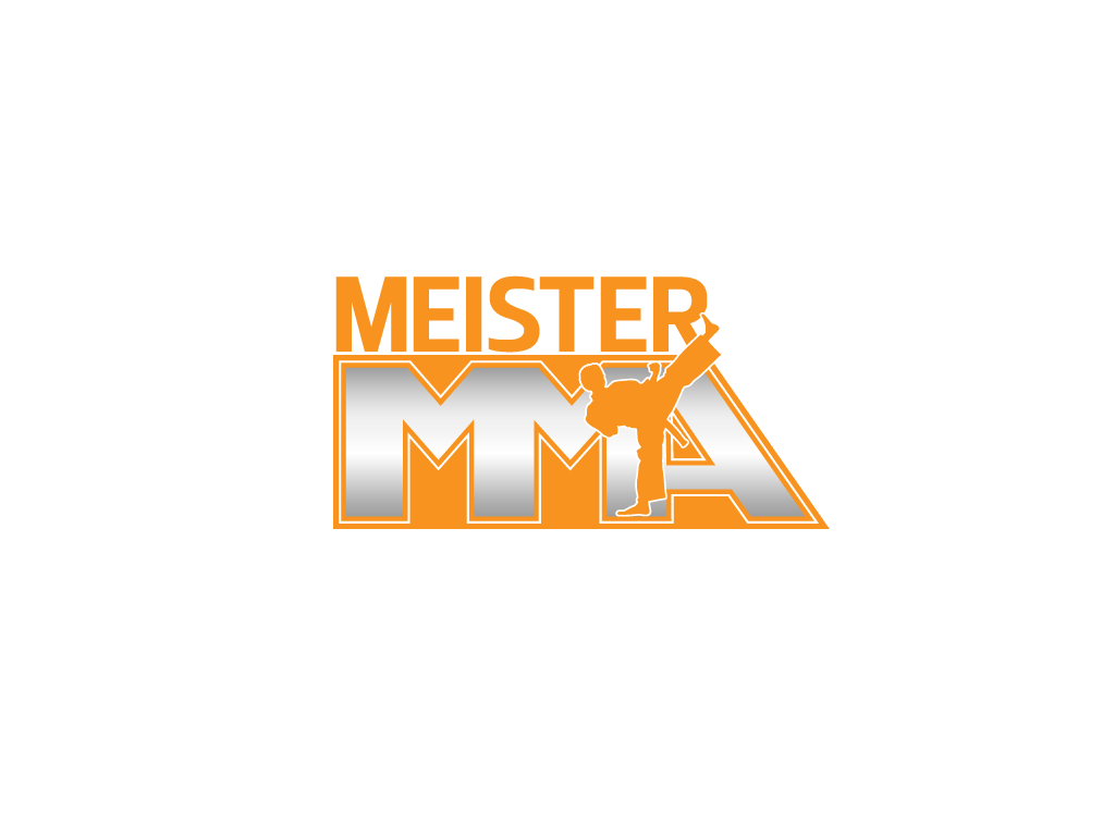
#10 - Again I like the creativity, but I think it's a little too playful. Not nearly bold enough. I like that the design is incorporated into the wording but I don't like the idea of a person's shape being in the logo - too cliche for me.
Overall I'm really impressed with #6 and I think there's some good aspects to be drawn from the others, especially the creativity of #8.
Hopefully I've given you enough guidance to modify/create from here and see if we're going in the right direction.