Logos are more than just symbols. They are the face of a brand, capturing its personality and values. But how have logos evolved over the last 20 years, from 2003 to 2023? How have they adapted to the changes in technology, design trends, and consumer tastes? In this article, we’ll take you on a journey through the history of logo design, and show you the strategies and styles that have defined each era.
1. Simplicity is Timeless (2003-2010):
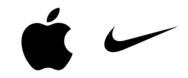
In the early 2000s, logos were often complex and detailed, featuring intricate shapes, textures, and effects. But as the decade progressed, simplicity became the new standard. Brands like Apple and Nike led the way, opting for clean, minimalist designs that conveyed a sense of sophistication and modernity.
2. Flat Design Revolution (2010-2015):

Flat design was a radical departure from the previous era. It eliminated all the unnecessary elements, such as shadows, gradients, and skeuomorphism. Instead, it focused on bold colors and simple shapes, creating logos that were crisp and clear. This trend was epitomized by Microsoft’s rebranding in 2012, embracing a flat, tile-based design language.
3. Responsive Logos (2013-2018):
The rise of mobile devices and diverse screen sizes posed a new challenge for logo designers. They had to create logos that could work on any platform, from a smartphone to a billboard. Scalability and versatility became key considerations, leading to the creation of logos that could be easily resized without sacrificing clarity.
4. Gradient Renaissance (2016-2020):

As technology improved, designers started to experiment with gradients again. But this time, they used them in a more subtle and sophisticated way. Gradients added depth and dimension to logos, creating a sense of movement and energy. Instagram’s 2016 logo redesign is a notable example, showcasing a gradient transition from warm pinks to vibrant purples.
5. Dynamic and Adaptive Logos (2020-2023):

With the increasing popularity of interactive media, some brands decided to take their logos to the next level. They created dynamic and adaptive logos, that could change and evolve based on user input or environmental factors. This innovative approach ensures that logos remain engaging and relevant in the ever-evolving digital landscape.
Conclusion:
The evolution of logo design from 2003 to 2023 has been a fascinating journey marked by shifting aesthetics and technological advancements. From the simple designs of the early 2000s to the dynamic designs of today, each era has left its mark on the visual language of brands. As we move forward, it will be exciting to witness how logo design continues to adapt to the ever-changing demands of the digital age, creating visual identities that connect with the audiences of tomorrow.
Subscribe to our Newsletter!

