Deans Logo needed
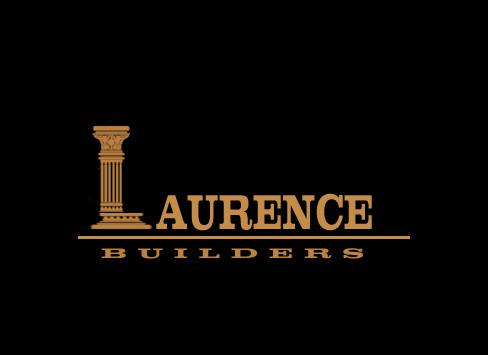
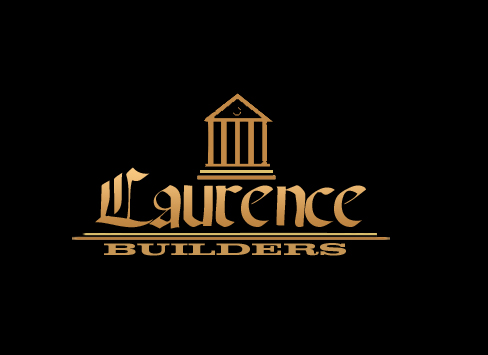
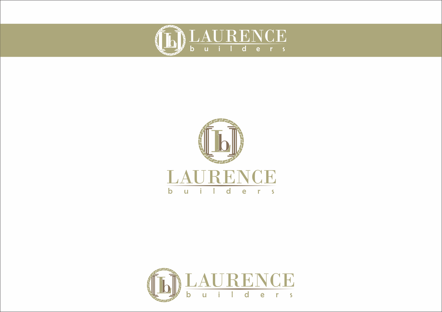
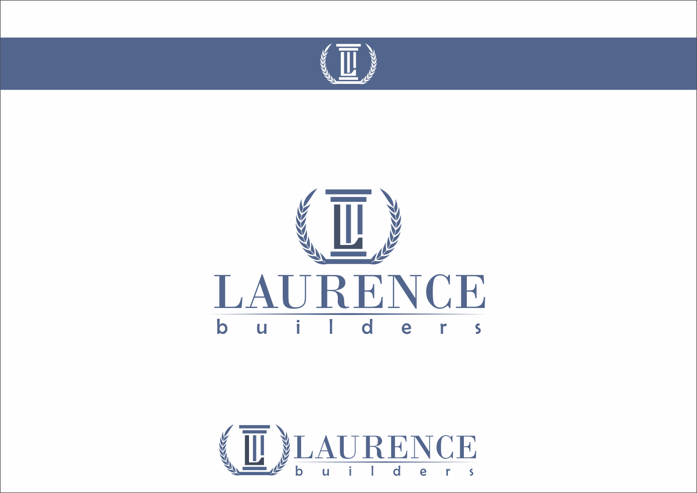
— Laurence Builders
Category → Logo Design Contest
Industry →
Client → ruinterk
Stats → 102 entries • 26 designers
Prize → $150
Start a Contest Like This!
Top Designs

Design Brief
| Contest title: | Deans Logo needed |
| Sub title: | Laurence Builders |
| Category: | Logo Design |
Brand Name: |
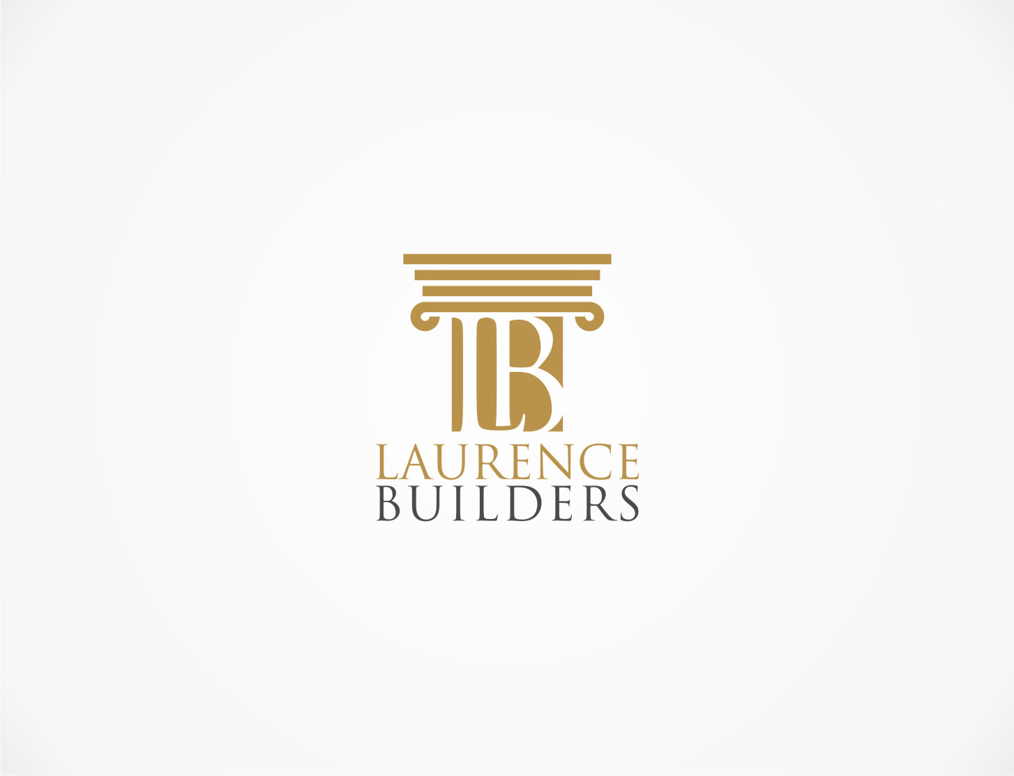
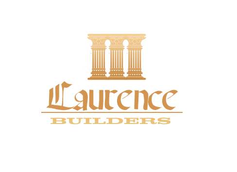
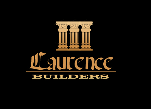
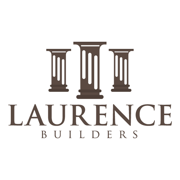
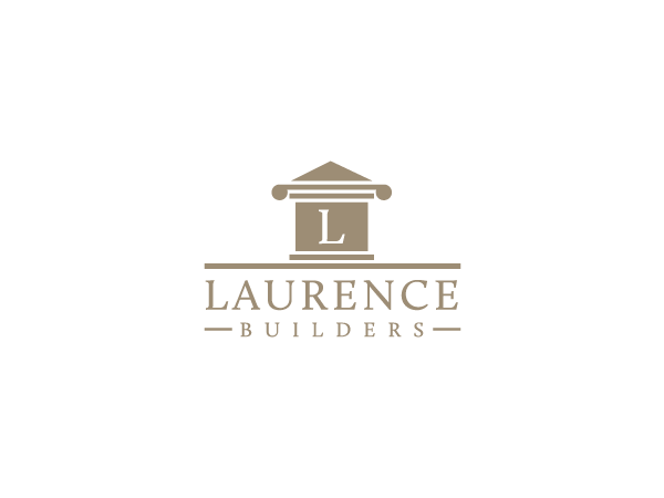
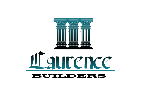
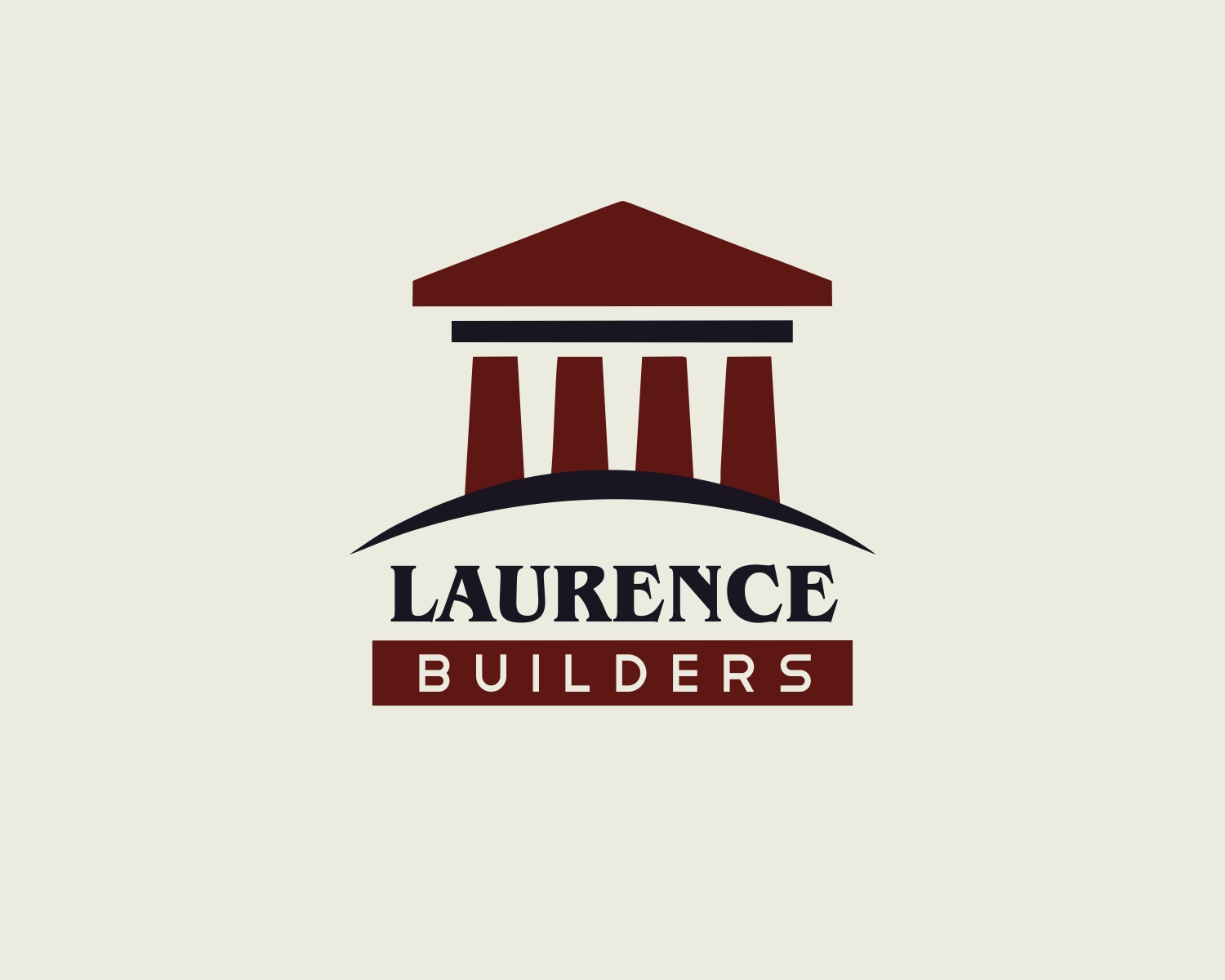
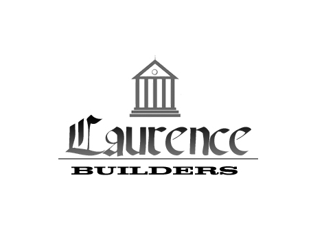
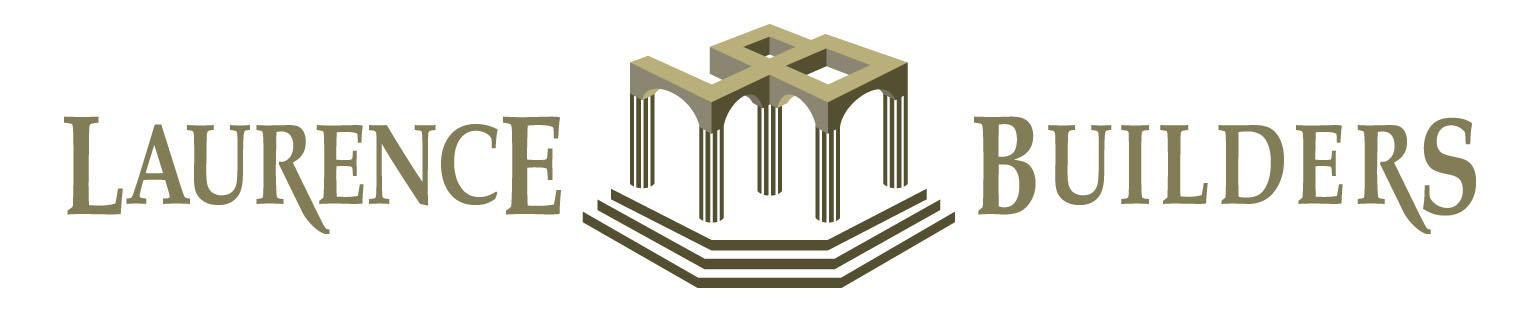
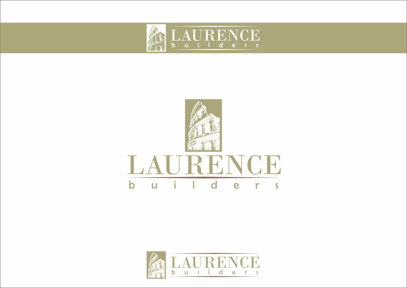
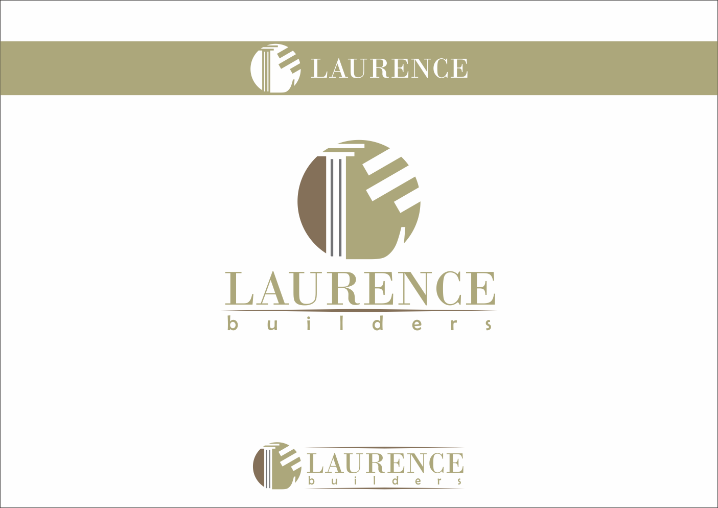
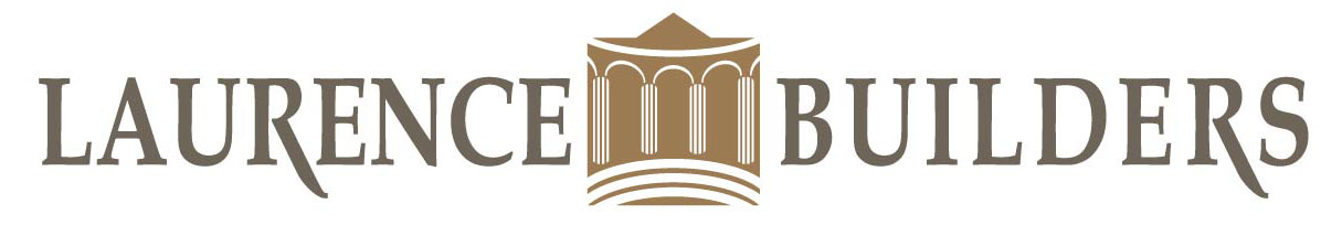
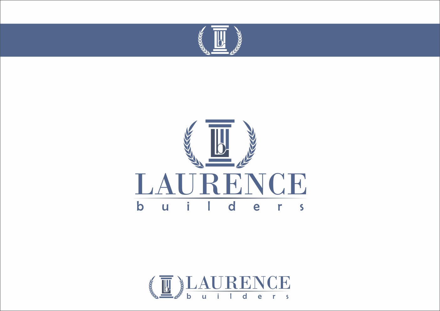
Laurence Builders |
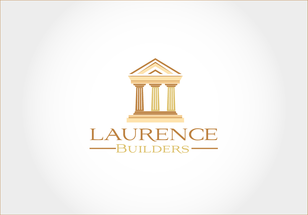
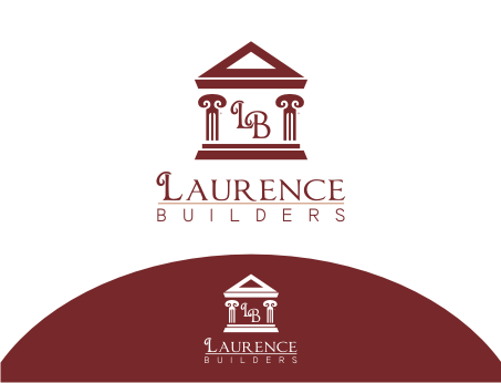
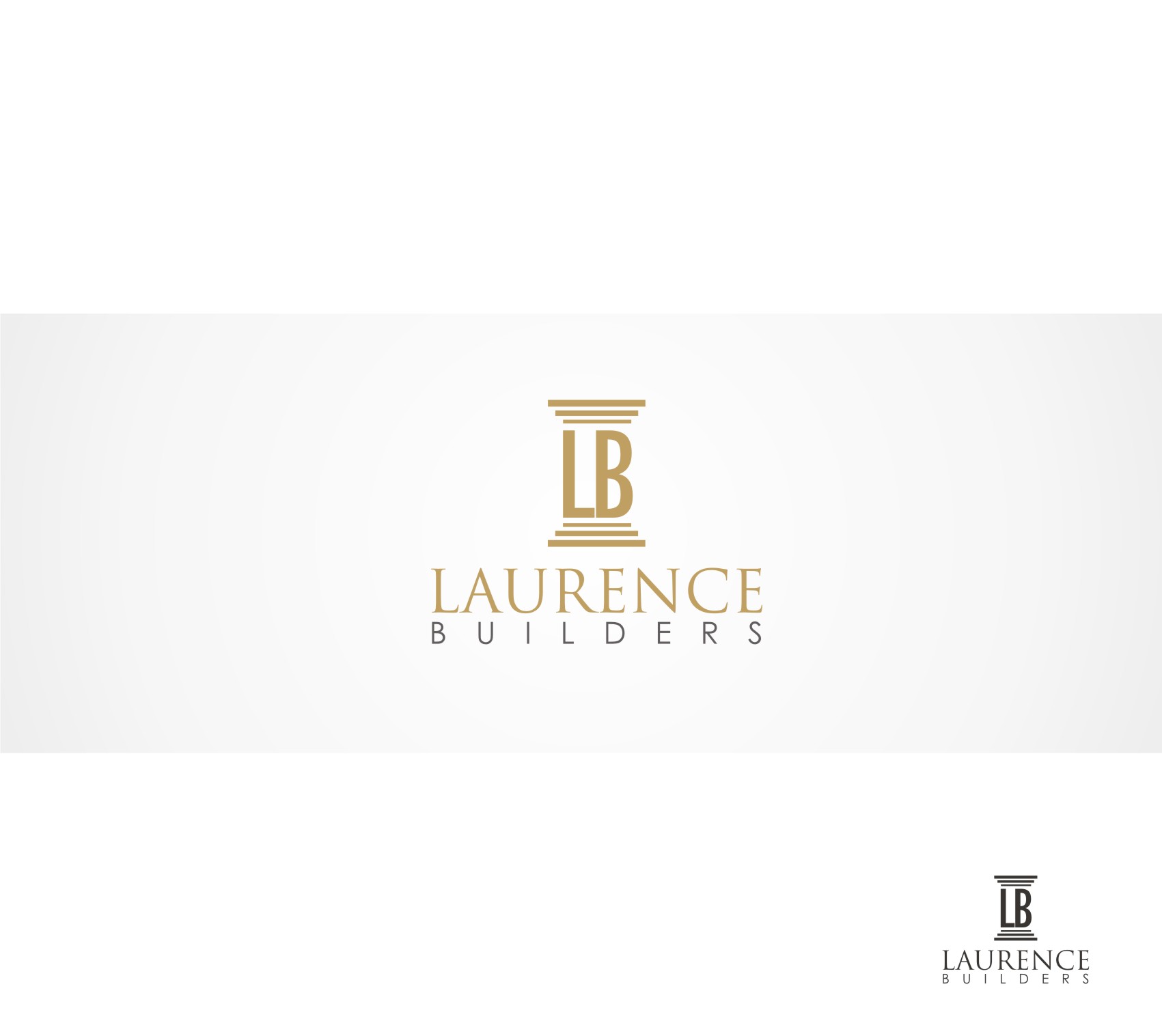
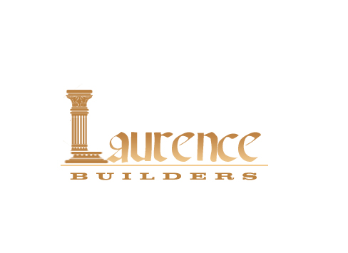
| Summary: | we are a construction company with the name Laurence Builders. We built lots of Roman ruins style constructions. we build houses and cover most building projects in historical Rome ruins style. |
| Description: | we are a construction company with the name Laurence Builders. We built lots of Roman ruins style constructions. we build houses and cover most building projects in historical Rome ruins style. |
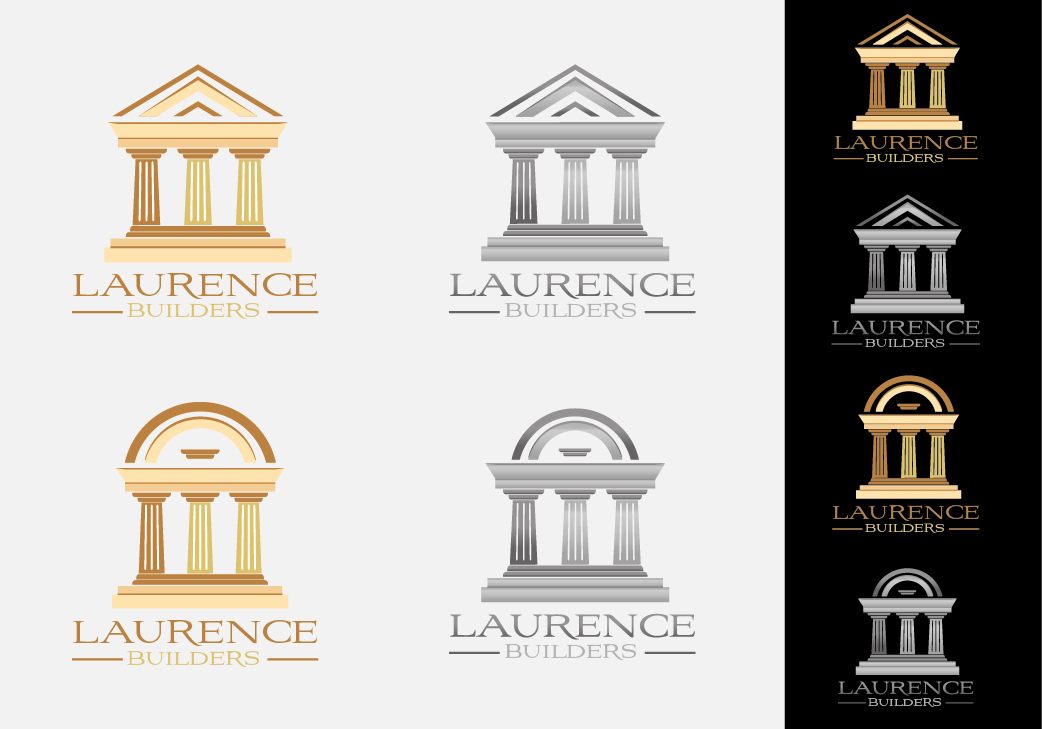
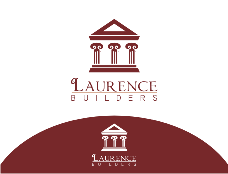
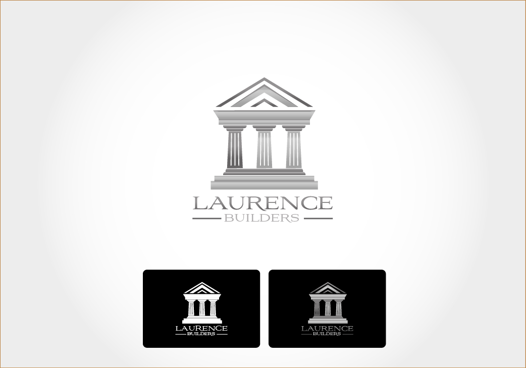
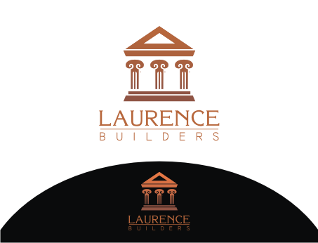
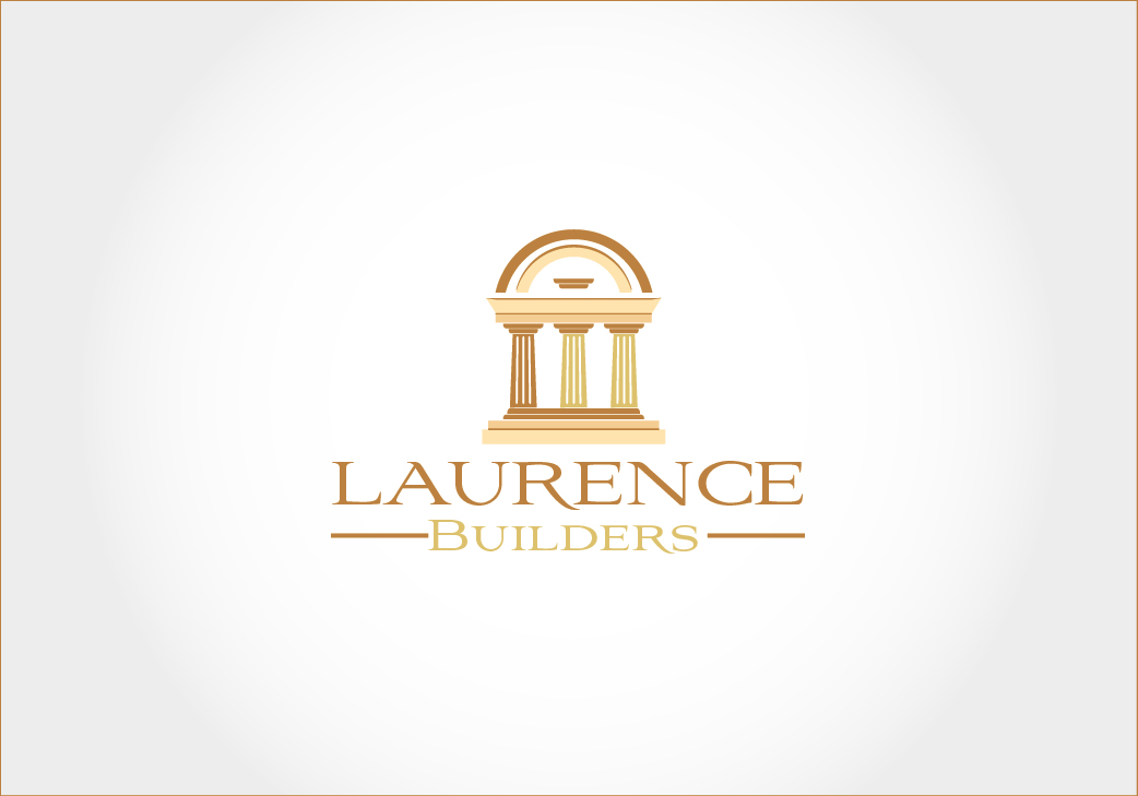
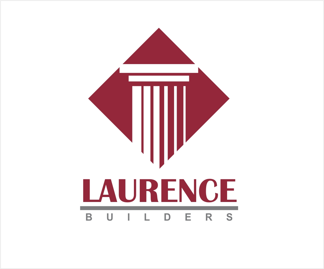
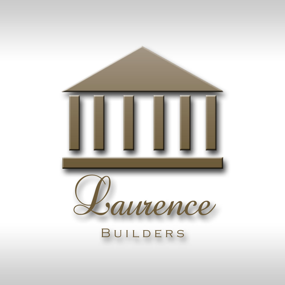
| Additional Information: | The Roman pillars would work. I like the pillars in #67, but the colors might not work with the logo. I also like the simplicity produced in #61, again the colors needs to be changed. However I really like the colors used by creativealys in its drafts, also like the 'L' differentiated in the pillars with the color. Roof concept above the pillars is good to be done. #34 pillars are also good and simple yet attractive. |
| CH Wants: | May be the Roman theme could be incorporated into the logo design.The logo must be traditional and attractive. |
| CH Don't Wants: | Today's style. Love to work with historic style. |
Contest Attachments
Contest material, sample files and attachments for the contest uploaded by Contest Holder.
No attachments yet!
About Contest
| Guaranteed $ Featured | |
| Industry: | |
| Created on: | Sun, 19 Feb 2012 00:40:39 +0000 |
| Ends on: | Sun, 04 Mar 2012 00:40:39 +0000 |
| Status: | Winner(s) Selected |
Prize(s)
| 1st Prize: | $150 |
Comments
niat ta ora nek gawe....
,ya om pixmo hahahahaha......... hanya kita ber 2 yang tau
OM PIXMO
But, next design i would like to try something not rough. Thank you, Sir.