Softcopy publishing company
— GreenSoft logo required
Category → Logo Design Contest
Industry →
Client → greensoftpub
Stats → 63 entries • 28 designers
Prize → $150
Start a Contest Like This!
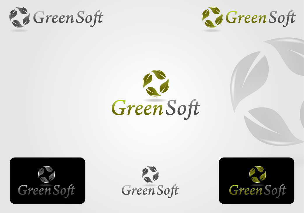
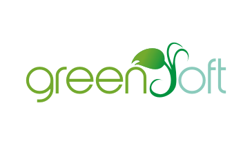
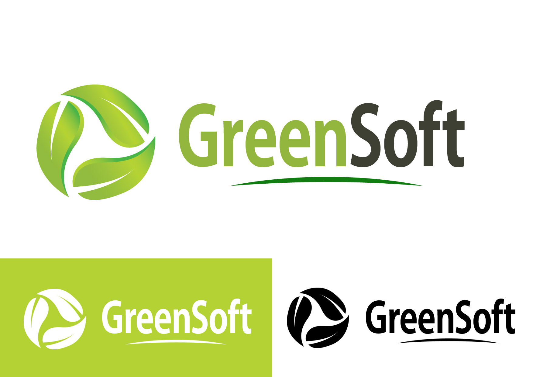
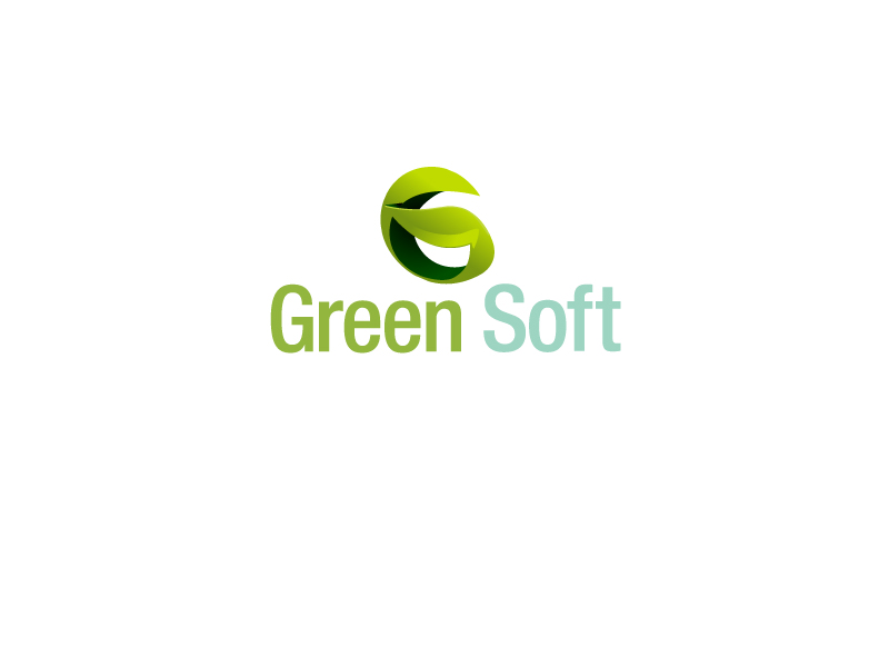
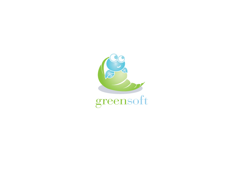
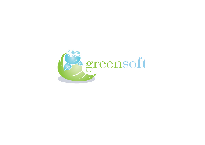
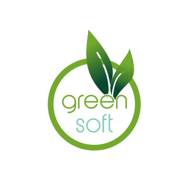
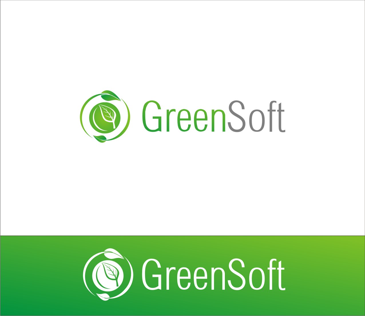
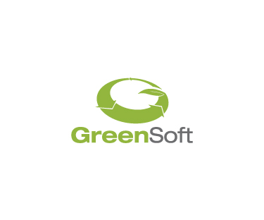
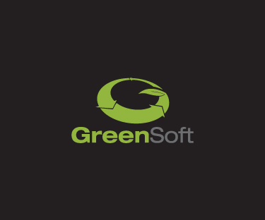
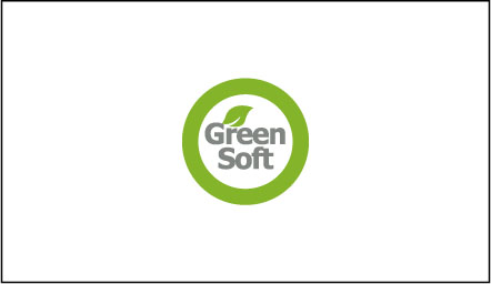
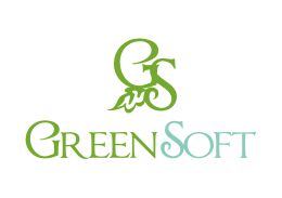
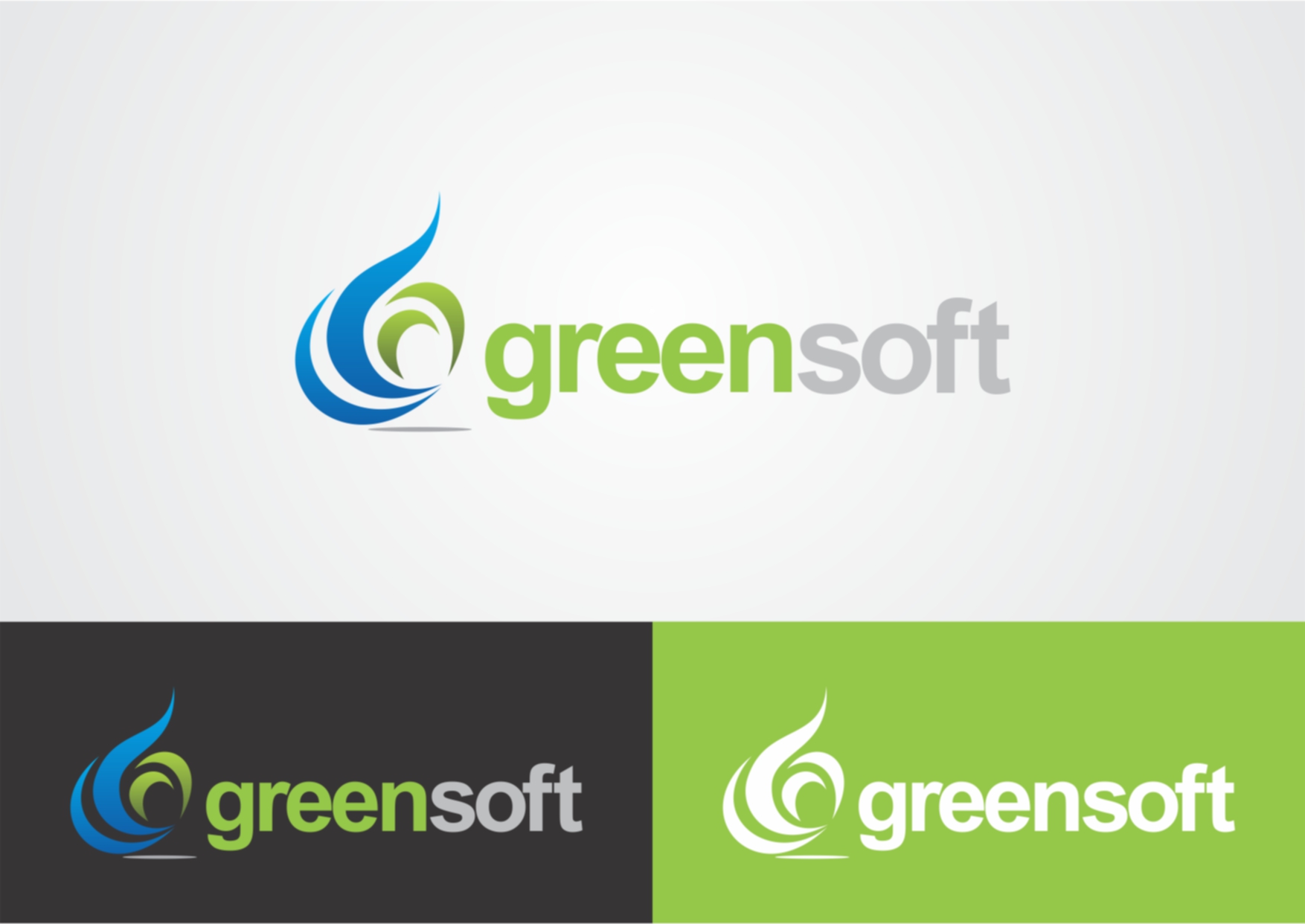
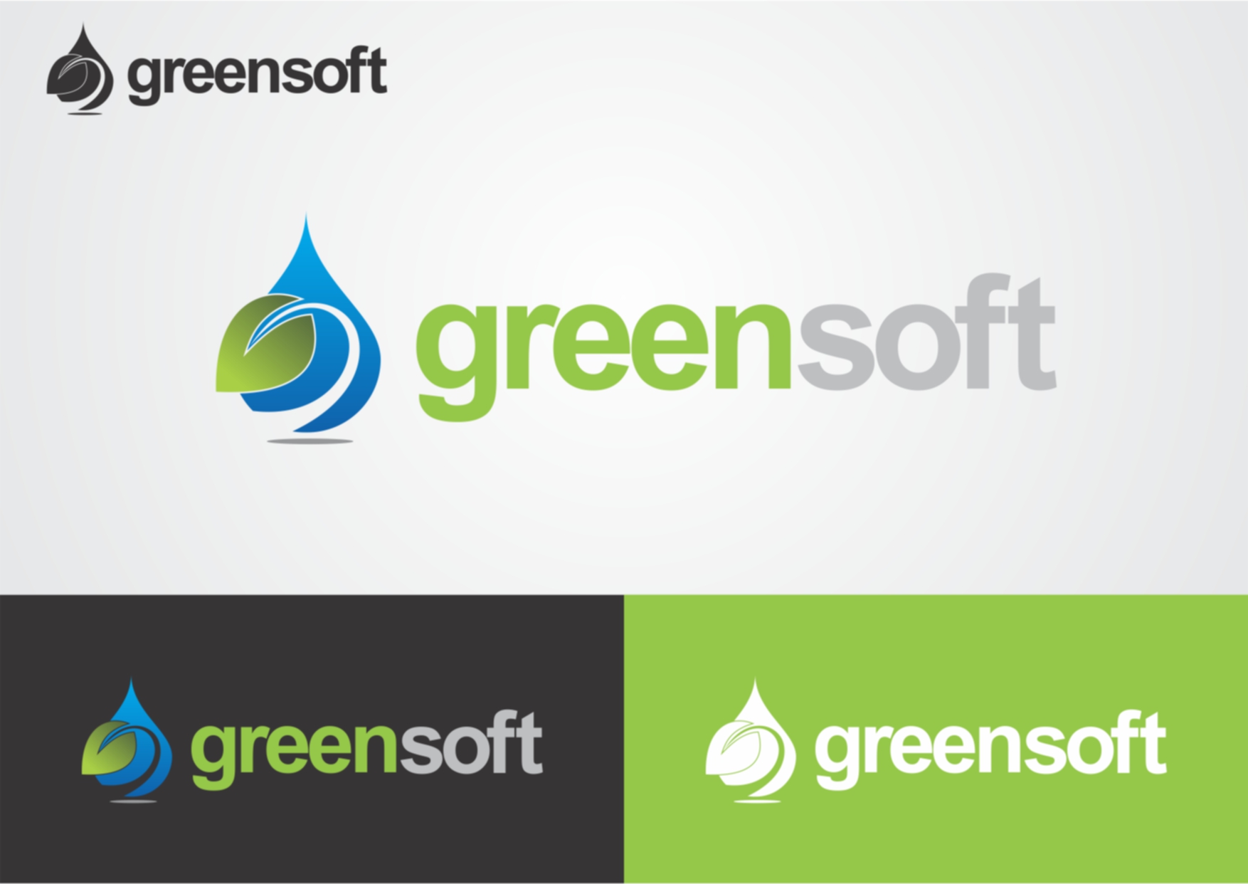
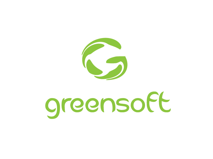
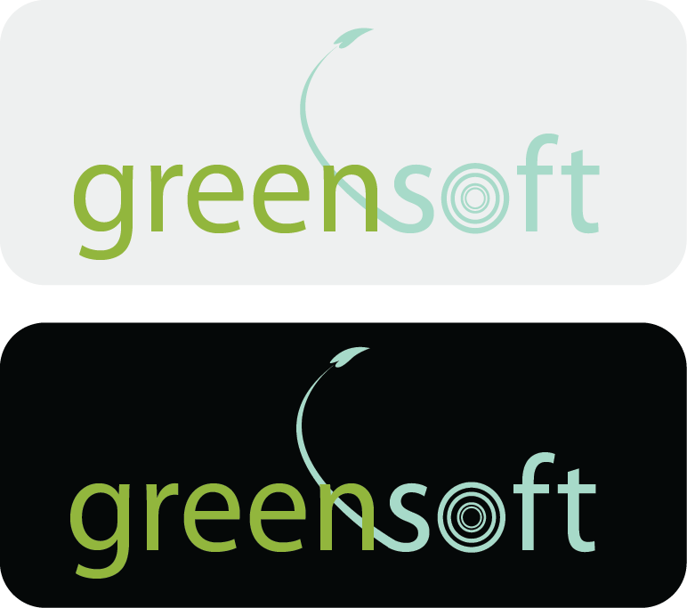
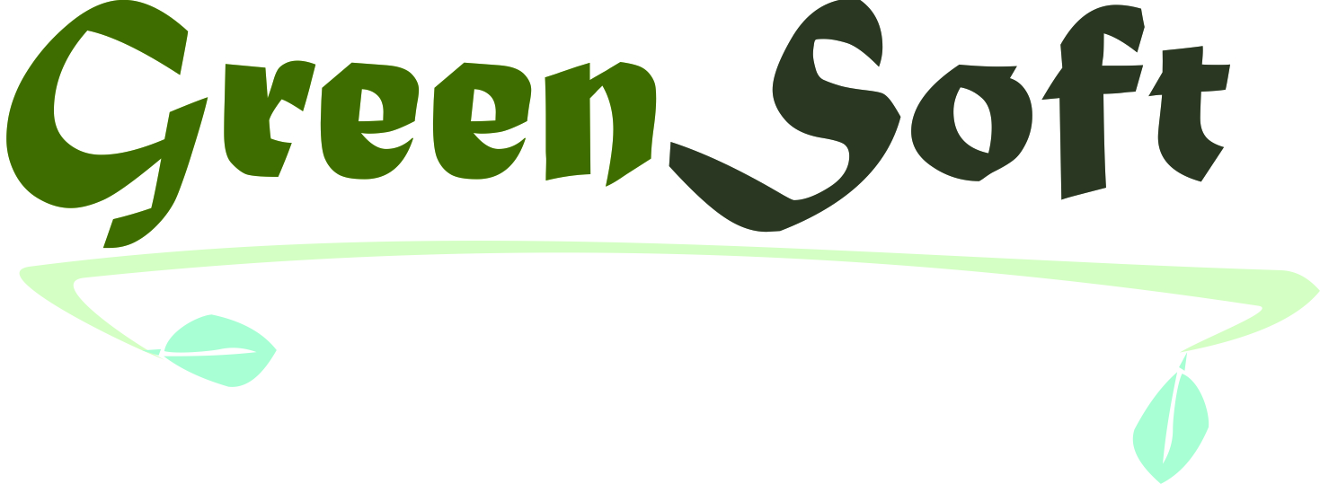
Top Designs

Design Brief
| Contest title: | Softcopy publishing company |
| Sub title: | GreenSoft logo required |
| Category: | Logo Design |
Brand Name: |
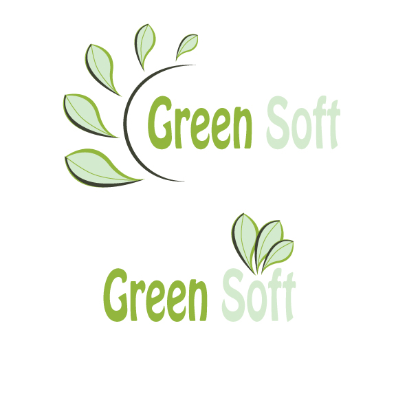
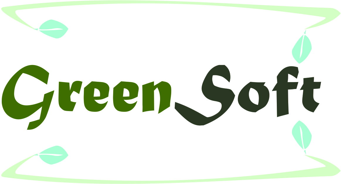
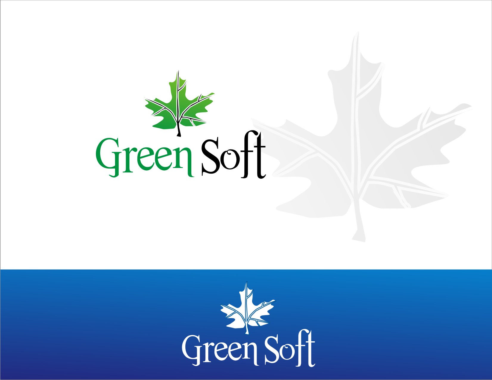
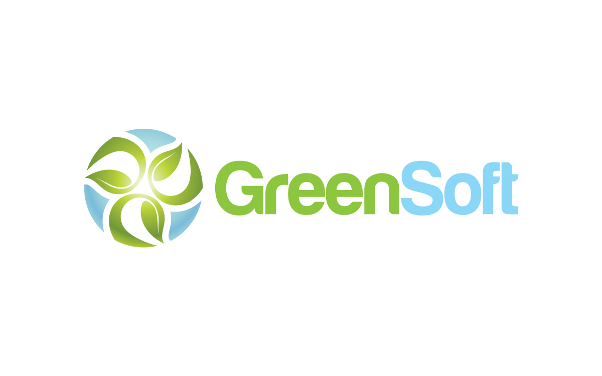
GreenSoft |
| Summary: | GreenSoft is a soft-copy publishing company and we require a creative logo design for our company. |
| Description: | GreenSoft is a soft-copy publishing company and we require a creative logo design for our company. One color palette is the following CMYK colors: 49-11-100-0 (word "Green" should be in this"),34-0-25-0, 17-0-23-0, 66-55-72-52, and white. However, designers can comeup with their own color palette. |
| CH Wants: | Here are some ideas from pictures we've seen in our istock account. But these are only ideas. You can click on them and read our accompanying notes. Please note, we only like certain elements of each. These should be taken as a starting point.http://www.istockphoto.com/stock-photo-16441194-light-bulb-with-sprout-inside.php?st=871954e (see the tree in the light bulb) http://www.istockphoto.com/search/text/environment%20energy%20tree/source/basic#1e119d8b (see the recycle round symbol with arrows)See what you can come up with. Please do not copy the ideas from the link mentioned here. We need something creative from you designers. |
| CH Don't Wants: | do not copy. |
Contest Attachments
Contest material, sample files and attachments for the contest uploaded by Contest Holder.
No attachments yet!
About Contest
| Guaranteed $ | |
| Industry: | |
| Created on: | Sat, 04 Feb 2012 06:26:47 +0000 |
| Ends on: | Tue, 14 Feb 2012 06:26:47 +0000 |
| Status: | Winner(s) Selected |
Prize(s)
| 1st Prize: | $150 |
Comments
thanks
Thanks for your efforts.