| Contest title: |
Design a logo for a natural baking mix company! |
| Sub title: |
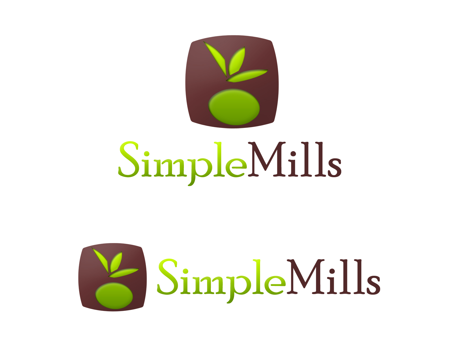
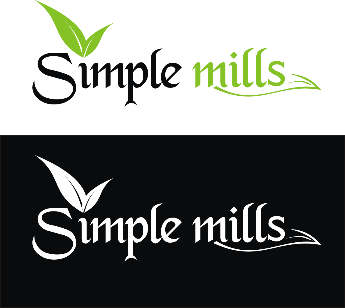
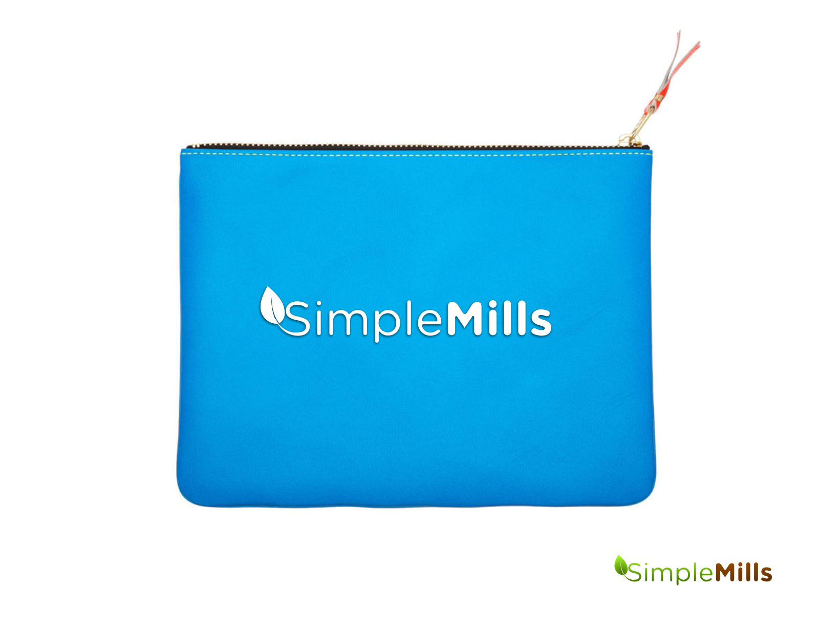
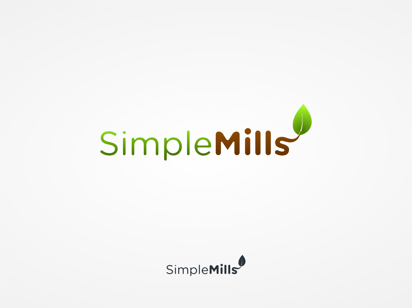
SimpleMills needs a new logo |
| Category: |
Logo Design
|
Brand Name: |
SimpleMills |
| Summary: |
SimpleMills, a natrual baking mix company, needs a new logo. |
| Description: |
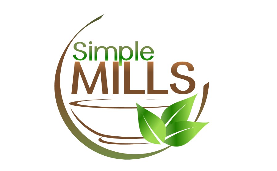
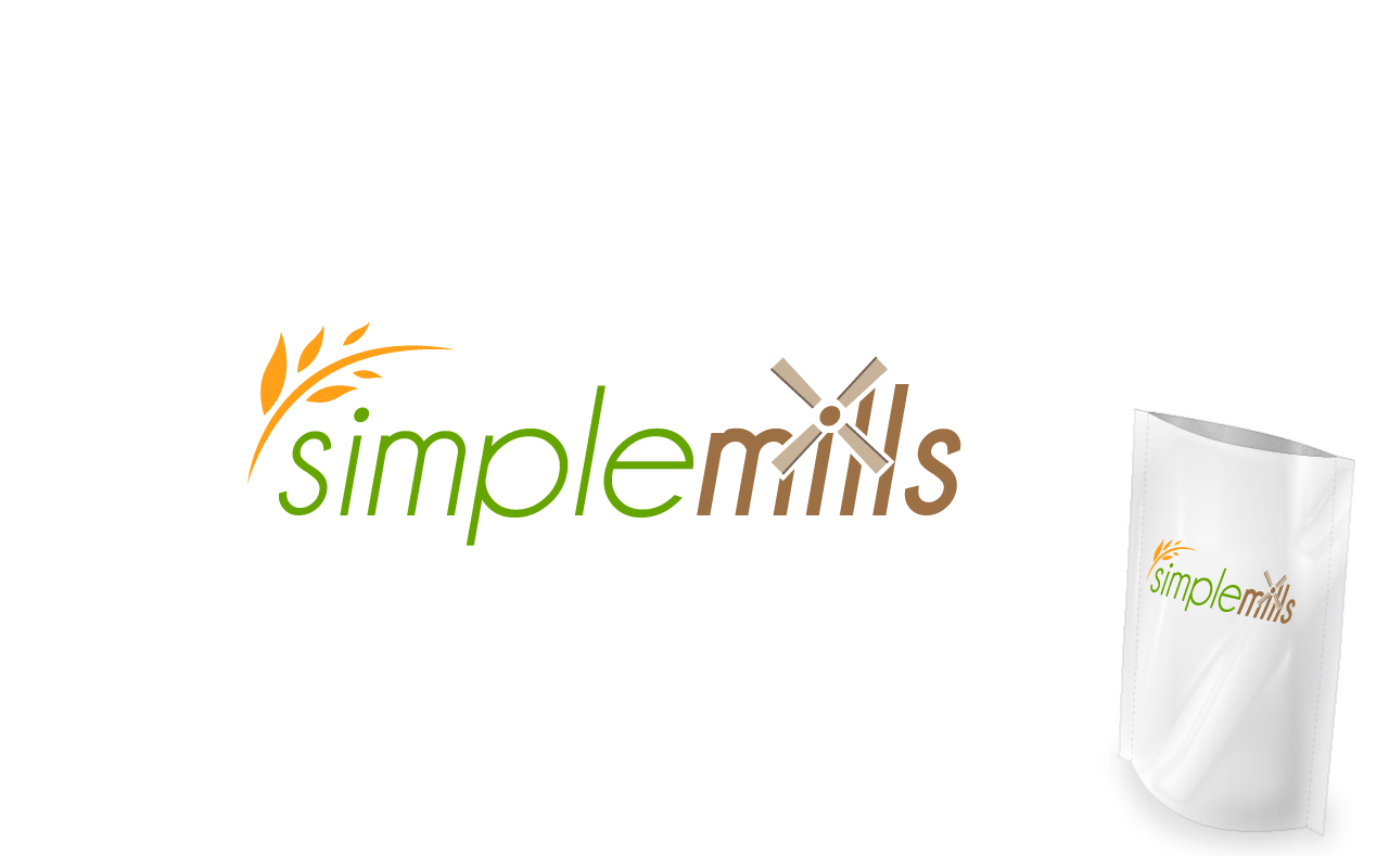
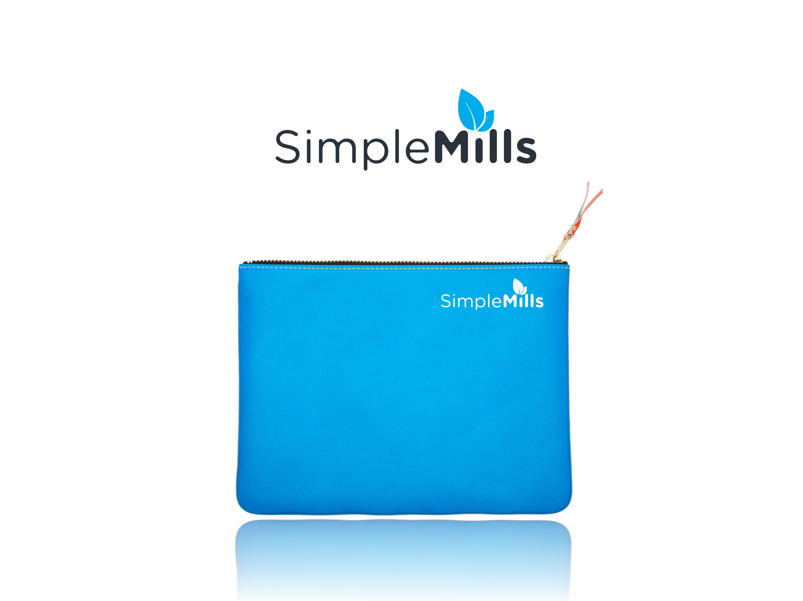
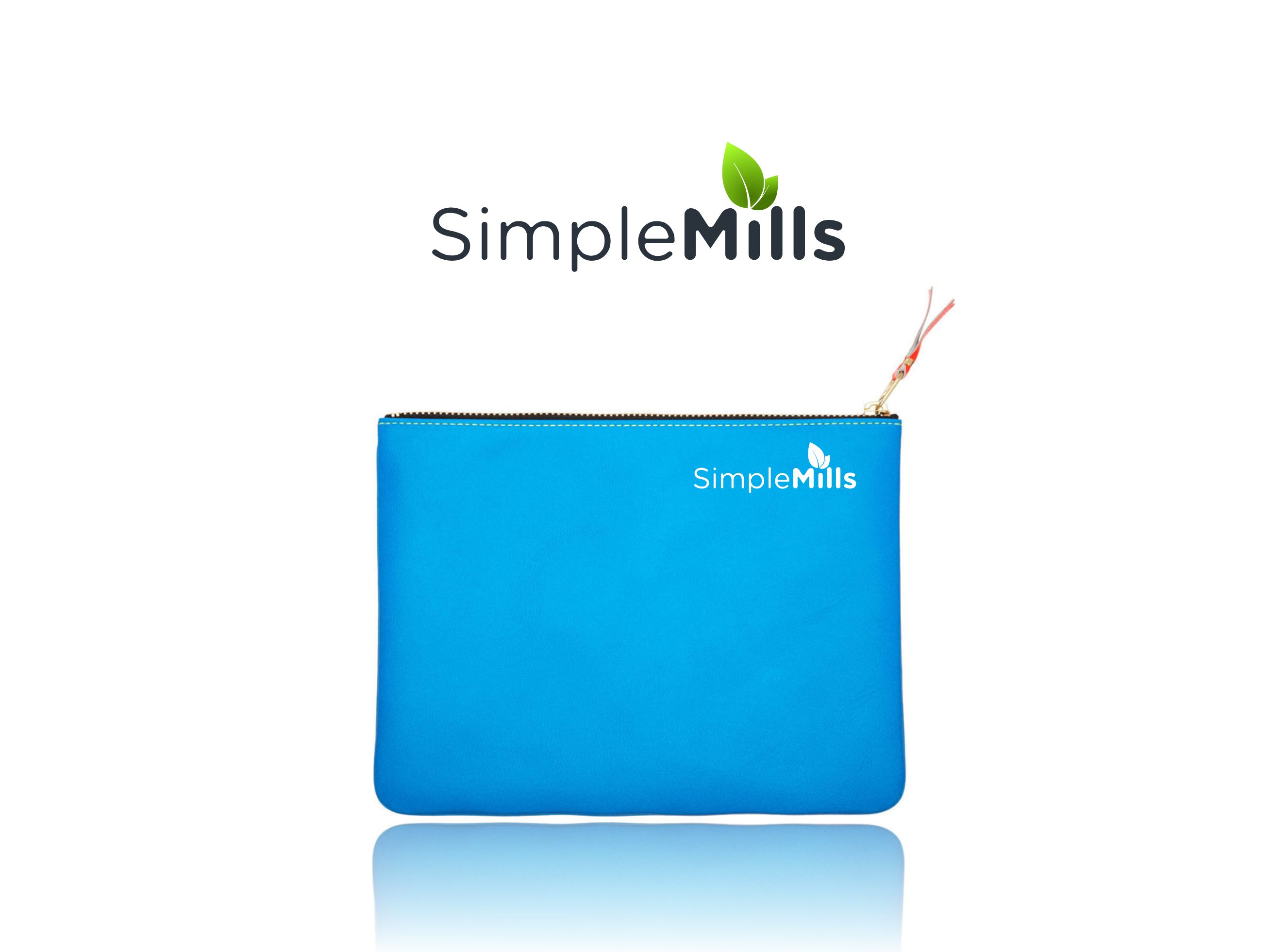
I need a logo. The logo will be used online and on the packaging. The logo shouldn't be too rustic, but should also be sophisticated enough to target high-end customers. The baking mixes contain very simple ingredients, so I don't want the logo to represent the product in a way that would lead customers to believe there are preservatives or ingredients they've never heard of. |
| CH Wants: |
I like green, brown, black - but I am open to other colors as well. Bear in mind that the logo will go on a stand-up, zip-top pouch, so it will need to fit appropriately on the packaging. |
| CH Don't Wants: |
I don't want logos that are too rustic. |


Comments
This logo also doesn't have to have leaves in the design. If you think of other ideas, I would be interested to see those as well! Just note that the product doesn't have wheat in it, so you won't want to use that. Mixing bowls are good too.
I like the color green used in #5. I also like that this one looks a bit more professional.