
To identify good design, the question often arises: “is the beauty and effectiveness of a design project subjective or not?”
People tend to mix design and art in the same bucket and the properties of one sometimes overlap in those of the other when it is created and when it is “judged”.
That’s why you have to be very careful and immediately mark two distinctions.
Art is subjective, it’s like a game in which there are almost no rules. The design is different and the fact that someone can put together a list of principles should already indicate that there are some rules.
So if there are rules, then we can say that these rules must be followed and that therefore design is not subjective.
However, to be completely honest, we cannot really say that design is 100% objective, because there are always impressions and unwritten rules defined by the culture and experience of each of us.
What is certain is that graphic design cannot be freewheeled because there are disciplines such as geometry and psychology that play an analytical role that is precise and not questionable.
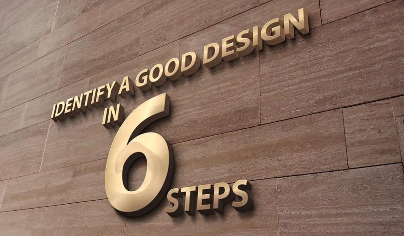
Here are 6 steps to follow with ease to distinguish a good design from a technically poor project.
#1) Is design effective?
The need for design is usually driven by a problem that must be solved. It could be a website that has to be made easier to use, a product that has to reach and attract a certain audience or a new business that needs a logo, the problem can be related to multiple situations and needs.
This is the first checkpoint to diagnose whether a project is good or not. If it does not solve the problem, it is not necessary to go further, it is certainly not a good project. It does not matter how beautiful it is if it does not even reach the main purpose of its existence.
#2) Is the tone used the right one?
To be able to determine if the tone used in the communication of the project in question is appropriate or not, first we must distinguish two things, the brand and the public.
THE BRAND
The term “brand” or “brand” is usually associated with commercial activities, but it is not limited to them, many things can have a brand, even a natural person. Your brand is the perception that people have of you, the same applies to companies.
Good design helps a company take control of its brand and shape the public’s opinion to match the way it wants to be perceived.
THE PUBLIC
A company usually has a target audience and could range from something broad to a very small niche. If you already know the target audience to which your design project is aimed, then the remaining question is “what is appropriate for them?”
In general, the wider the public, the more clean and conventional the design is, this is why many companies risk losing part of their “soul” as they grow if they do not always pay more attention to advertising. This is because some design gimmicks that will work for small niches will not stick to a larger audience, so the company risks “sacrificing” this to attract more people. On the other side of the spectrum, when the audience is smaller and more specific, we rely on small tricks to make the design attractive, engaging and focused.
#3) Resist the test of time?
Good design is sensitive (and a lot) over time.
Ideally, one would like a design that positions itself above time, but this is not always necessary or even advised. It depends a lot on what the design project is trying to communicate and the duration of the advertising message.
If you’re designing a web page for a product that will be replaced or updated in two years, for example, it probably makes sense to take advantage of the current year’s trends to design. This will help your design to look contemporary, modern and relevant.
However, you should try to stay ahead of the curve and see where the trends are going. There’s nothing worse than taking the wave too late, this will only make you look slow, like you’re trying to catch up rather than being the only one to set a trend.
On the other hand, if we’re talking about a logo that should last for years or decades, then yes, you should definitely avoid design fads that have a short expiration date. If you look at the renowned redesign of the logo like the Starbucks logo, the trend is to make them simpler over time, so the simpler the way you do it, the longer it will last.
#4) Is it friction free?
Friction is anything that stands between the end user and the product / service we want to promote. The more friction you add, the harder it is for the user to get what he wants from your design.
Basically, friction is generated when the text is difficult to read or when a website is difficult to use.
This may seem like an obvious mistake, but you might be surprised by the number of times designers end up sacrificing readability and usability to make their design “better”.
It is important to measure the amount of information that you want to present very carefully.
Avoid information overload, which will only add friction to your design. For this, you must honestly understand what your audience needs and, in many cases, you even have to distill that information and make it more digestible.
If the design is well done, it will become invisible and people will easily find what they need. If it’s not, then you’re probably staring at a bad design, because good design is friction-less.
#5) Is it visually appealing?
Let’s go back to talking about subjectivity. This is the part where most people like to concentrate and it is also the stage that generates more discussion and controversy.
This happens because sometimes it can be subjective to interface with a design project and it is difficult to agree on something when all we have are opinions.
However, there is a way to break part of this subjectivity. You only need to learn the principles that make the design visually appealing. Among these there are elements consistently and frequently present among the good design examples, such as the patterns that follow each other as well-balanced compositions, a curated and relevant typography, precise alignments of all the elements present, involving and winning color combinations and many others. Things that experience and look around with a critical and curious eye can certainly unveil…
However, a principle that must never be forgotten is:
#6) 3 + 3 = 7?
If the design has passed the 5 checkpoints described so far, you already have an excellent project. But you can still bring it to the top.
To find out if a design has more than the sum of its parts, you just have to look closely with honesty and rationality. Basically when a design goes beyond a winning combination of typography and colors, to say when there is a brilliant idea that supports everything and takes it to a whole new level of communication.
In short, good design has more than what the eye sees, it is not just about how it looks, but a combination of a series of weighted decisions that are taken thinking of the end user.
Subscribe to our Newsletter!