The FIFA World Cup has been and definitely will remain the most famous football event throughout the years. Several factors of the game has produced much hype. For instance the official logo design and this year is no different.
The design is essential as the logo symbolizes and creates the identity of each year’s World Cup event. While you look at a particular year’s logo, you instantly relate all the World Cup events and features from that year. Furthermore, the logos attempt to express elements of the host country in its design.
Let’s look into the logo designs for the World Cup as we take a trip back in its history, from the first World Cup event in Uruguay (1930) to modern-day Russia (2018).
Uruguay (1930)
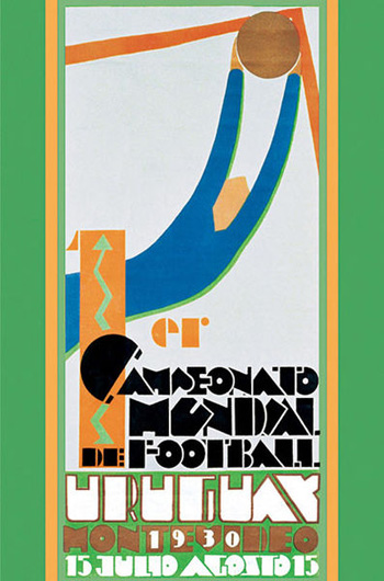
The very first World Cup tournament and its poster. The design here has an artsy abstract feel to it yet it’s easily understood – it is a goalkeeper, dressed in Uruguay’s flag colors, preserving the ball from the goal.
There were only 13 teams taking part in this inaugural World Cup.
Italy (1934)
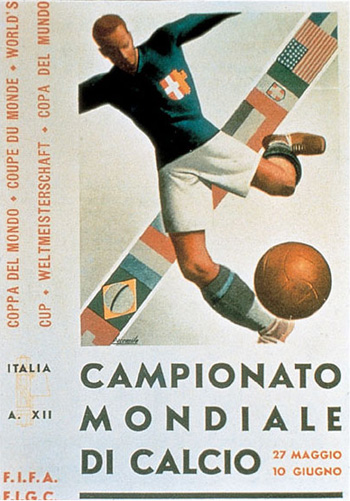
This poster clearly represents Italy as the host country. The football player included has part of the Italian flag on his jersey. Even the socks are colored white and green which are part of the country’s flag colors.
To show that it is an international competition, flags of participating countries are placed in the background.
France (1938)
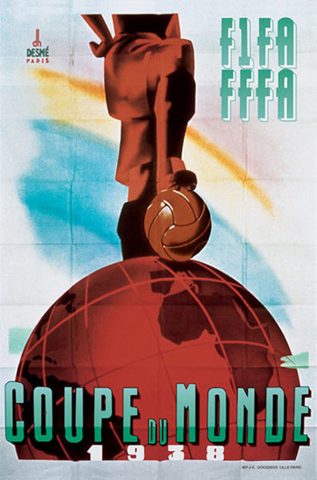
The world is at your feet – well, in this poster, it is placed under a football too. The posture of the player, is both dominant, as a symbol of victory and success, and imposing, challenging other nations in a worldwide competition spanning the globe. The colors used are from the French flag although in a a little different shade.
This was the last year World Cup posters are used to symbolize the Games.
Brazil (1950)
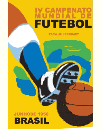
Following two skipped World Cup events because of WW2, the World Cup reappeared in a new host country, Brazil. It was the final first year to sport an official World Cup logo, however the general design was still poster-like. Like the year 2014 logo, the colors from the Brazilian flag are integrated in the design.
Switzerland (1954)
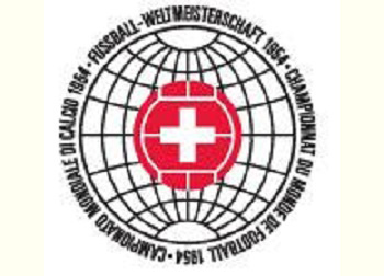
Switzerland was already attempting minimalism in 1954, and boldly does so with a World Cup logo design. The white cross on red, indicates the Swiss flag, and is positioned on a red football. The fact that it is a world event is outlined with the globe style in the background.
The text at the outline of the globe can be roughly translated as World Football Championship in three languages – French, German and Italian, the three most spoken languages in Switzerland.
Sweden (1958)
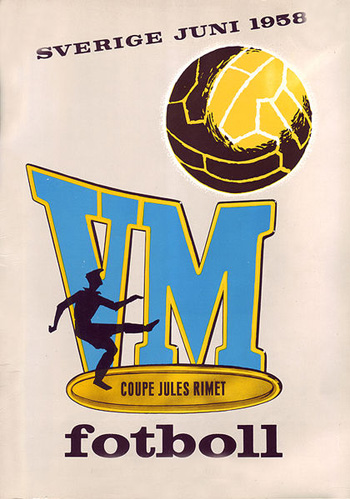
Sweden turns back to the poster style although with a few liberties, with this 1958 World Cup logo design. The letters VM in the background stands for Världsmästerskapet. It means World Championship from Swedish.
The ball and the football player wraps up this simple football event logo design.
Chile (1962)
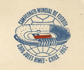
Highlighted in the middle of the logo is a stadium. Chile put their flag in the field to indicate that the World Cup would take place on their grounds. Surrounding the stadium is a circle that is top half football and the bottom half globe.
The event was slightly marred by a 9.5-magnitude earthquake, and major reconstruction was needed to the infrastructures affected.
England (1966)
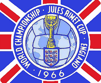
The design leaves no one guessing as to who is the host of the 1966 World Cup. Flanked by the UK flag, this logo design has a bit of history in it – the trophy you see was the previous trophy design prior to the existing one was unveiled in 1974. Also, it was christened the Jules Rimet Cup hence its name within the text.
The globe and football are shown as one, one in shape, the other in color shades.
Mexico (1970)
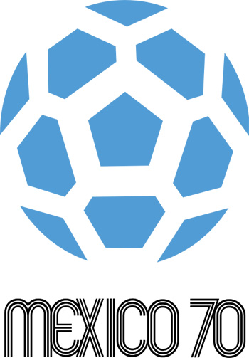
Mexico really stripped down the World Cup logo in this shockingly simple, tradition-defying logo. Using negative and positive space to reflect the shape of the football, this logo design signifies the beginning of more ahead. The only sign we have that the World Cup was hosted in Mexico is in its associating text.
Exciting point: Brazil, having won the World Cup for the third time, takes home the Jules Rimet Cup forever.
Germany (1974)
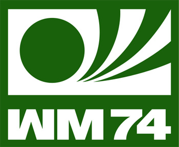
Germany, or West Germany to be specific, persisted with the single-color design, started by Mexico. At first sight, it appears that there is nothing to claim that Germany is the host country. The solution lies in the letters WM, short for Weltmeisterschaft meaning World Cup in German.
The year also designated the start of a new trophy design.
Argentina (1978)
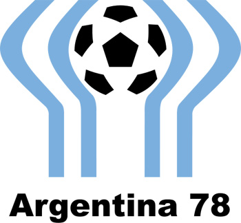
There are two versions of this logo. The other contains the flags of participating nations encircling this. The variation displayed here is simpler and returns the flag color and design style – the blue lines around the football signify the Argentinian flag.
Spain (1982)
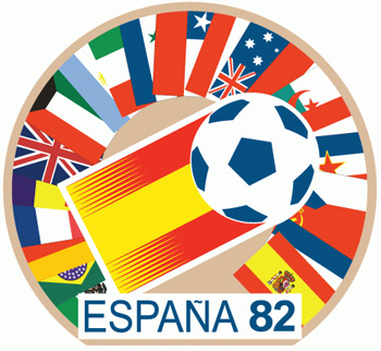
Spain also had taken the flag path with their logo design but incorporated more than just their own flag. The Spanish flag lies prominently in the center of the logo with the football, and flanked by flags of participating nations. The design had purpose to celebrate. The 1982 World Cup was the first to observe presence of more than 2 million viewers.
It was also the first year that 24 teams took part in the World Cup, All this while, only 16 teams, at most, participated in the event.
Mexico (1986)
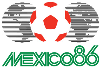
Mexico is once again host to the World Cup, and in their second logo design, simpleness still dominates. A football lies in between two parts of the globe, creating the bond with the year’s slogan “The World United By Ball”.
The country’s flag colors, red, white and green are shown prominently by the logo.
Italy (1990)
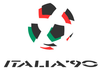
The first time Italy hosted the event was half a century back. Not simply has the event evolved through 50 years, the advance in logo design has also been substantial. It was straightforward, minimalistic, using only three colors, red and green from the country’s flag and black.
Germany obtained their third championship in this World Cup, the third country to do so after Brazil and Italy.
USA (1994)
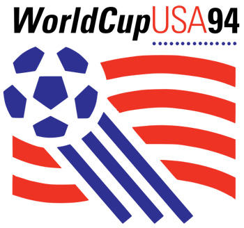
Held in the United States, this logo clearly declares the location where the World Cup was held back in 1994. It features the red and white stripes from the American flag. Where the blue part of the flag should be is a blue football kicked way up, diagonally.
This was so far the most greatly attended World Cup event in its history, with near 3.6 million viewers!
France (1998)
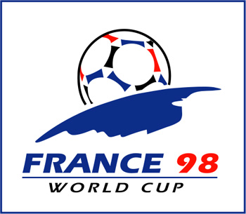
Many have lauded the France World Cup logo to be the best and it’s obvious why. Even though design is simple, it delivers its point and it’s creative. The design highlights the football “rising” over the Earth’s horizon, like it is the Sun. The colors used are from the French flag.
This was the 2nd year France hosted the event, and the first time it had taken home the Cup.
Korea/Japan (2002)
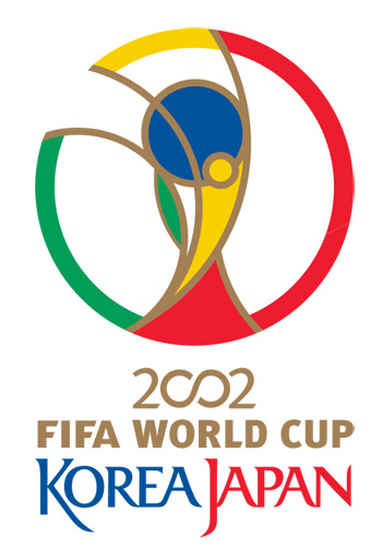
We get into a new millennium and the World Cup logo obtained a renovation that is a lot more with the times. Created by London-based firm Interbrand, the logo incorporates a stylized World Cup trophy in prominence whilst integrating elements from Korea and Japan, the hosts.
The zeroes in 2002 is formed as the infinity mark to represent the unity and link between the co-organizers and other engaged parties.
Germany (2006)
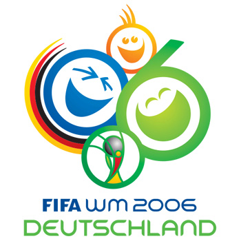
When compared to its 1974 logo design, this variation is much more colorful and pleasing. It is called “Celebrating Faces of Football” and is meant to express the emotions and chumminess one can get in a football match. Two of the faces sitting alongside form 0 and 6 to indicate the year 2006.
Germany’s flag colors produces a subtle look and feel, adding color to the mix and look, the logo design from 2002 creates a cameo!
South Africa (2010)
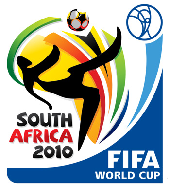
So much color! 2010’s logo was created by Gaby de Abreu from Switch Design and comes with a silhouette of a person carrying out a bicycle kick on a football. The red, yellow, blue and green blotches in the background creates the African continent and the South African flag. The trophy design from 2002 makes another, softer cameo.
This World Cup was the first to be hosted in the African continent and observed Spain come out as the winners.
Brazil (2014)
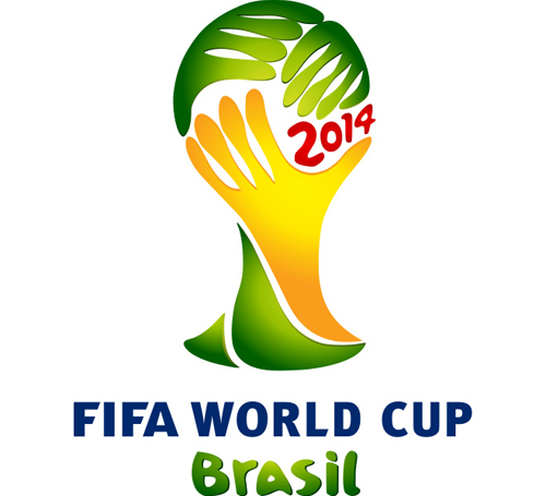
Year 2014’s FIFA World Cup had its logo exposed during the 2010 World Cup in South Africa. It had been picked from the 125 designs by 25 Brazilian-based agencies. Named “Inspiration“, the logo was produced by design agency Africa.
The philosophy of the logo is simple. It forms the look of the World Cup trophy with hands holding up the trophy in triumph. The yellow and green represent the golden beaches and the tropics of Brazil, and are also the two primary colors of the Brazilian flag. The design also identifies Brazil’s five victories in past World Cup tournaments.
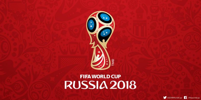
Russia (2018)
![]()
To creatively capture the essence of this remarkable, historic moment, inspiration was drawn from both Russia’s rich artistic tradition and its history of bold achievement and innovation. Above all, Russia’s pioneering in space was a truly captivating theme.
The shape of the Official Emblem of Russia 2018 takes on the universally recognizable outline of the World Cup Trophy, while the bold use of red, gold, black and blue in the emblem’s color palette was inspired by centuries-old techniques seen in world-renowned Russian art dating back to the earliest icon paintings.
The magic ball at the top of the emblem puts the world’s love of football into the spotlight. And the components of the emblem taken together blend unique attributes of the World Cup and of Russia as host nation. It unites magic and dreams, as the competition is doing for millions of fans in 2018.
Conclusion
It’s interesting to view how the logos change over time. They may not be ideal however they meet their objective to say factors of the host nation of that year’s World Cup event. At the end of the day, it is still a worldwide event, participated by some of the world’s best football players, and viewed and accompanied by football lovers throughout.
Which World Cup logo design do you consider was the most exceptionally designed?
Subscribe to our Newsletter!