
Every field has own set of representative characteristics which play an immense role in logo design. Construction logos are represented by the field’s major characteristics and colors.
Fonts
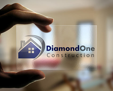
The fonts used to design a logo for a construction company are formal, not italicized or stylish. The font should be simple and have a corporate approach such as a bold font.
Colors
Colors used to create a logo for a construction company should be formal. These colors should be dull and sober. Bright colors should not be used because they give an unprofessional image to the logo and the company. The colors most commonly used include shades of brown, black, gray and blue.
Style
Logos designed for construction companies have to be formal but should have a bit of style to them because they are concerned with designing housing and structures. Being artistic is part of their strength, so the logo may benefit from a bit of style. Traditional construction logos incorporate shapes that represent home structures and it is common to have the name of the company below the structure in the theme color of the company.
Subscribe to our Newsletter!