Designing a logo for a tech company isn’t just about looking sleek or modern. It’s about conveying innovation, reliability, and user-friendliness — all while standing out in an overcrowded digital space. Unfortunately, many logo designers fall into common traps when working with tech brands.
In this post, we break down the top 7 mistakes designers make when creating logos for tech companies — and how to avoid them.
1. Overloading with Tech Clichés (like circuits, power buttons, etc.)
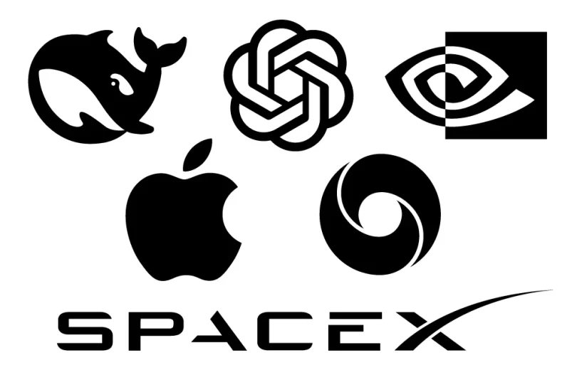
Tech logos often fall victim to predictable symbols — gears, circuit boards, power icons. While these elements might scream “tech,” they rarely stand out. They make the logo look like every other startup in a saturated market.
👉 What to do instead: Focus on the company’s core value proposition, audience, or a unique metaphor instead of overused symbols.
2. Ignoring Scalability for App Icons and Favicons
Many tech brands have a heavy mobile/web presence. A logo that looks great on a desktop screen might become illegible or too complex when resized to an app icon or favicon.
👉 Tip: Always test the logo at small sizes. Simplicity and clarity should dominate.
3. Choosing Futuristic Fonts That Hurt Readability
Yes, tech brands should feel modern — but that doesn’t mean using ultramodern or stylized fonts that are hard to read. If users can’t read the name instantly, you’ve lost them.
👉 Try this: Use clean, readable typefaces with slight tech-leaning tweaks for distinction.
4. Lack of Color Psychology Consideration
Many tech startups use blue — for good reason (trust, intelligence, dependability). But using it blindly without understanding your brand’s tone is a mistake.
👉 Consider: Does your product empower, protect, entertain, or connect? Choose colors accordingly. For example, green = growth, orange = creativity, purple = innovation.
5. Making It Too Abstract
Minimal logos are great — but if the design becomes too abstract, it disconnects from the brand identity. A shapeless mark won’t communicate much unless it’s strategically designed.
👉 Balance: Combine simplicity with relevance. A subtle nod to the product or purpose can go a long way.
6. Forgetting the Tech Brand’s Target Audience
Is it B2B or B2C? Are they targeting developers, enterprises, or everyday users? A bold, edgy logo might turn off a corporate client, while a sterile logo might bore young consumers.
👉 Strategy: Understand the brand’s tone, market, and users before sketching anything.
7. Copying Trends Without Originality
Flat design. Gradients. Glitches. Rounded sans-serif fonts. Tech logos often ride design trends — and while that helps them appear modern, they quickly become outdated or unmemorable.
👉 Pro tip: Incorporate modern styles, but ground the design in something timeless and original.
Conclusion:
Tech logos have the unique challenge of needing to feel innovative, scalable, and trustworthy — all at once. Avoiding these 7 mistakes ensures your logo will not just look modern but also communicate clearly and build lasting brand recognition.
Need a custom tech logo?
Start a logo design contest on 110Designs and get dozens of unique ideas from professional designers!
Subscribe to our Newsletter!


