• Launch Contest
  • View Contests
  • Design Portfolio
  • Pricing
  • Designers
  • Support Center
  • Facebook
  • Twitter
  • Tumblr
  • Pinterest
  • YouTube
  • LinkedIn
110Designs Blog
  • Need a Logo?
  • Business & Advertising
  • Clothing & Merchandise
  • Packaging & Label
  • Graphic Design
110Designs Blog
  • Need a Logo?
  • Business & Advertising
  • Clothing & Merchandise
  • Packaging & Label
  • Graphic Design
Business

Four Color Squares – Microsoft New Logo

11,776 Views
2 min read
Four Color Squares – Microsoft New Logo

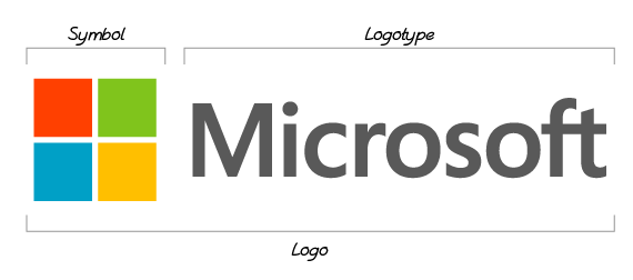
Have you seen these four color squares? Microsoft after 25 years finally changed its company logo from typeface to four color squares along with its typeface. We all are familiar with the four color squares organized in a two-by-two matrix seen in earlier versions of the Windows logo along with the term Microsoft in a lightweight, sans serif font called Segoe.

1_microsoft-old-logo

Microsoft says it is excited for its new logo. “It’s been 25 years since we’ve updated the Microsoft logo and now is the perfect time for a change.”

The explanation provided by Microsoft to have a four color squares in its new logo is that they would like their all products and solutions delivering an acquainted and smooth experience for their all users.

The reviews collected so far, quite a few consider the company has a winner using the fresh logo’s simplicity, block layout, other people declare it’s too tedious. Well-liked logos have both of these aspects in common – distinctive and simple. Precisely what is important to find out here is that logos facilitate customers determine a company. The more distinctive a logo is, the more prominent it becomes. In case of Microsoft, the logo design is simple, but not distinctive. It must be uncommon enough to recognize. Those four squares – it’s very frequent. It has no movement; it’s even not dynamic by any means.

1_windows-8-logo

However, if we take a look at Windows 8’s logo, it is designed in the Metro style that is seen as broad use of consistently colored squares and rectangles. It is quite simple too yet effective. The angled squares made it dynamic and showing movement.
1_microsoft-logo-typeface

The Simplification in the Microsoft’s new logo can be declared as a step up the correct direction, but the problem is that those four squares remind of their Windows product logos. We can say that the new logo is a simply an aspect in Microsoft’s offer to re-create itself with Windows 8 as they have declared this year an exciting year for Microsoft in which they  prepare to release new versions of nearly all of our products.

Ultimately, Microsoft is very hopeful to gain the market with its new logo and declaring this as the new era for Microsoft.

What do you think? Comment below!

Subscribe to our Newsletter!

4 squares logo company logo Famous Logos logo logo design logo design reviews microsoft new logo
    FacebookXPinterestLinkedInWhatsApp
Social Media Works for Your Business – 5 TacticsSocial Media Works for Your Business – 5 Tactics
Technology Consulting Company – Logo DesignTechnology Consulting Company – Logo Design

You may also like

Photo Manipulation
Business

Photo Manipulation

285 Views
1 min read

Many celebrities are trapped and then have to justify claiming that their images/photos have been...

get the best logo design for business
Business

How to Get the Best Logo Design for Your Business

169 Views
1 min read

A logo is more than just a symbol or a word. It is the visual representation of your brand, your...

Categories

  • Business107
  • Creative Inspiration41
  • Design Resources35
  • Inside 110Designs5
  • Logo Design7

Industry Logo Design

  • Accounting Logos
  • Advertising & Media Logos
  • Animals & Pets Logos
  • Art & Design Logos
  • Attorney & Law Logos
  • Automotive Logos
  • Business Logos
  • Children & Kids Logos
  • Construction Logos
  • Consulting Logos
  • Cosmetics & Beauty Logos
  • Community Logos
  • Dental Logos
  • Education Logos
  • Entertainment Logos
  • Fashion Logos
  • Food & Drink Logos
  • Medical Logos
  • Real Estate Logos
  • Religion & Spirituality Logos
  • Spa & Massage Logos
  • Sports & Fitness Logos
  • Technology Logos
  • Travel Logos

Featured Posts

  • types-of-company-logo-design
    4 Types of Company Logo Design — What to choose?
  • 7-mistakes-made-by-logo-designers-in-fashion-logos
    7 Mistakes Made by Logo Designers in Fashion Logos
  • types-of-logos
    Types of Logos – Text, Symbol and Combination...
  • create-logo-for-business
    Logo Maker | Create a logo for your business
  • The-Art-and-Science-of-Business-Logo-Design
    The Art and Science of Business Logo Design: Making...

Trending Now

  • 7-mistakes-made-by-logo-designers-in-fashion-logos
    Design Resources 7 Mistakes Made by Logo Designers in Fashion Logos
    19,152 Views
  • featured-logos-01
    Business High-tech Logos – Logo Design Features
    10,531 Views
  • Technology Consulting Company – Logo Design
    Creative Inspiration Technology Consulting Company – Logo Design
    7,827 Views
  • Creative Inspiration Logo Design for Team Basketball Camp
    5,363 Views
  • Creative Inspiration Construction Company Logo – Contest Review
    4,816 Views

Recent Design Contests

Business Logo Design
1 January 2025
Design My Logo for River City Aquaculture
2 June 2024
Design the Future: eDream VIP Logo Contest
24 April 2024
Lawn Company Logo Need
17 April 2024
Front of pack design for line of sparkling organic health and hydration beverages. 3 flavors with fruit illustration, 12oz sleek can
2 January 2024
  • Need a Logo?
  • Business & Advertising
  • Clothing & Merchandise
  • Packaging & Label
  • Graphic Design
  • Launch Contest
  • View Contests
  • Design Portfolio
  • Pricing
  • Designers
  • Support Center
  • Customer FAQs
  • Designer FAQs
  • Contact Us
  • Login
  • Sign Up

Copyright © 2025 110Designs.

  • 110Designs
  • Business
  • Design Resources
  • Creative Inspiration
  • Inside 110Designs