
Designs by DIC
For Contest: Amelia Earhart Airport - Logo design
Design Entries
-
#44
-
#59
-
#58
-
#57
-
#56
-
#51
-
#50
-
#49

-
#48
-
#47
-
#46
-
#45
-
#60
Discussion
Showing last 10 comments - View All
DIC
Designer
Tue, 31 Jan 2017 09:36:27 +0000
DIC
Designer
Tue, 31 Jan 2017 09:35:07 +0000
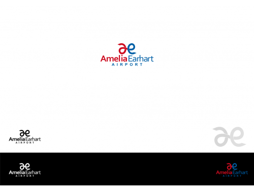
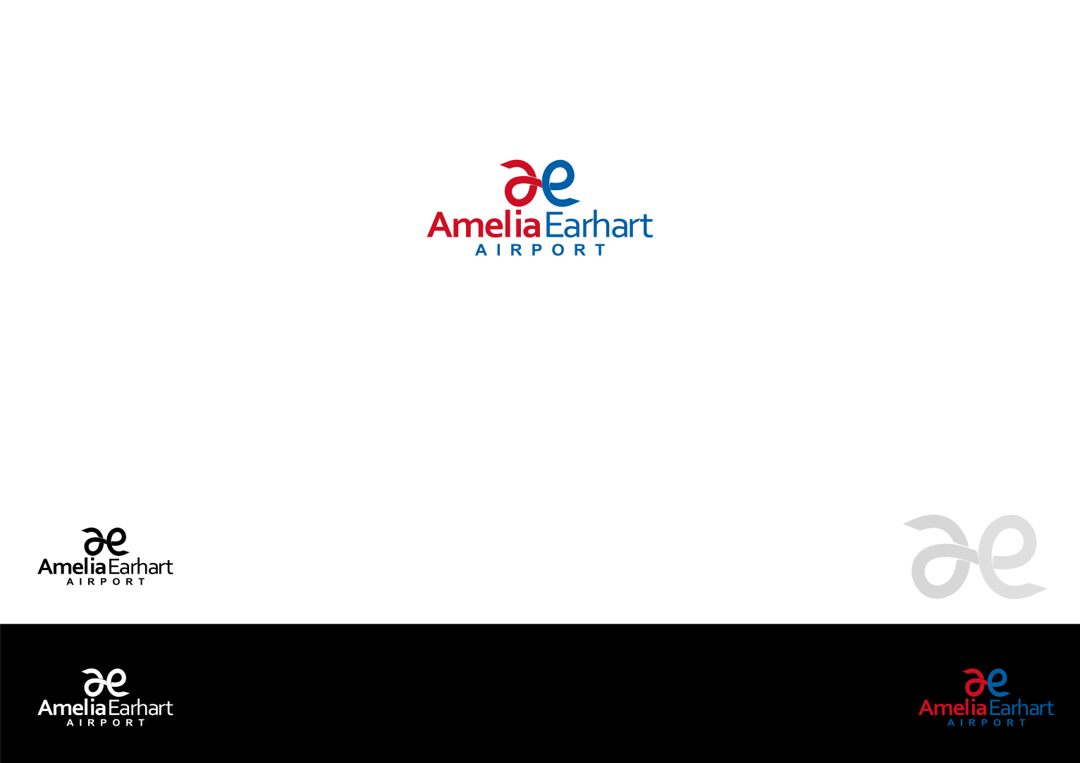
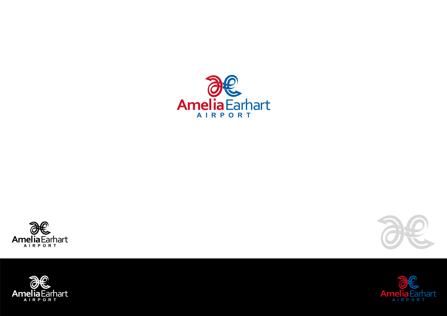
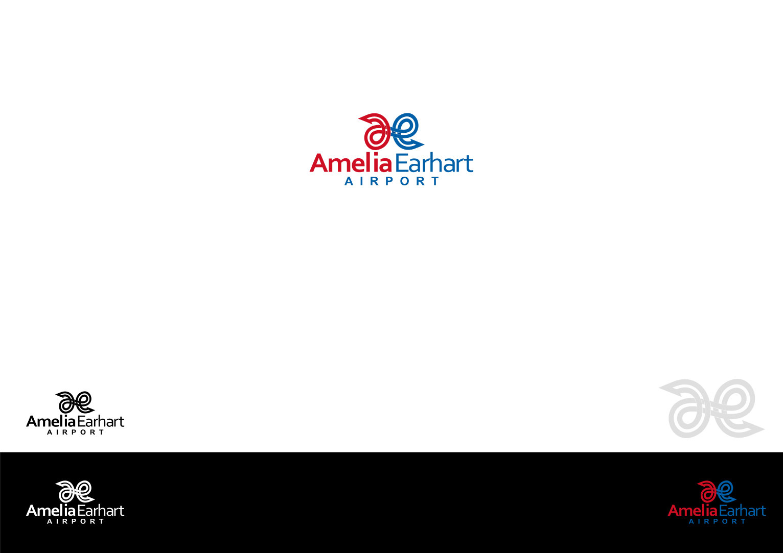
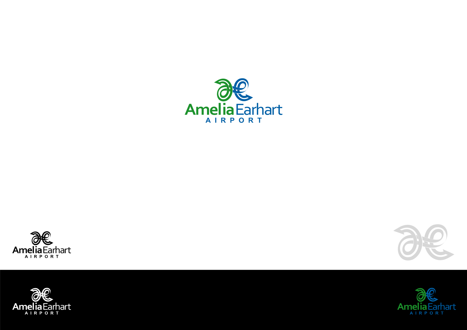
Dear Amelia Earhart Airport
I submit my design for your new logo
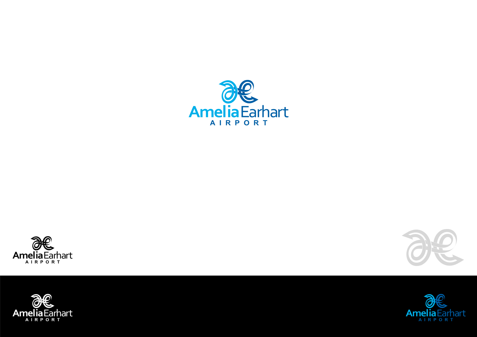
Simply continuous line formed an “a” , an “e” , 2 location icons and a pathway symbolize AmeliaEarhart Airport.
The continuous line with crisp edge resemble airlines, the airplanes tracks from and to AmeliaEarhart Airport.
The 2 location icons resemble prime destination.
The “a” and “e” are the initials of your name / airport.
Blue and green are the colors of Atchinson.
Hopefully you love it. Please give me your early feedback.
Best regards,
Denny Djoko
I submit my design for your new logo
Simply continuous line formed an “a” , an “e” , 2 location icons and a pathway symbolize AmeliaEarhart Airport.
The continuous line with crisp edge resemble airlines, the airplanes tracks from and to AmeliaEarhart Airport.
The 2 location icons resemble prime destination.
The “a” and “e” are the initials of your name / airport.
Blue and green are the colors of Atchinson.
Hopefully you love it. Please give me your early feedback.
Best regards,
Denny Djoko
DIC
Designer
Tue, 31 Jan 2017 09:33:45 +0000
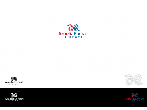
Dear Amelia Earhart Airport
I submit my design for your new logo
Simply continuous line formed an “a” , an “e” , 2 location icons and a pathway symbolize AmeliaEarhart Airport.
The continuous line with crisp edge resemble airlines, the airplanes tracks from and to AmeliaEarhart Airport.
The 2 location icons resemble prime destination.
The “a” and “e” are the initials of your name / airport.
Blue and green are the colors of Atchinson.
Hopefully you love it. Please give me your early feedback.
Best regards,
Denny Djoko
DIC
Designer
Tue, 31 Jan 2017 09:27:26 +0000
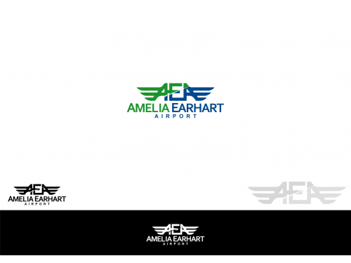
Dear Amelia Earhart Airport
I submit my design for your new logo
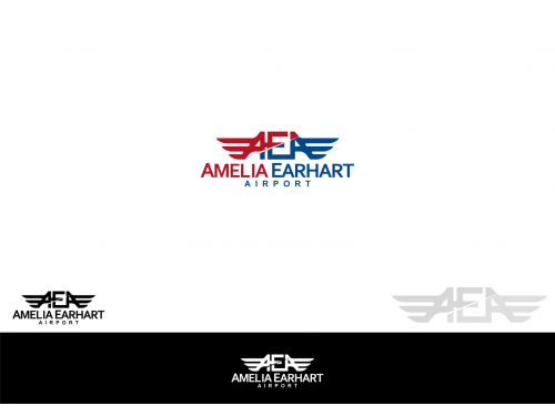
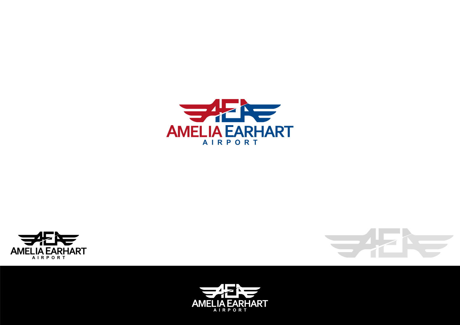
Classic-Atchison regional appeal AEA with wings symbolize AmeliaEarhart Airport.
Blue and Green resemble City of Atchison.
Hopefully you love it. Please give me your early feedback.
Best regards,
Denny Djoko
I submit my design for your new logo
Classic-Atchison regional appeal AEA with wings symbolize AmeliaEarhart Airport.
Blue and Green resemble City of Atchison.
Hopefully you love it. Please give me your early feedback.
Best regards,
Denny Djoko
DIC
Designer
Tue, 31 Jan 2017 09:21:09 +0000
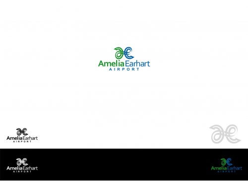
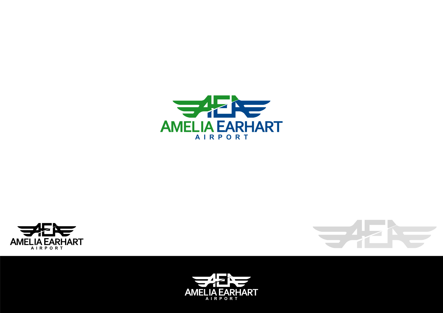
Dear Amelia Earhart Airport
I submit my design for your new logo
Classic-Atchison regional appeal AEA with wings symbolize AmeliaEarhart Airport.
Blue, Red and Green resemble City of Atchison.
Hopefully you love it. Please give me your early feedback.
Best regards,
Denny Djoko
I submit my design for your new logo
Classic-Atchison regional appeal AEA with wings symbolize AmeliaEarhart Airport.
Blue, Red and Green resemble City of Atchison.
Hopefully you love it. Please give me your early feedback.
Best regards,
Denny Djoko
DIC
Designer
Tue, 31 Jan 2017 07:05:51 +0000
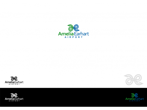
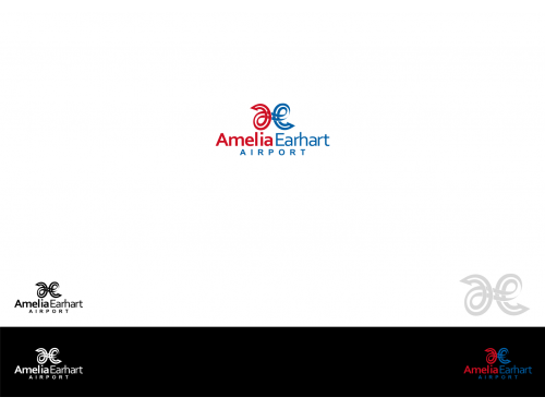
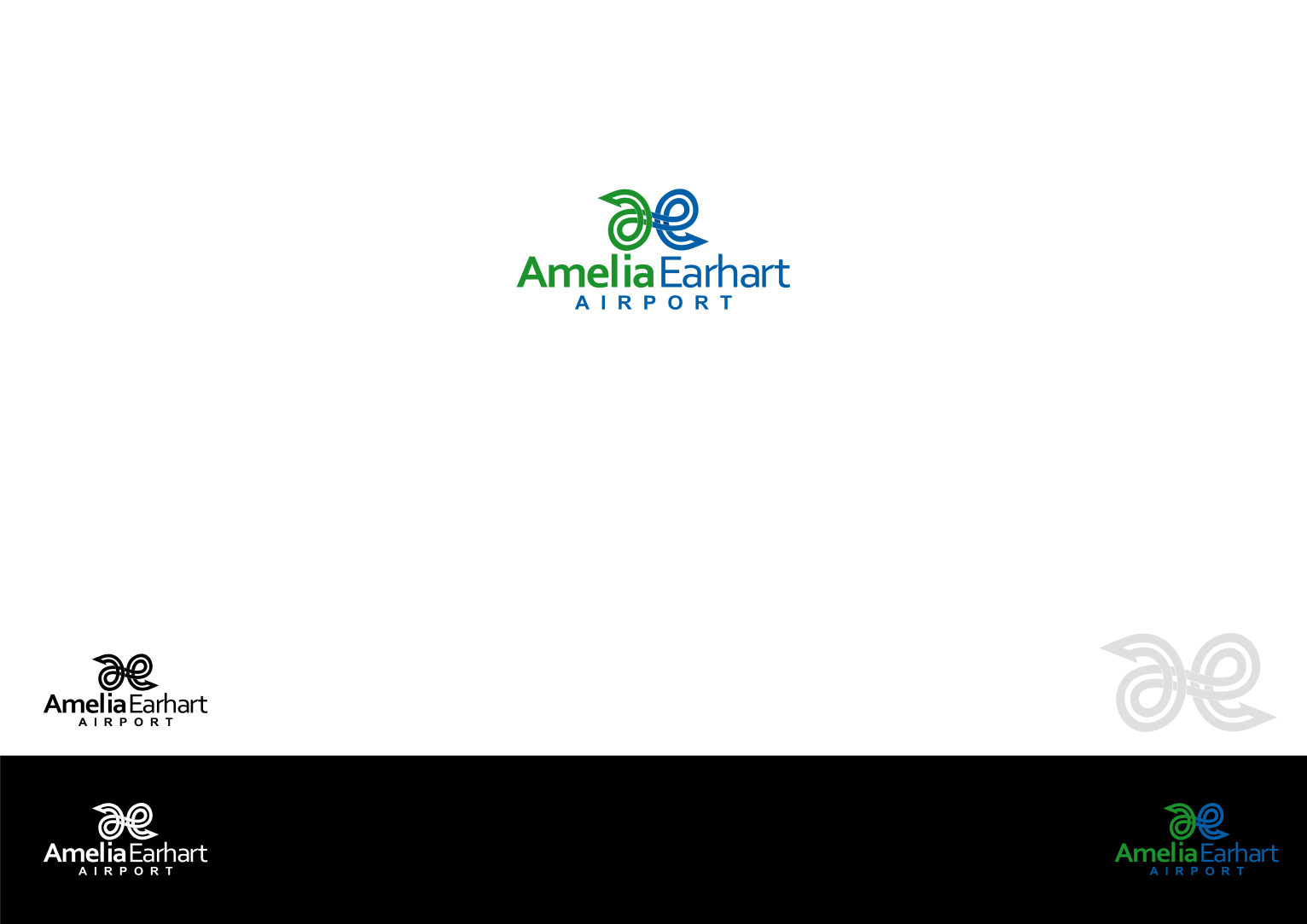
Dear Amelia Earhart Airport
I submit my design for your new logo
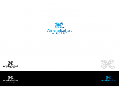
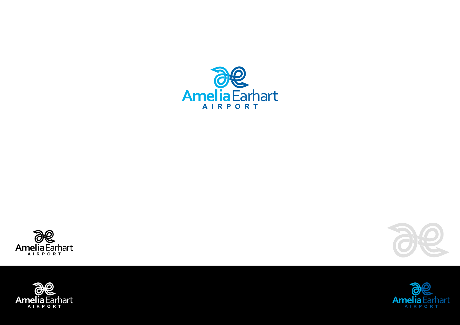
Simply continuous line formed an “a” , an “e” , 2 location icons and a pathway symbolize AmeliaEarhart Airport.
The continuous line with crisp edge resemble airlines, the airplanes tracks from and to AmeliaEarhart Airport.
The 2 location icons resemble prime destination.
The “a” and “e” are the initials of your name / company.
Blue resemble professional and air transportation.
Light Blue resemble sky, new
Hopefully you love it. Please give me your early feedback.
Best regards,
Denny Djoko
I submit my design for your new logo
Simply continuous line formed an “a” , an “e” , 2 location icons and a pathway symbolize AmeliaEarhart Airport.
The continuous line with crisp edge resemble airlines, the airplanes tracks from and to AmeliaEarhart Airport.
The 2 location icons resemble prime destination.
The “a” and “e” are the initials of your name / company.
Blue resemble professional and air transportation.
Light Blue resemble sky, new
Hopefully you love it. Please give me your early feedback.
Best regards,
Denny Djoko
DIC
Designer
Tue, 31 Jan 2017 07:04:50 +0000
Dear Amelia Earhart Airport
I submit my design for your new logo
Simply continuous line formed an “a” , an “e” , 2 location icons and a pathway symbolize AmeliaEarhart Airport.
The continuous line with crisp edge resemble airlines, the airplanes tracks from and to AmeliaEarhart Airport.
The 2 location icons resemble prime destination.
The “a” and “e” are the initials of your name / company.
Blue resemble professional and air transportation.
Light Blue resemble sky, new
Hopefully you love it. Please give me your early feedback.
Best regards,
Denny Djoko
DIC
Designer
Tue, 31 Jan 2017 07:03:37 +0000
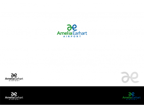
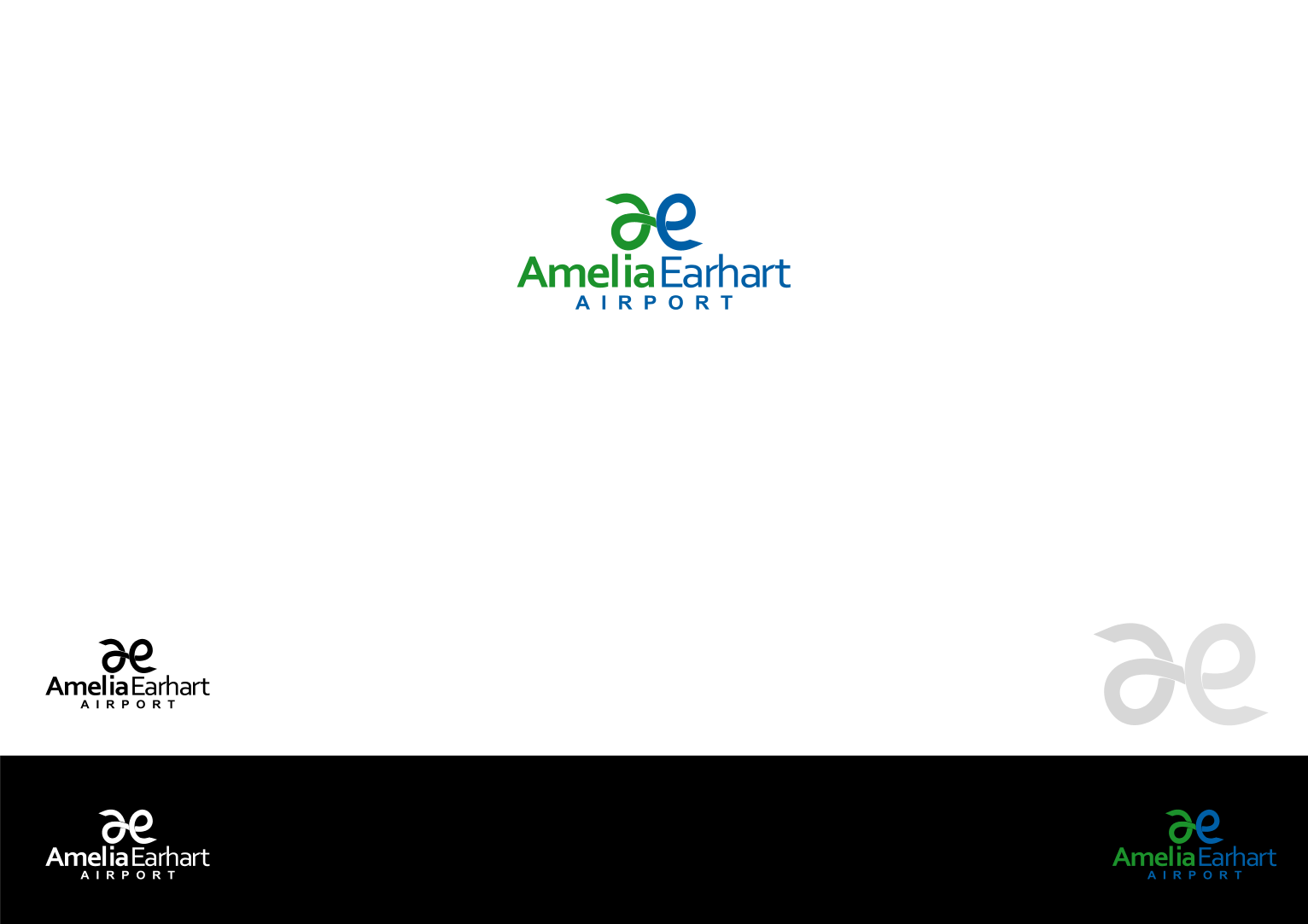
Dear Amelia Earhart Airport
I submit my design for your new logo
Simply continuous line formed an “a” , an “e” , 2 location icons and a pathway symbolize AmeliaEarhart Airport.
The continuous line with crisp edge resemble airlines, the airplanes tracks from and to AmeliaEarhart Airport.
The 2 location icons resemble prime destination.
The “a” and “e” are the initials of your name / company.
Blue resemble professional and air transportation.
Light Blue resemble sky, new
Hopefully you love it. Please give me your early feedback.
Best regards,
Denny Djoko
I submit my design for your new logo
Simply continuous line formed an “a” , an “e” , 2 location icons and a pathway symbolize AmeliaEarhart Airport.
The continuous line with crisp edge resemble airlines, the airplanes tracks from and to AmeliaEarhart Airport.
The 2 location icons resemble prime destination.
The “a” and “e” are the initials of your name / company.
Blue resemble professional and air transportation.
Light Blue resemble sky, new
Hopefully you love it. Please give me your early feedback.
Best regards,
Denny Djoko
DIC
Designer
Tue, 31 Jan 2017 06:06:13 +0000
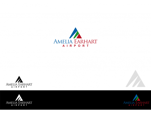
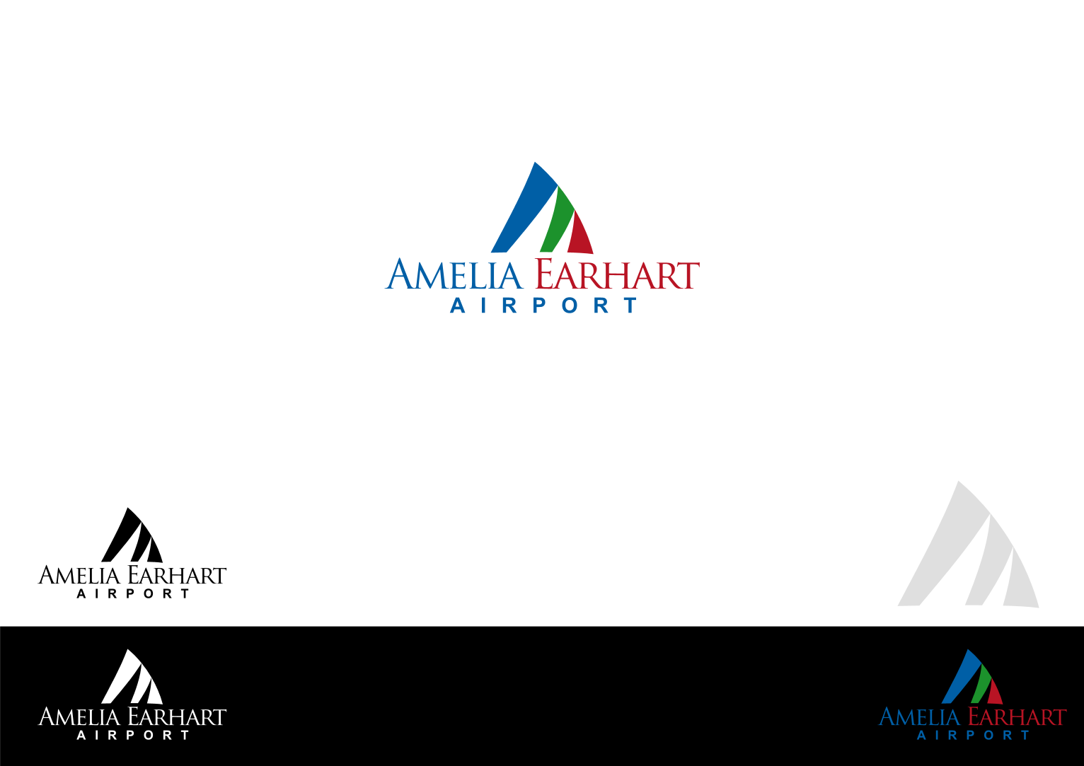
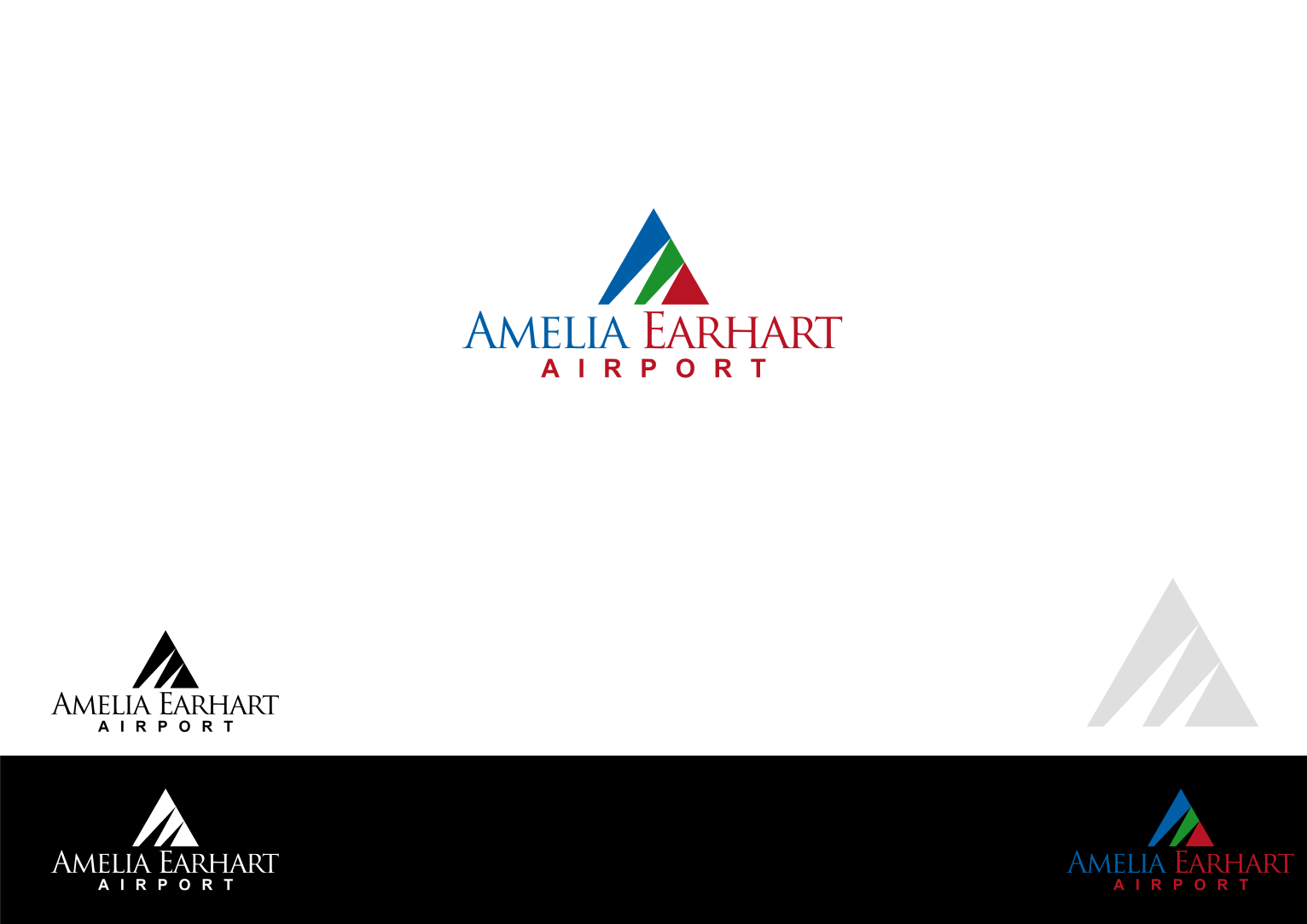
Dear Amelia Earhart Airport
I submit my design for your new logo
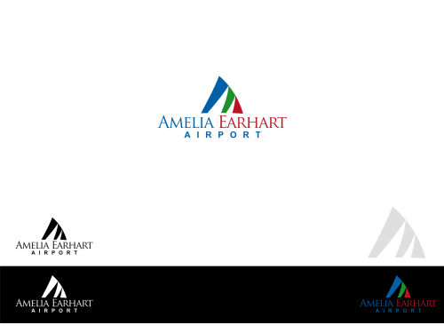
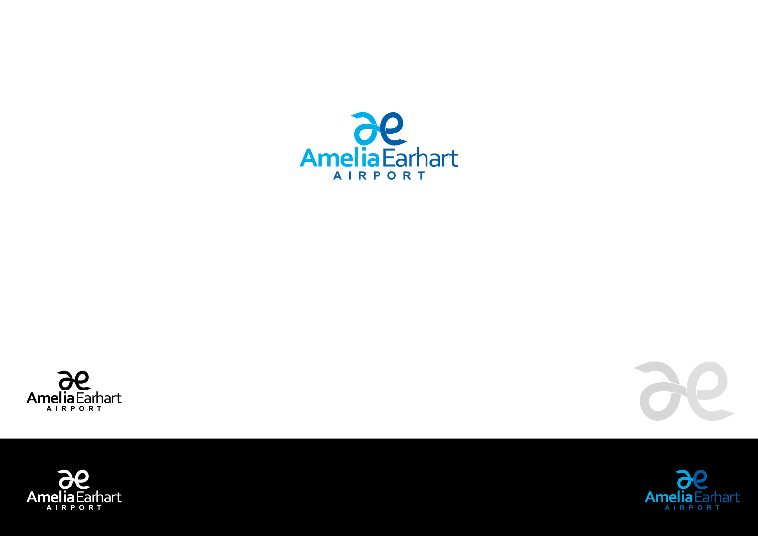
A triangel divided with 2 triangels formed an “A” and an “E” symbolize AmeliaEarhart Airport.
The 2 triangels resemble airlines, the airplanes tracks from and to AmeliaEarhart Airport.
The “A” and “E” are the initials of your name / company.
Blue, Red and Green resemble City of Atchison.
Hopefully you love it. Please give me your early feedback.
Best regards,
Denny Djoko
I submit my design for your new logo
A triangel divided with 2 triangels formed an “A” and an “E” symbolize AmeliaEarhart Airport.
The 2 triangels resemble airlines, the airplanes tracks from and to AmeliaEarhart Airport.
The “A” and “E” are the initials of your name / company.
Blue, Red and Green resemble City of Atchison.
Hopefully you love it. Please give me your early feedback.
Best regards,
Denny Djoko
DIC
Designer
Tue, 31 Jan 2017 06:01:48 +0000
Dear Amelia Earhart Airport
I submit my design for your new logo
A triangel divided with 2 triangels formed an “A” and an “E” symbolize AmeliaEarhart Airport.
The 2 triangels resemble airlines, the airplanes tracks from and to AmeliaEarhart Airport.
The “A” and “E” are the initials of your name / company.
Blue, Red and Green resemble City of Atchison.
Hopefully you love it. Please give me your early feedback.
Best regards,
Denny Djoko
I submit my design for your new logo
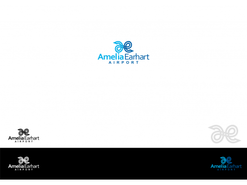
Simply continuous line formed an “a” , an “e” , 2 location icons and a pathway symbolize AmeliaEarhart Airport.
The continuous line with crisp edge resemble airlines, the airplanes tracks from and to AmeliaEarhart Airport.
The 2 location icons resemble prime destination.
The “a” and “e” are the initials of your name / airport.
Blue and green are the colors of Atchinson.
Hopefully you love it. Please give me your early feedback.
Best regards,
Denny Djoko