
Designs by steyr
For Contest: Dentist Advertisement Poster Board
Design Entries
-
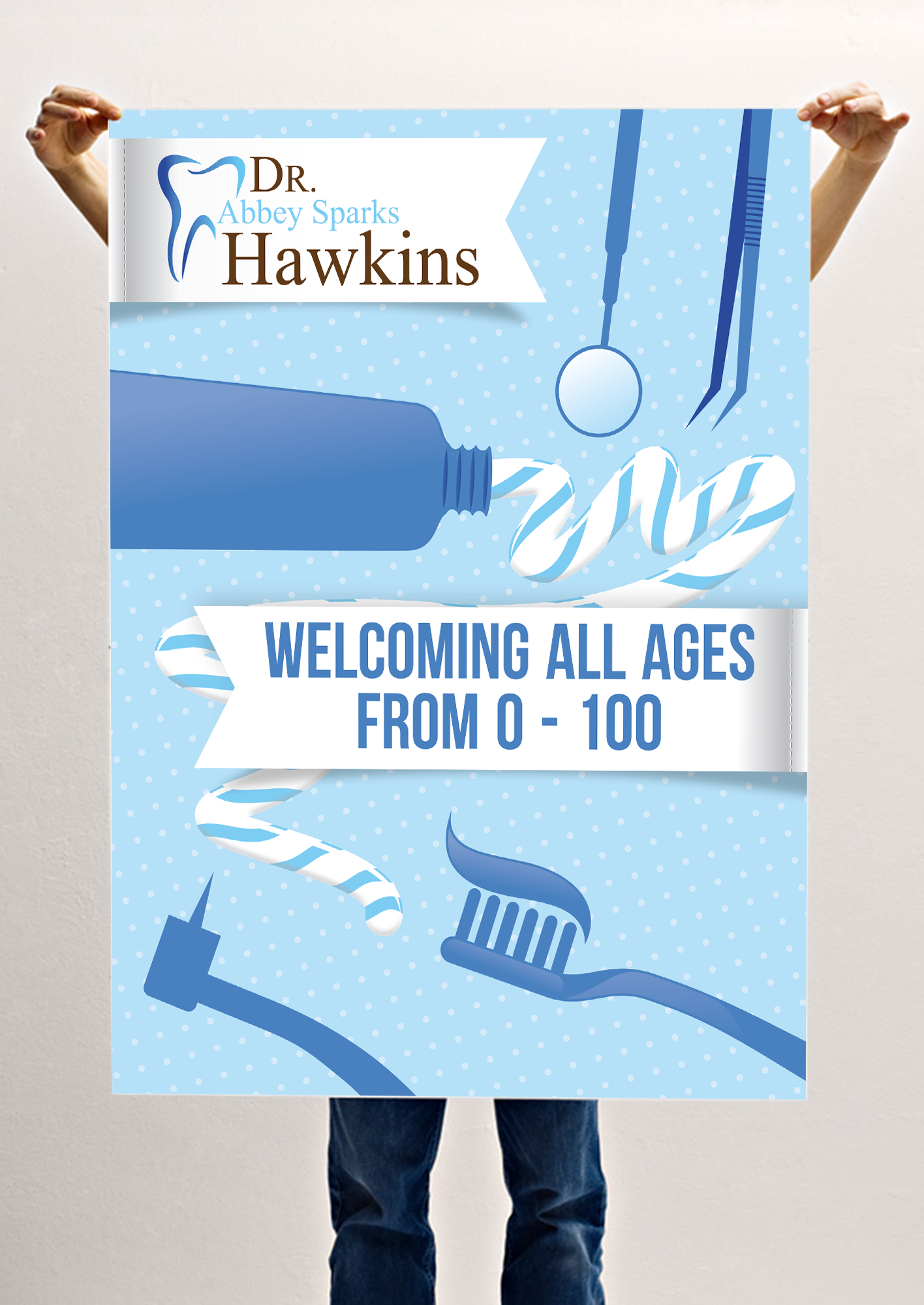
#45
1st Winner
-
#1
-
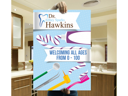
#4
-
#24
-
#38
-
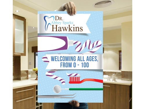
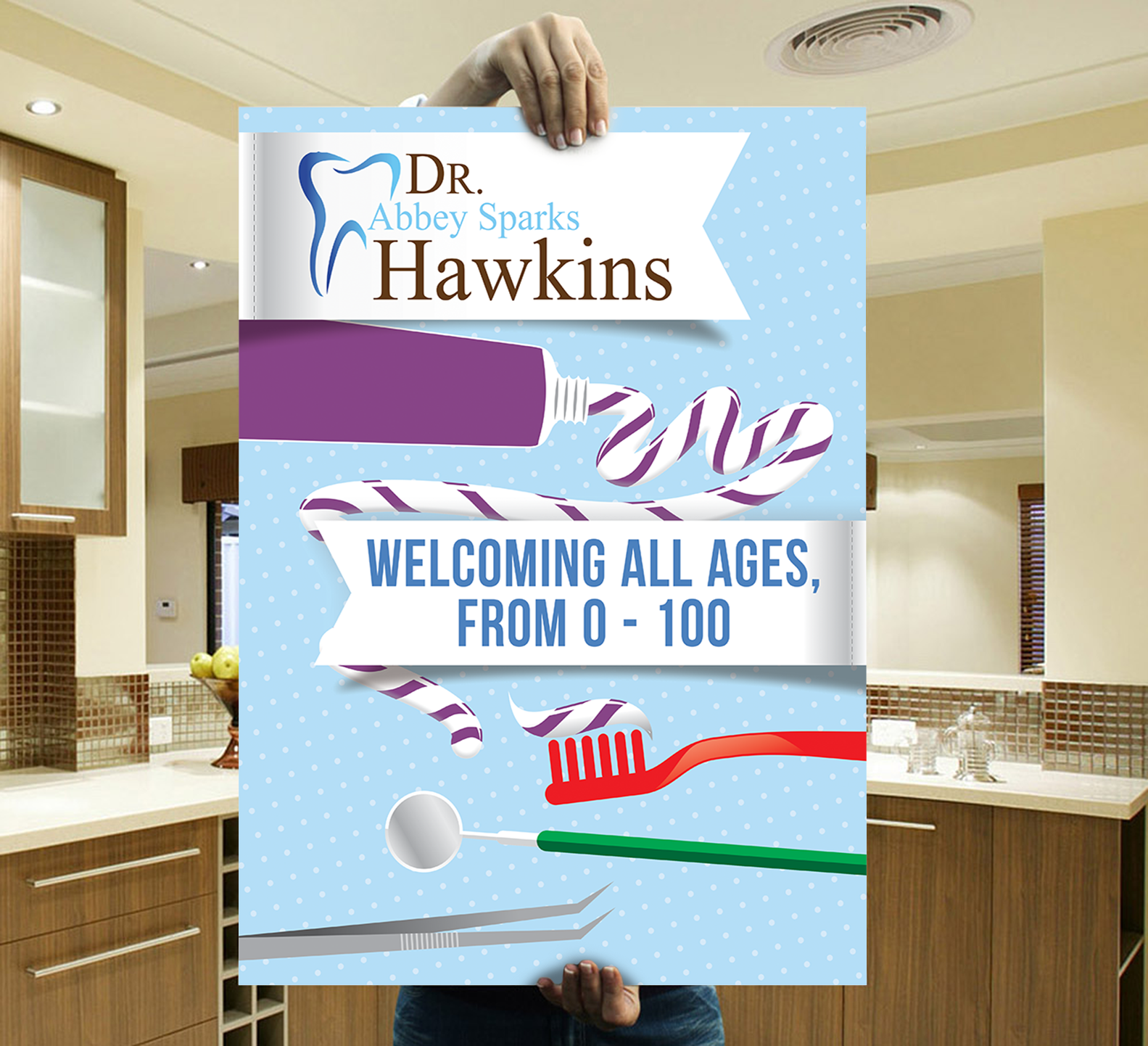
#39
-
#23

Discussion
Showing last 10 comments - View All
 hawkinsunc
Contest Holder
Thu, 22 Oct 2015 18:40:49 +0000
hawkinsunc
Contest Holder
Thu, 22 Oct 2015 18:40:49 +0000
steyr
Designer
Wed, 21 Oct 2015 20:13:50 +0000
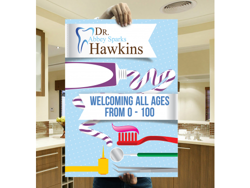
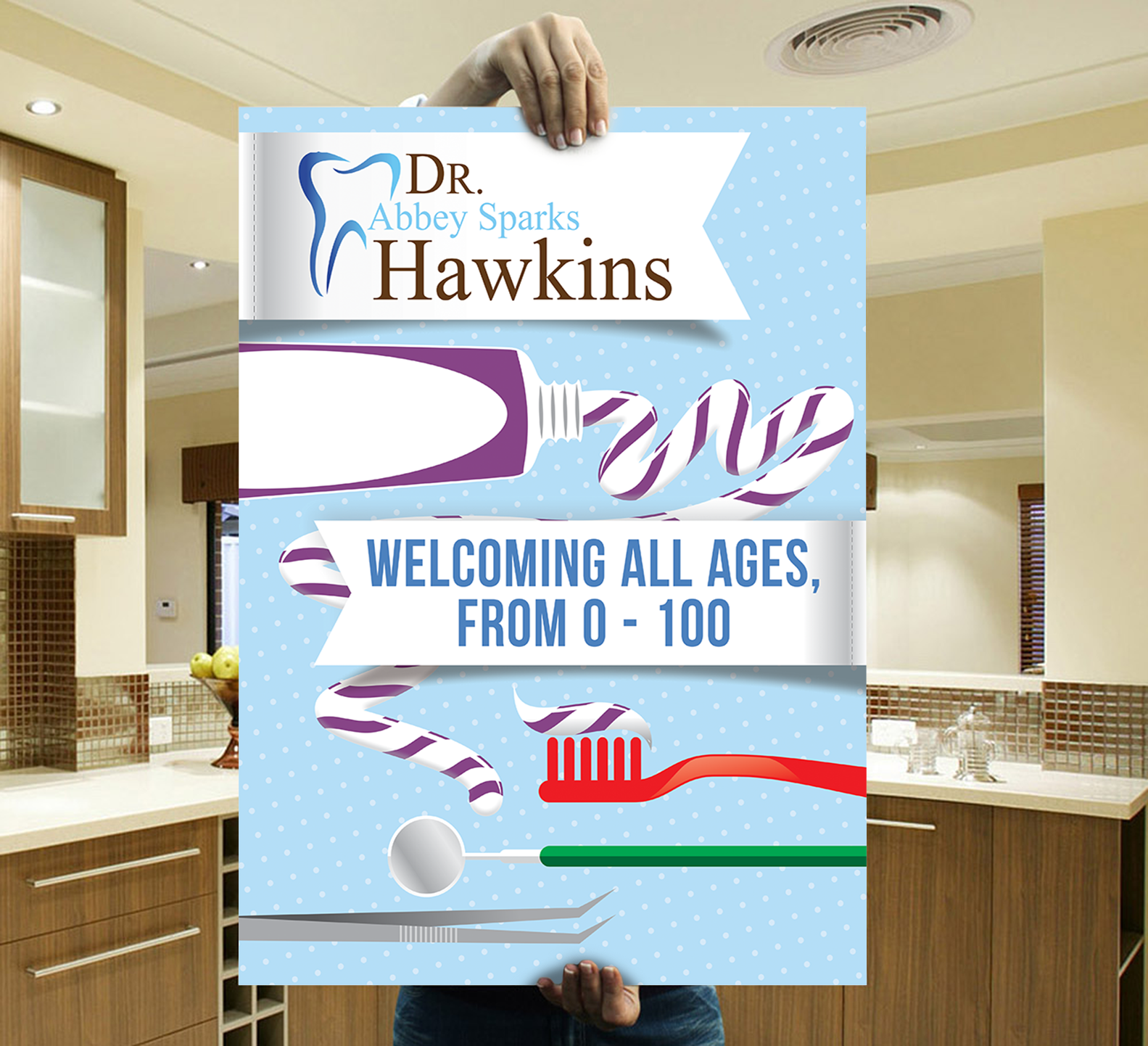
this is the revision as per your request Dr. the tube slightly downward, more thinner, all purple. no white oval. and for the tools i've also tilt them slightly so they doesn't looks so flat. And don't hesitate if you have any request about the design. thank you. By the way, i am also interested in your pamflet contest, but i realize the submission time is over. could you please extend the contest a bit?
hawkinsunc
Contest Holder
Wed, 21 Oct 2015 18:27:01 +0000
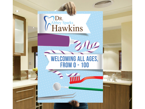
Let's do this: on #39, tilt the toothpaste tube downward slightly (like in your original all-blue one). Also, make the tube slightly thinner (like in your original) and all purple (no white oval). Also, the 3 tools at the bottom, tilt them slightly so they're not so flat and straight (I may not like this change, but want to see it anyways). Thanks.
steyr
Designer
Wed, 21 Oct 2015 12:39:35 +0000
hi Dr. here the revision. take a look, please. thank you.
steyr
Designer
Wed, 21 Oct 2015 12:22:03 +0000
thank you Dr. revised right away.
hawkinsunc
Contest Holder
Wed, 21 Oct 2015 11:38:13 +0000
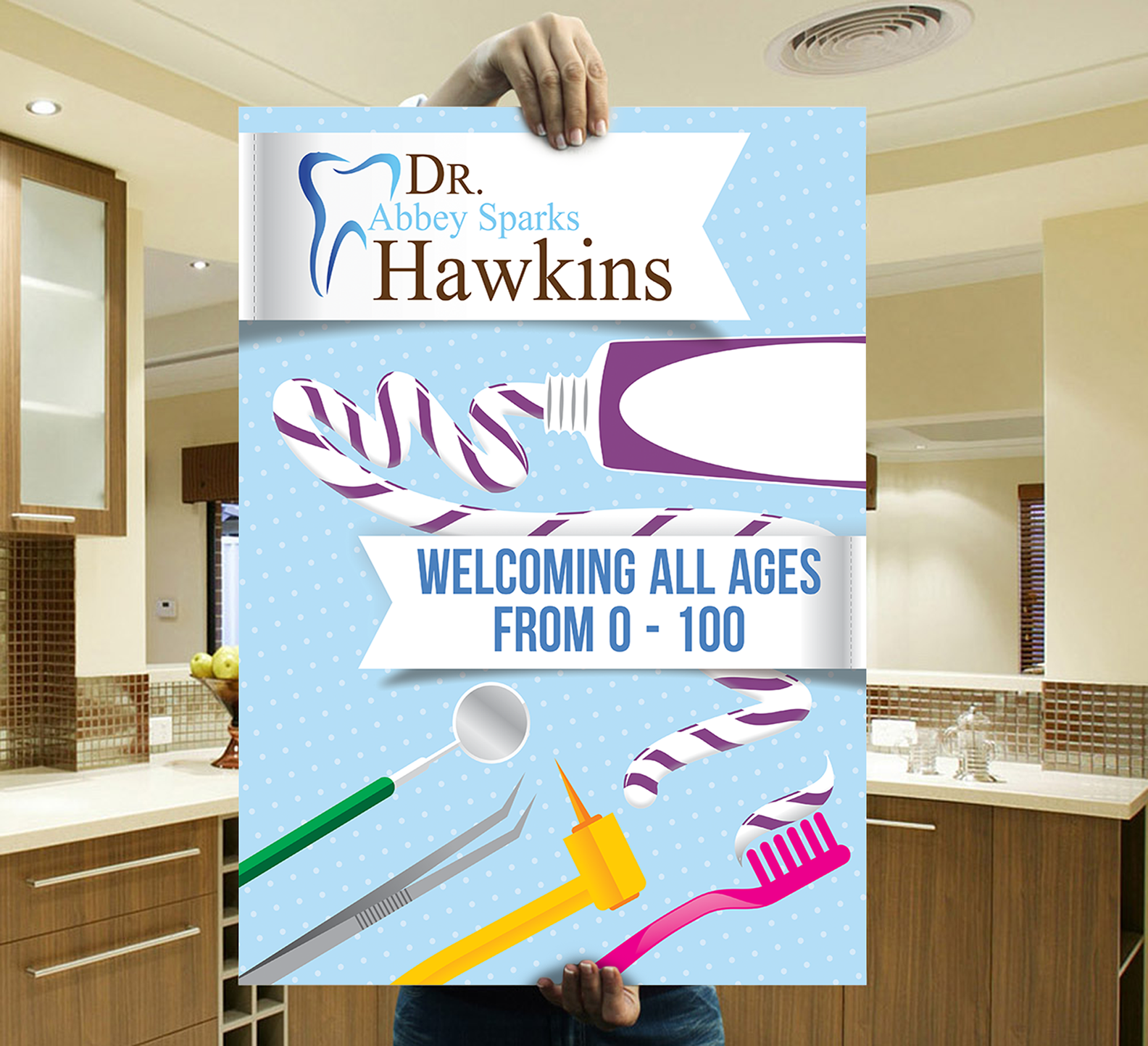
Looking better. On #24, take the drill out....drills scare some people. And move the tweezers over to where the drill is. And put a comma beside "ages". Almost there. Thanks.
steyr
Designer
Tue, 20 Oct 2015 23:32:30 +0000
hi Dr. Hawkins. how are you. hope you fine. here the alternative design. change the layout a bit. more clean. let me know if you have any feedback. thank you.
steyr
Designer
Mon, 19 Oct 2015 22:33:22 +0000
hi Dr. Hawkins... apologize for slow response. just online right now. here the refinement of your poster. i've change the logo with ribbon more larger. and the instrument more colorfull. any comment or feedback are appreciated. thank you before. best regards.
steyr
Designer
Sun, 18 Oct 2015 22:28:41 +0000
Hi Hawkins... glad to hear you like my design. i would like to confirm. that sure i can change the design. but unfortunately. the submission time is over. so we can't upload any revision. maybe you should contact the 110designs.com team to extend a contest a little bit. so i can upload a new revision for you. thanks.
hawkinsunc
Contest Holder
Sun, 18 Oct 2015 12:58:16 +0000
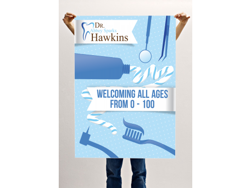
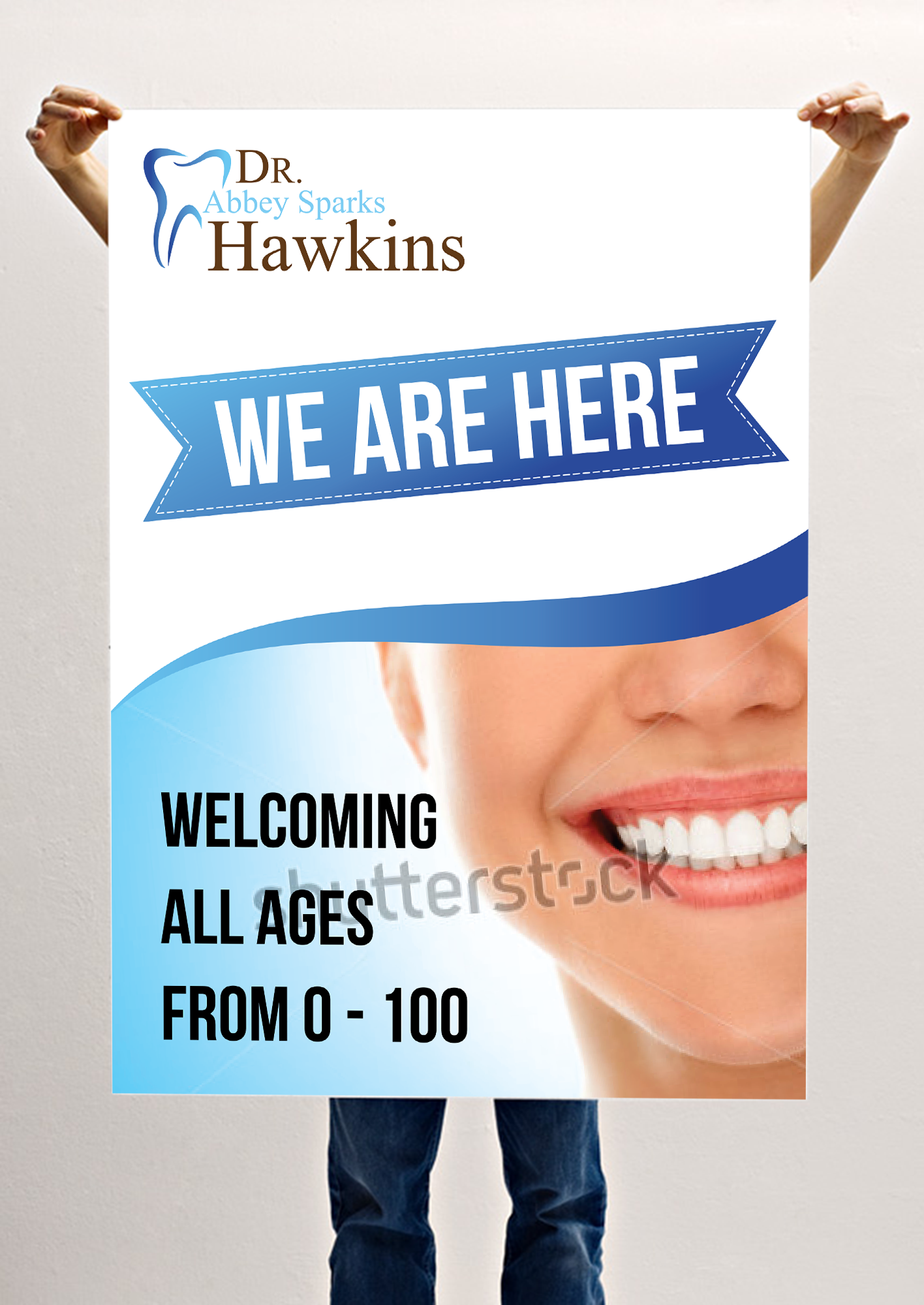
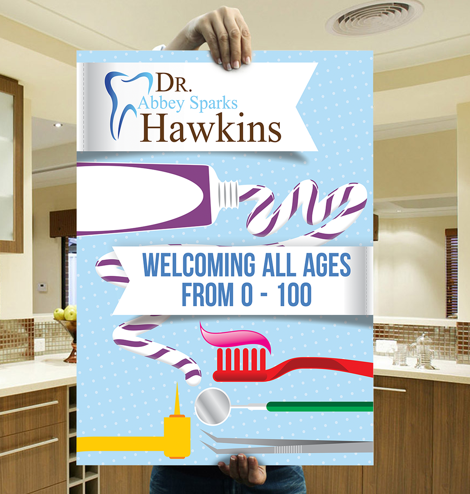
steyr, i like your design the best, but need a few changes. I like the overall design, but every being completely blue is a bit blah. Can you make each of the icons/instruments in the poster a different color? Also, make the ribbon at the top with our logo a big larger. Thanks.
Please send artwork for the poster ASAP, hopefully in in Adobe Illustrator format (I'm assuming that's what you used).