
Designs by eugeniya
For Contest: Gorgeous Culture Logo Design
Design Entries
-
#10
-
#20
-
#28

Discussion
eugeniya
Designer
Thu, 15 Dec 2011 01:46:26 +0000
+
kevindc
Contest Holder
Wed, 14 Dec 2011 12:21:42 +0000
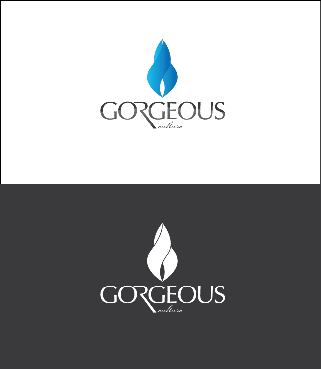
Again, I like both #10 and #20 designs, but my company name is "Gorgeous Culture", I can only see Gorgeous in bold text font, but the "culture" part is too small. Please make the word readable.
eugeniya
Designer
Wed, 14 Dec 2011 01:21:05 +0000
+
kevindc
Contest Holder
Tue, 13 Dec 2011 17:11:53 +0000
I love the concept and the graphic part, but i can hardly see the second part of my company name "culture". Maybe making it readable in a different font and size? I think your graphic approach is that cultures merge and come together, which is very neat. Do you think maybe using two different colors (two colors that are not clash) would probably work better?
eugeniya
Designer
Mon, 12 Dec 2011 03:40:18 +0000
+