
Designs by moenibcreactive
For Contest: Construction Company Logo Design
Design Entries
-
#4
-
#21

-
#22

-
#23


Discussion
moenibcreactive
Designer
Mon, 16 Dec 2013 19:54:02 +0000
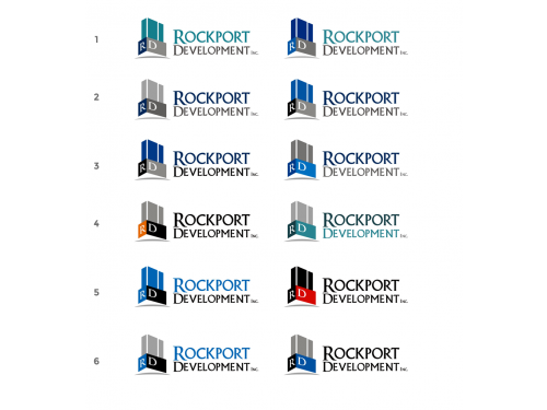
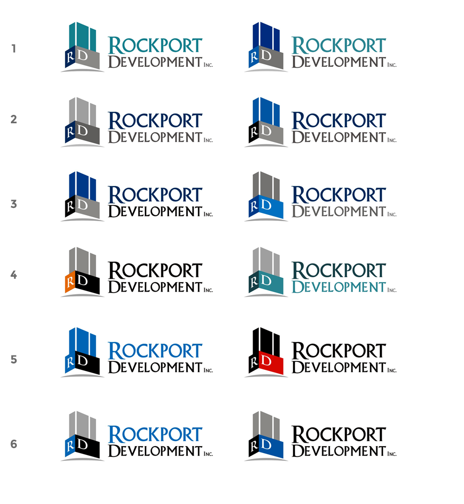
i have send alternatif color
 kevindc
Contest Holder
Mon, 16 Dec 2013 17:04:52 +0000
kevindc
Contest Holder
Mon, 16 Dec 2013 17:04:52 +0000
Thanks for the quick response. Too many colors, please keep it simple and not to use too many different colors. Also, all of our clients are between the age of 40-60, very bright colors make the company looks fun but childish. Thanks.
moenibcreactive
Designer
Mon, 16 Dec 2013 13:52:59 +0000
different color
moenibcreactive
Designer
Mon, 16 Dec 2013 13:48:51 +0000
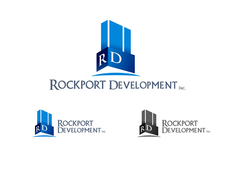
thanks you for feedback. and i have send design
kevindc
Contest Holder
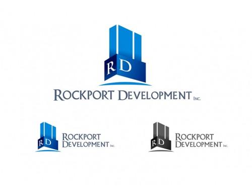
Mon, 16 Dec 2013 13:37:21 +0000
I like your design, clean and simple. I like the logo to be horizontal (graphic part on the same line as the text part) instead of vertical. One concern I have is that you used shading effect (gradually changing color) on the graphic part, but I prefer solid color instead for simplicity. you may use 3 or max 4 colors on the logo (including text part). thank you very much