
Designs by mdTonkin
For Contest: Construction Company Logo Design
Design Entries
-
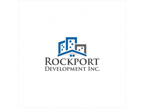
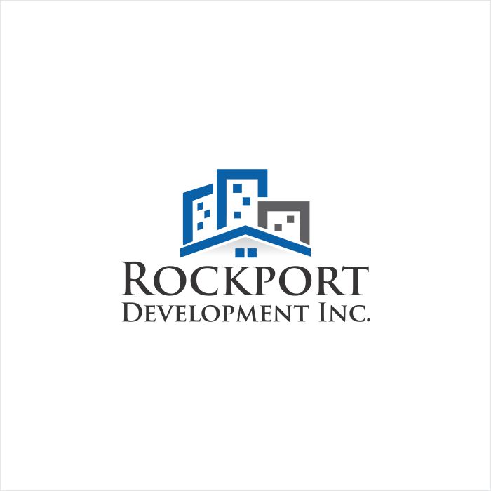
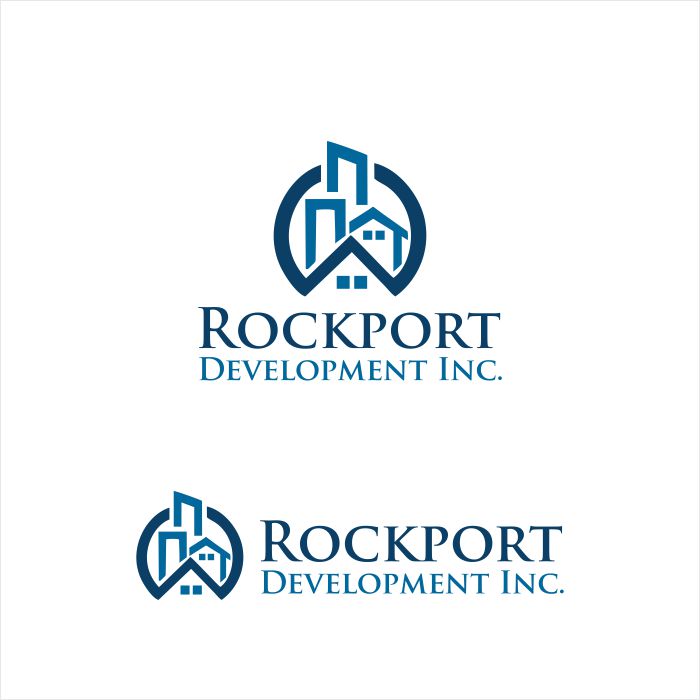
#25
1st Winner

-
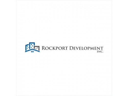
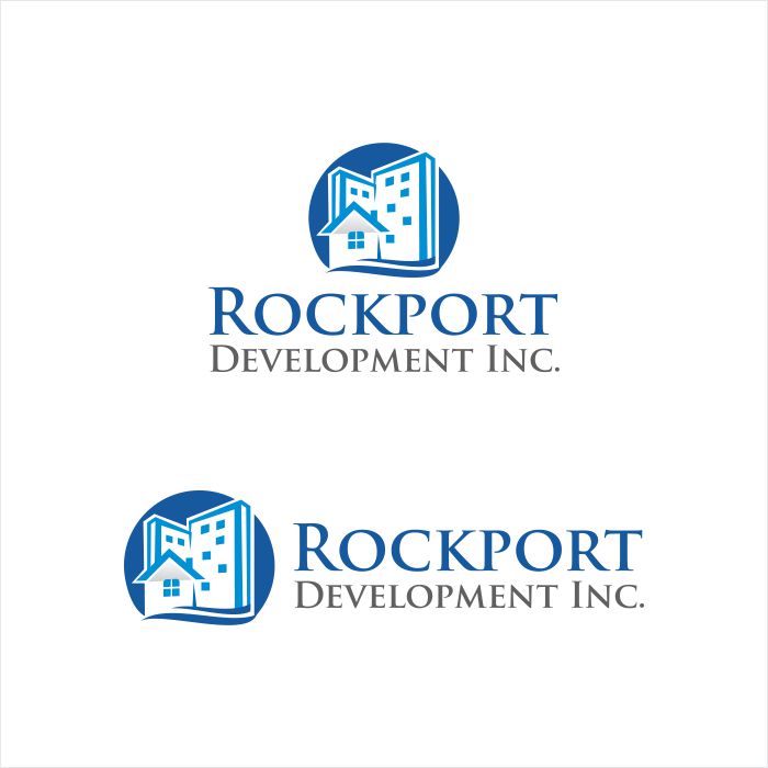
#1
-
#2
-
#3
-
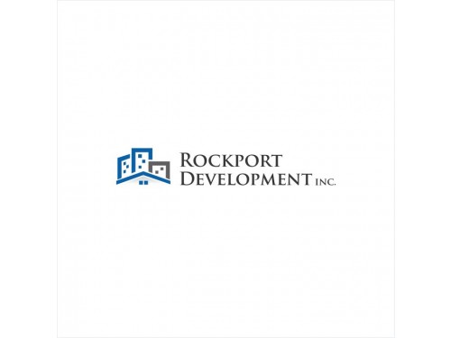
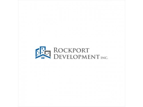
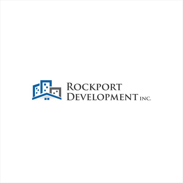
#19
-
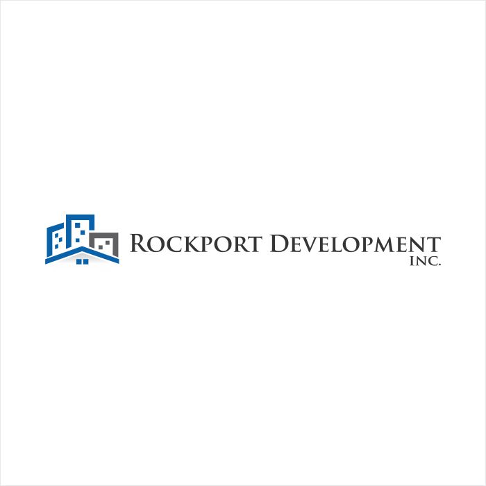
#20
-
#24
Discussion
mdTonkin
Designer
Wed, 18 Dec 2013 06:42:08 +0000
mdTonkin
Designer
Wed, 18 Dec 2013 06:38:52 +0000
.
mdTonkin
Designer
Tue, 17 Dec 2013 14:43:24 +0000
Hello,
I made the changes. Let me know your opinion.
Best!
mdTonkin
I made the changes. Let me know your opinion.
Best!
mdTonkin
mdTonkin
Designer
Tue, 17 Dec 2013 14:42:59 +0000
Hello,
I made the changes. Let me know your opinion.
Best!
mdTonkin
I made the changes. Let me know your opinion.
Best!
mdTonkin
 kevindc
Contest Holder
Tue, 17 Dec 2013 14:17:22 +0000
kevindc
Contest Holder
Tue, 17 Dec 2013 14:17:22 +0000
Please kindly make the changes I commented in my previous note, that should be it. thanks!
kevindc
Contest Holder
Mon, 16 Dec 2013 20:45:22 +0000
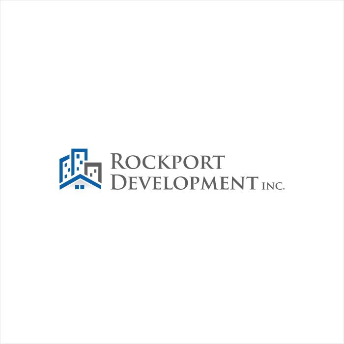
#19 is almost there. Please change the graphic part to be a little bit narrower, and the text part to be the same grey color as in the graphic part. Thanks!
mdTonkin
Designer
Mon, 16 Dec 2013 13:47:44 +0000
.
mdTonkin
Designer
Mon, 16 Dec 2013 13:47:30 +0000
Hello,
I propose you options with the image from the left side of the text.
Let me know your opinion. Do you like the color scheme?
Regards
I propose you options with the image from the left side of the text.
Let me know your opinion. Do you like the color scheme?
Regards
kevindc
Contest Holder
Mon, 16 Dec 2013 13:27:34 +0000
I like your concepts. However, "Rockport Development" should be the main attention in our company name, thus should be equal sized, "Inc." is just the company type which is not that important. So "Development" and "Inc" should not be the same size and attract the same amount of attention. Maybe you can re-arrange it? #1 is clean and simple which I like the most. I like the logo to be horizontal instead of vertical (graphic on top of text). thank you very much.
Thank you very much for awarding me! I have sent you the final files and Logo Guide. Let me know if everything is OK.
If you need any promotional materials (stationary), I can propose you options.
Best!
mdTonkin