
Designs by batiksolo
For Contest: LABS
Design Entries
-
#8
-
#10

-
#12

-
#64
-
#11
-
#9

-
#65
-
#57

-
#56
-
#55
-
#33
-
#32

-
#66


Discussion
Showing last 10 comments - View All
batiksolo
Designer
Thu, 10 Oct 2013 22:12:34 +0000
batiksolo
Designer
Thu, 10 Oct 2013 22:08:18 +0000
Dear Elymatt,
I submit my design for your new logo.
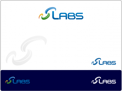
3 UPWARD CURVES symbolize LABS.
The 3 curves resemble BUSINESS STAGES . Here is the software and solutions for business management.
The curves also resemble getting up gradually.
Blue resemble well managed, high technology, IT.
Green resemble comfort, user-friendly software.
Orange resemble hot, great stat-up.
Regards,
Djoko
I submit my design for your new logo.
3 UPWARD CURVES symbolize LABS.
The 3 curves resemble BUSINESS STAGES . Here is the software and solutions for business management.
The curves also resemble getting up gradually.
Blue resemble well managed, high technology, IT.
Green resemble comfort, user-friendly software.
Orange resemble hot, great stat-up.
Regards,
Djoko
batiksolo
Designer
Thu, 10 Oct 2013 22:05:09 +0000
Dear Elymatt,
I submit my design for your new logo.
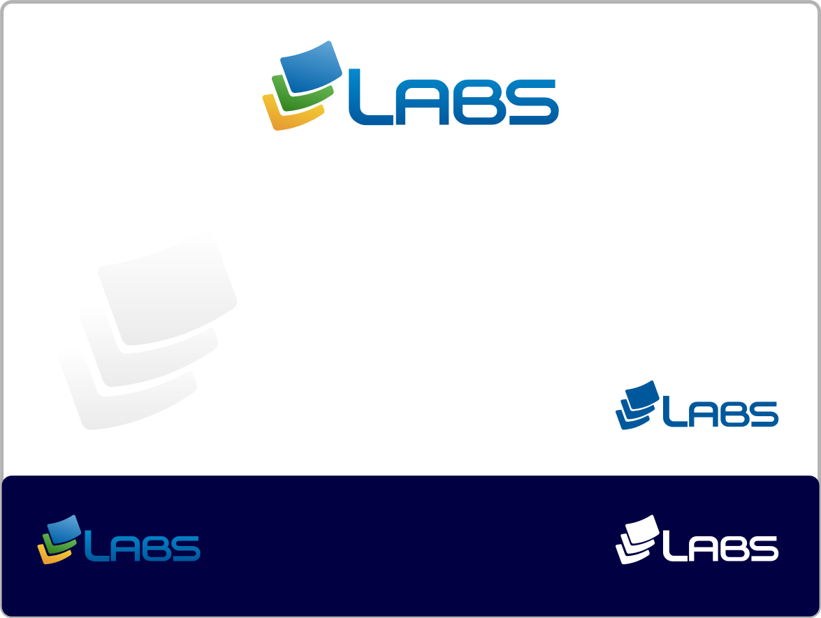
3 SHEETS OF PAPERS FORMED “L”s AND CHECK ICON symbolize LABS.
The 3 sheets of papers resemble BUSINESS STAGES . Here is the software and solutions for business management.
The stages also resemble getting up gradually.
The check resemble correct.
Blue resemble well managed, high technology, IT.
Green resemble comfort, user-friendly software.
Orange resemble hot, great stat-up.
Regards,
Djoko
I submit my design for your new logo.
3 SHEETS OF PAPERS FORMED “L”s AND CHECK ICON symbolize LABS.
The 3 sheets of papers resemble BUSINESS STAGES . Here is the software and solutions for business management.
The stages also resemble getting up gradually.
The check resemble correct.
Blue resemble well managed, high technology, IT.
Green resemble comfort, user-friendly software.
Orange resemble hot, great stat-up.
Regards,
Djoko
batiksolo
Designer
Thu, 10 Oct 2013 14:14:04 +0000
Dear Elymatt,
I submit my design for your new logo.
3 SHEETS OF PAPERS FORMED “L”s AND CHECK ICON symbolize LABS.
The 3 sheets of papers resemble BUSINESS STAGES . Here is the software and solutions for business management.
The stages also resemble getting up gradually.
The check resemble correct.
Blue resemble well managed, high technology, IT.
Green resemble comfort, user-friendly software.
Orange resemble hot, great stat-up.
Regards,
Djoko
batiksolo
Designer
Thu, 10 Oct 2013 13:57:43 +0000
Dear Elymatt,
I submit my design for your new logo.
3 UPWARD CURVES symbolize LABS.
The 3 curves resemble BUSINESS STAGES . Here is the software and solutions for business management.
The curves also resemble getting up gradually.
Blue resemble well managed, high technology, IT.
Green resemble comfort, user-friendly software.
Orange resemble hot, great stat-up.
Regards,
Djoko
batiksolo
Designer
Thu, 10 Oct 2013 13:29:37 +0000
Dear Elymatt,
I submit my design for your new logo.
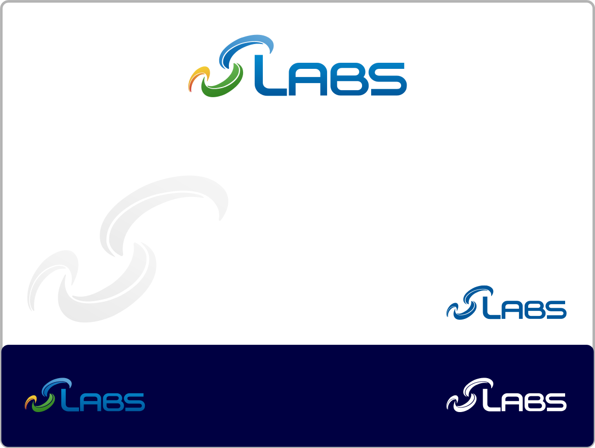
A HEMISPHERE CURVE UPON 2 CURVES SUBTLY FORMED AN “L” symbolize LABS.
The 2 curves resemble the software and solutions for business management.
The curves also resemble getting up gradually.
The curves also formed a hemisphere,resemble global company.
The tin solder of a modern pcb resemble INNOVATION.
The “L” is the initial of your company.
Blue resemble well managed, high technology, IT.
Regards,
Djoko
I submit my design for your new logo.
A HEMISPHERE CURVE UPON 2 CURVES SUBTLY FORMED AN “L” symbolize LABS.
The 2 curves resemble the software and solutions for business management.
The curves also resemble getting up gradually.
The curves also formed a hemisphere,resemble global company.
The tin solder of a modern pcb resemble INNOVATION.
The “L” is the initial of your company.
Blue resemble well managed, high technology, IT.
Regards,
Djoko
batiksolo
Designer
Mon, 07 Oct 2013 12:17:56 +0000
Dear Elymatt,
I submit my design for your new logo.
3 UPRIGHT WAVES subtly FORMED A VERTEX AND AN “L” symbolize LABS.
The 3 upright curves resemble the software and splutions for business management.
The curves also resemble getting up gradually.
The “L” is the initial of your company.
The subtle globe resemble IT, internet, global.
Blue resemble well managed, high technology, IT.
Orange resemble active, responsive, INNOVATION.
Grey resemble trusted and reliable company.
Regards,
Djoko
batiksolo
Designer
Mon, 07 Oct 2013 11:50:15 +0000
Dear Elymatt,
I submit my design for your new logo.
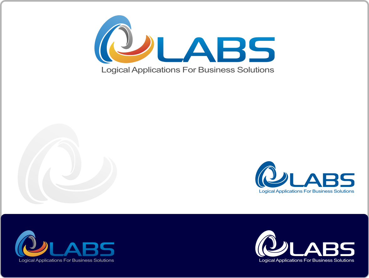
This time is the cariations of #10, which I elaborate the GLOBE to become more “L” shaped. This extra odinary , elegant and modern logo would protruding among other software developer company. Hopefully you’ll like it.
5 upright curves subtly FORMED A GLOBE AND AN “L” symbolize LABS.
The 5 upright curves resemble the software and splutions for business management.
The curves also resemble getting up gradually.
The “L” is the initial of your company.
The subtle globe resemble IT, internet, global.
Blue resemble well managed, high technology, IT.
Orange resemble active, responsive, INNOVATION.
Regards,
Djoko
I submit my design for your new logo.
This time is the cariations of #10, which I elaborate the GLOBE to become more “L” shaped. This extra odinary , elegant and modern logo would protruding among other software developer company. Hopefully you’ll like it.
5 upright curves subtly FORMED A GLOBE AND AN “L” symbolize LABS.
The 5 upright curves resemble the software and splutions for business management.
The curves also resemble getting up gradually.
The “L” is the initial of your company.
The subtle globe resemble IT, internet, global.
Blue resemble well managed, high technology, IT.
Orange resemble active, responsive, INNOVATION.
Regards,
Djoko
batiksolo
Designer
Sat, 05 Oct 2013 14:20:44 +0000
Dear Elymatt,
I submit my design for your new logo.
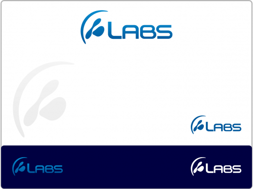
2 CURVES SUBTLY FORMED AN “L” symbolize LABS.
The 2 curves resemble the software and solutions for business management.
The curves also resemble getting up gradually.
The tin solder of a modern pcb resemble INNOVATION.
The “L” is the initial of your company.
Blue resemble well managed, high technology, IT.
Regards,
Djoko
I submit my design for your new logo.
2 CURVES SUBTLY FORMED AN “L” symbolize LABS.
The 2 curves resemble the software and solutions for business management.
The curves also resemble getting up gradually.
The tin solder of a modern pcb resemble INNOVATION.
The “L” is the initial of your company.
Blue resemble well managed, high technology, IT.
Regards,
Djoko
batiksolo
Designer
Sat, 05 Oct 2013 13:14:18 +0000
Dear Elymatt,
I submit my design for your new logo.
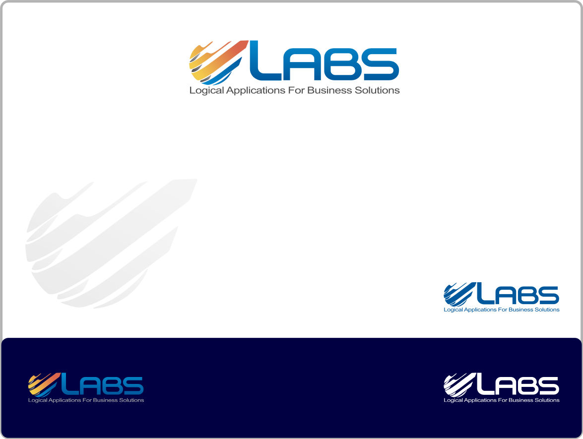
A COG AND 2 CURVES AN “L” symbolize LABS.
The 2 upright curves resemble the software and solutions for business management.
The curves also resemble getting up gradually.
The half cog resemble SOFTWARE / APPS.
The “L” is the initial of your company.
The subtle globe resemble IT, internet, global.
Blue resemble well managed, high technology, IT.
Orange resemble active, responsive, INNOVATION.
Regards,
Djoko
I submit my design for your new logo.
A HEMISPHERE CURVE UPON 2 CURVES SUBTLY FORMED AN “L” symbolize LABS.
The 2 curves resemble the software and solutions for business management.
The curves also resemble getting up gradually.
The curves also formed a hemisphere,resemble global company.
The tin solder of a modern pcb resemble INNOVATION.
The “L” is the initial of your company.
Blue resemble well managed, high technology, IT.
Regards,
Djoko