
Designs by zacksign
For Contest: GDS Global Distribution Service GmbH (Company Logo & Font creation / definition)
Design Entries
-
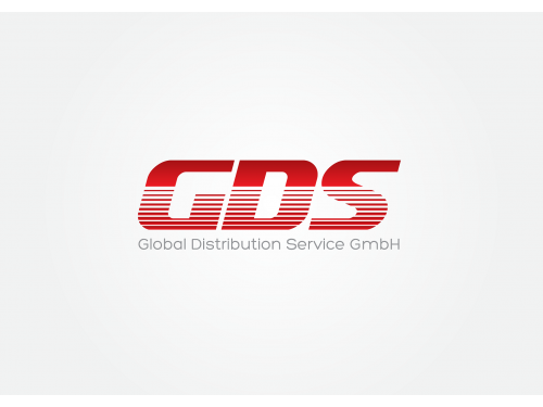
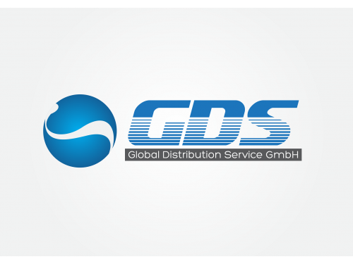
#58

-
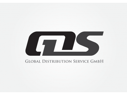
#52
-
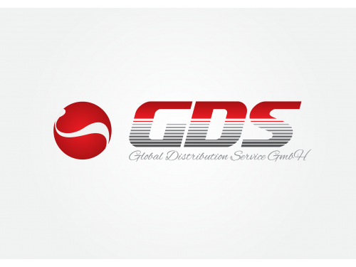
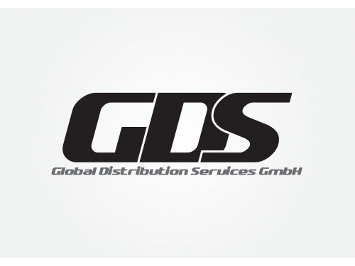
#51

-
#12
-
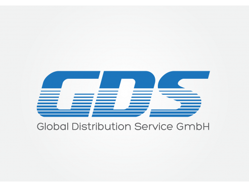
#57
-
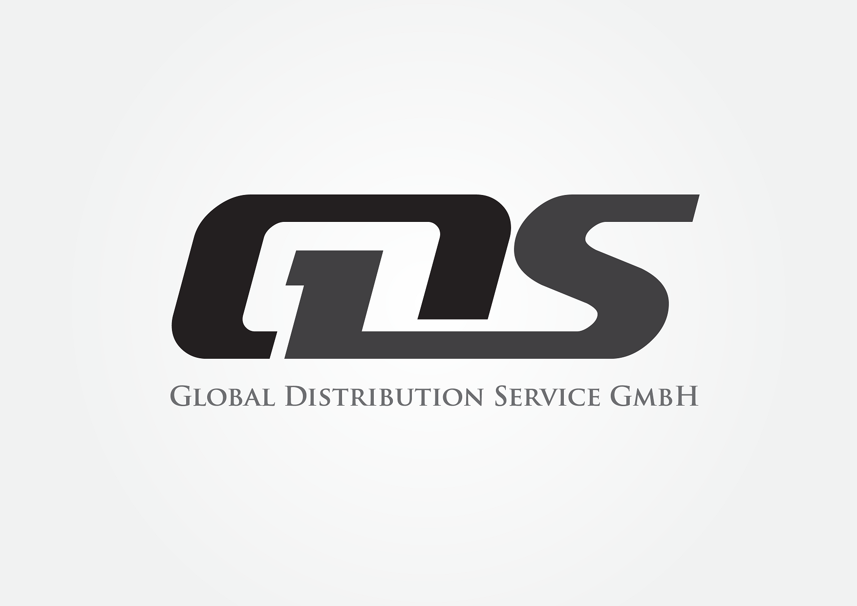
#21
-
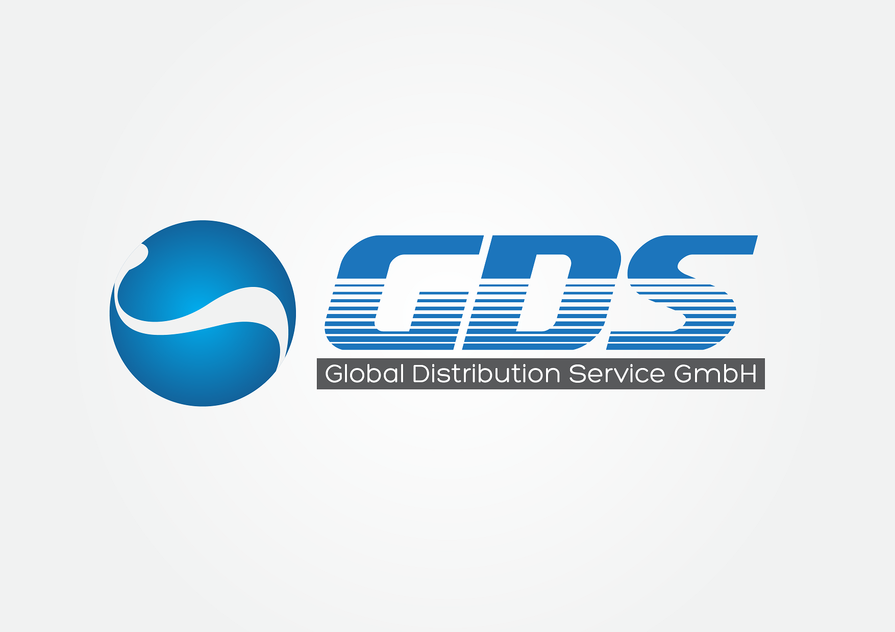
#22
-
#24
-
#20
-
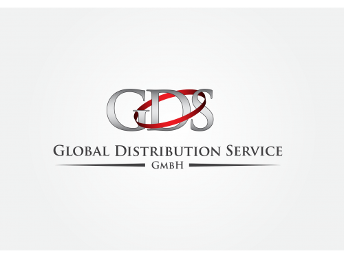
#11


Discussion
zacksign
Designer
Fri, 06 Jul 2012 11:09:14 +0000
revision
 OS
Contest Holder
Fri, 06 Jul 2012 10:15:57 +0000
OS
Contest Holder
Fri, 06 Jul 2012 10:15:57 +0000
Hi,
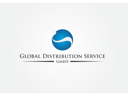
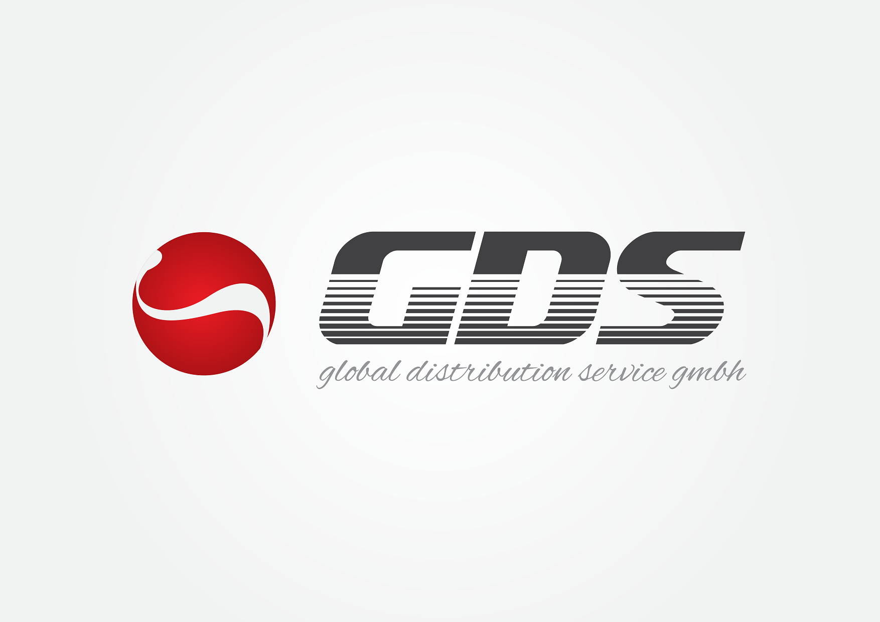
#51 and #52 are already very good - could you play around with version #52 still a bit:
- shrink the globe-ball to fit to the total height of the font next to it
- change the GDS font color from red to dark grey
- also use "cursive" font for "Global Distribution Service GmbH"
Thanks a lot
Oliver
#51 and #52 are already very good - could you play around with version #52 still a bit:
- shrink the globe-ball to fit to the total height of the font next to it
- change the GDS font color from red to dark grey
- also use "cursive" font for "Global Distribution Service GmbH"
Thanks a lot
Oliver
zacksign
Designer
Fri, 06 Jul 2012 09:39:49 +0000
revision
zacksign
Designer
Fri, 06 Jul 2012 07:41:55 +0000
Ok, I will revise my design, thank you very much for feedback..., I open to any suggestion for make a design is perfect and match with what you wanted.
OS
Contest Holder
Fri, 06 Jul 2012 07:15:00 +0000
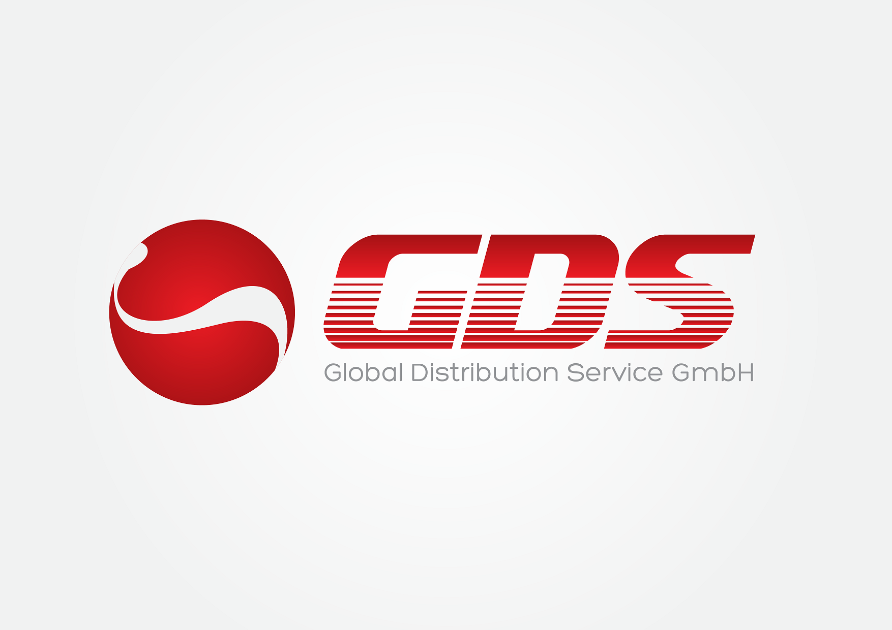
Dear Zacksign,
your designs #21 and #22 look quite good and we will consider it seriously.
Could you make another variant of these 2 designs with red or dark red instead of blue color for the globe-symbol and the GDS font.
In additon please use for both the design of version #22 reg. the wording "Global Distribution Service GmbH" (light and not in a grey block).
Thanks
Oliver