
Designs by Jonas Mateus
For Contest: GDS Global Distribution Service GmbH (Company Logo & Font creation / definition)
Design Entries
-
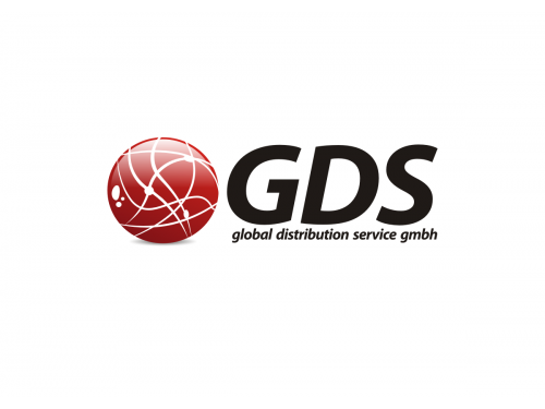
#46
-
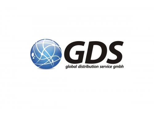
#47
-
#48
-
#49
-
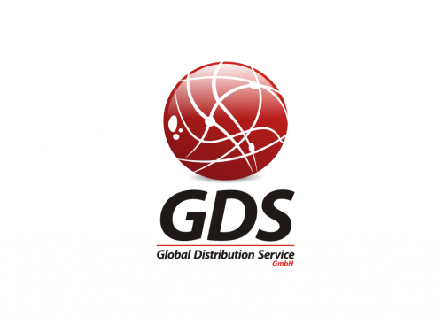
#17
-
#53

-
#54
-
#55
-
#56


Discussion
Jonas Mateus
Designer
Fri, 06 Jul 2012 10:36:48 +0000
 OS
Contest Holder
Fri, 06 Jul 2012 10:12:29 +0000
OS
Contest Holder
Fri, 06 Jul 2012 10:12:29 +0000
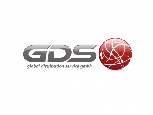
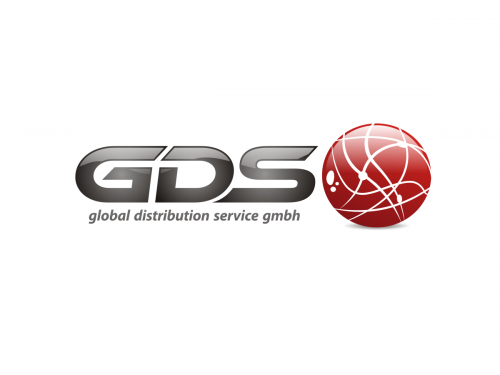
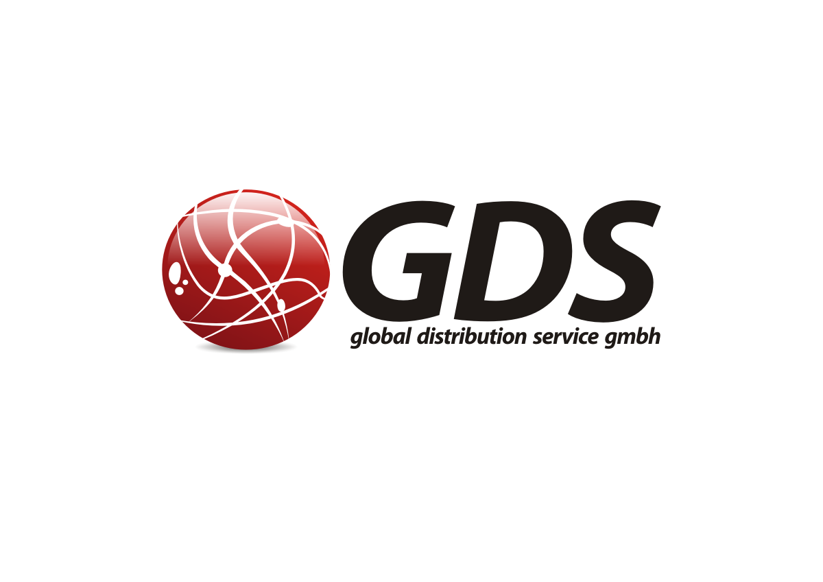
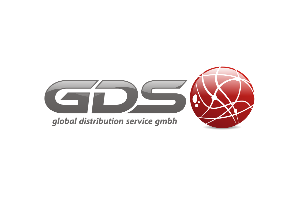
hi jonas, very good #46-49 are very close to what we are looking for.
Could you still play around a little bit with the font of "GDS", since I was looking for something a bit more light / perhaps also change the font color from black to dark grey.
Thanks
Oliver
Could you still play around a little bit with the font of "GDS", since I was looking for something a bit more light / perhaps also change the font color from black to dark grey.
Thanks
Oliver
Jonas Mateus
Designer
Fri, 06 Jul 2012 08:13:49 +0000
Hi!
Thanks for your feedback!
Any other changes let me know.
Kind Regards
Jonas Mateus
Thanks for your feedback!
Any other changes let me know.
Kind Regards
Jonas Mateus
OS
Contest Holder
Fri, 06 Jul 2012 07:11:31 +0000
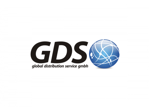
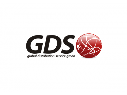
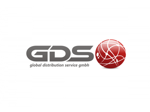
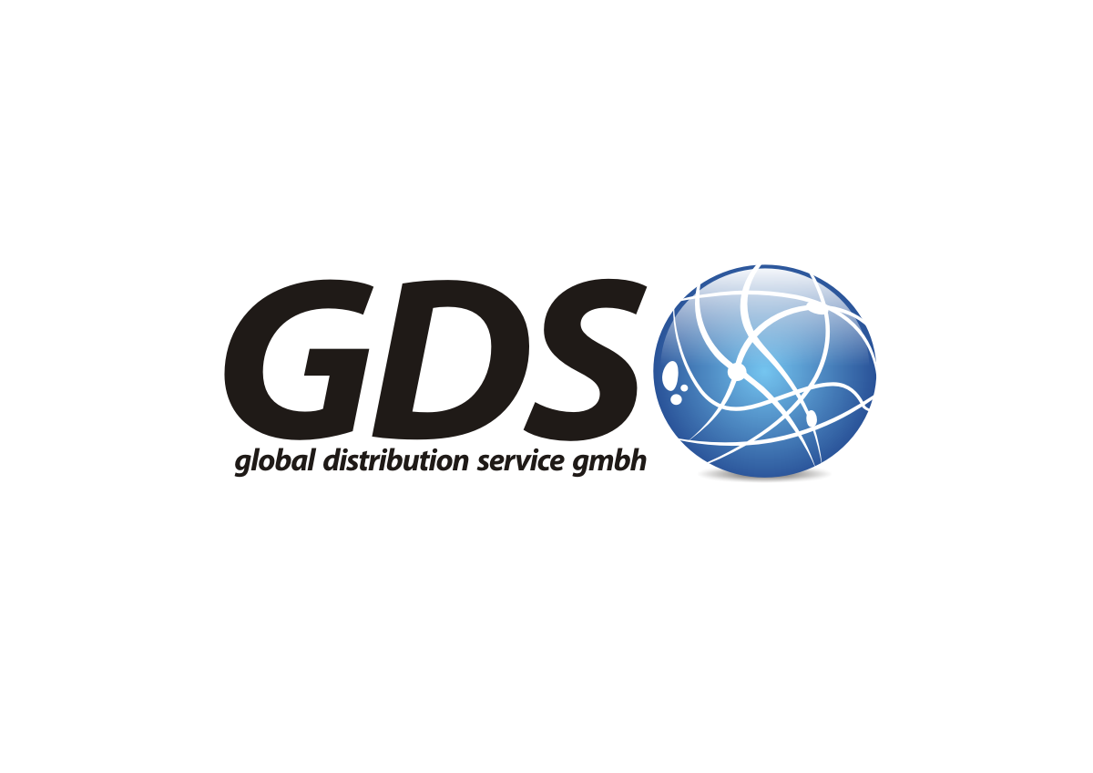
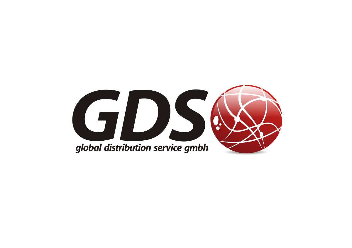
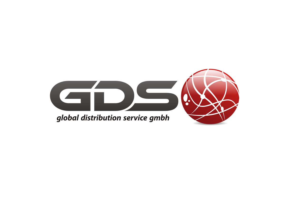
Hi Jonas, could you please send another proposal of #17 (GDS) with the globe-ball icon next to the GDS letters.
Also please leave out the red separation line and just mention very subtile "global distribution service gmbh"
Also please leave out the red separation line and just mention very subtile "global distribution service gmbh"
Jonas Mateus
Designer
Tue, 03 Jul 2012 22:08:13 +0000
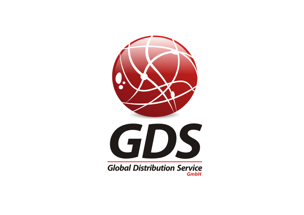
Hi,
New logo design!
Concept is 100% original and unique.
Any changes let me know.
Kind Regards.
Jonas Mateus
New logo design!
Concept is 100% original and unique.
Any changes let me know.
Kind Regards.
Jonas Mateus
Updates!
Any other changes let me know.
Kind Regards
Jonas Mateus