
Designs by pensil.1784
For Contest: Re design logo
Design Entries
-
#16
-
#18
-
#19
Discussion
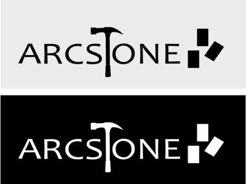
pensil.1784
Designer
Thu, 09 Oct 2025 01:38:08 +0000
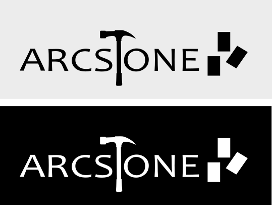
A strong, capitalized design featuring a hammer-shaped “T”, symbolizing strength and craftsmanship. At the end of the “E”, three rising bricks represent growth and upward progress. The simple, strong, solid look reflects the company’s stability, forward momentum, and vision for success.
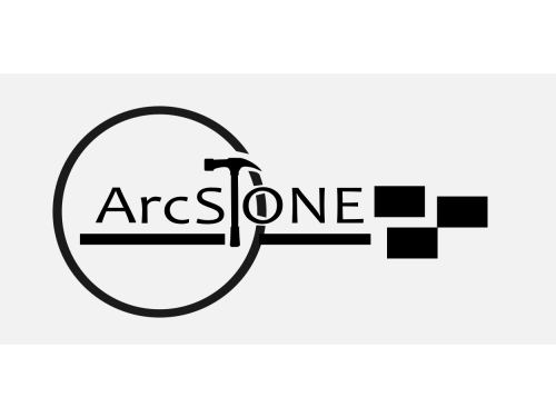
pensil.1784
Designer
Thu, 09 Oct 2025 01:27:07 +0000
I’ve reimagined the arcsTone logo as a key to success. The “KEY” element flows naturally from the arc-shaped handle, while “sTone” features a “T” as a hammer and the “E” cleverly forms a key. This design symbolizes strength, craftsmanship, and unlocking new possibilities—hoping the new logo becomes the key to the company’s future success.
pensil.1784
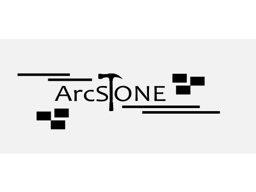
Designer
Thu, 09 Oct 2025 00:04:02 +0000
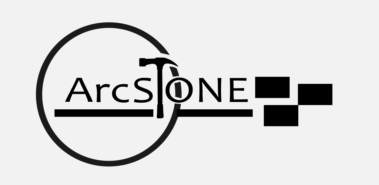
This design for arcsTone features a stylized hammer icon with a prominent “T” integrated into its form, symbolizing strength and craftsmanship. Subtle bricks are positioned at the bottom left and top right, reflecting the company’s foundation and growth. The overall layout conveys an open-minded and forward-thinking vision, emphasized by dynamic diagonal lines stretching from the top left to the bottom right, suggesting movement, progress, and connectivity. The composition balances structure with creativity, embodying the company’s innovative approach in the construction and design industry.