
Designs by SUKET DESIGN
For Contest: Design Contest
Design Entries
-
#21

-
#205
-
#207
-
#210

-
#211
-
#216
-
#19

-
#20
-
#206


Discussion
SUKET DESIGN
Designer
Wed, 20 Aug 2025 05:40:10 +0000
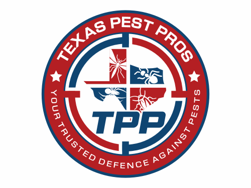
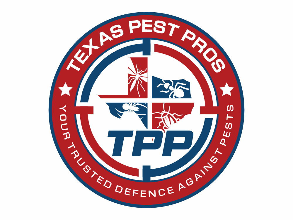
This all proposal reflects strength, protection, and professionalism, perfectly aligned with Texas Pest Pros. The use of bold red and blue highlights reliability and trust, while the outline of Texas emphasizes strong local identity. The pest illustrations integrated with the target symbol represent precision and effectiveness in pest control. The circular badge style also communicates authority and security, making it ideal for uniforms, vehicles, and promotional materials. If selected, I’d be glad to also design a matching business card as a complimentary addition to strengthen your brand presence.
SUKET DESIGN
Designer
Wed, 20 Aug 2025 03:50:25 +0000
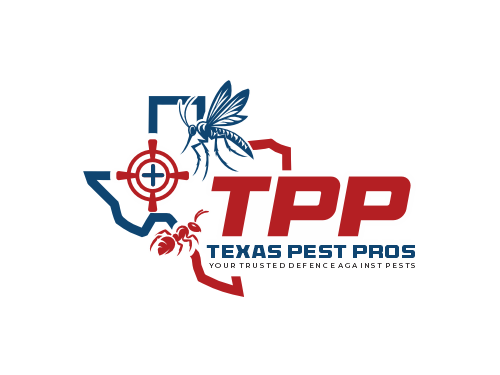
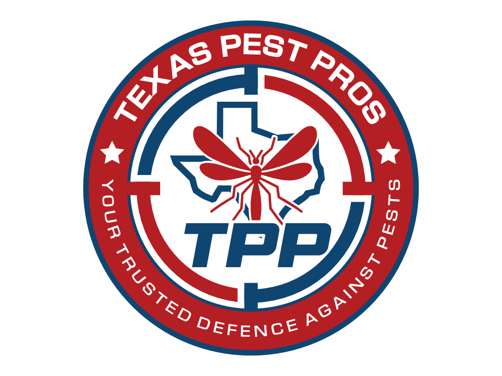
This logo for Texas Pest Pros (TPP) reflects strength, precision, and trust. The combination of the Texas state outline, pest illustrations, and target symbol emphasizes protection and expertise in pest control. The bold red and navy color scheme communicates confidence, reliability, and professionalism, while the tagline “Your Trusted Defence Against Pests” reinforces the company’s mission to safeguard homes and businesses. The design is modern, impactful, and versatile for various branding needs, from digital media to uniforms and vehicles.
I am fully committed to ensuring the final result matches your vision and expectations. Revisions will be provided as many times as needed until you are completely satisfied with the outcome.
I am fully committed to ensuring the final result matches your vision and expectations. Revisions will be provided as many times as needed until you are completely satisfied with the outcome.
SUKET DESIGN
Designer
Thu, 14 Aug 2025 05:28:23 +0000
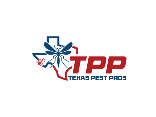
The logo combines strong visual symbolism with clean, modern typography to convey professionalism and expertise.
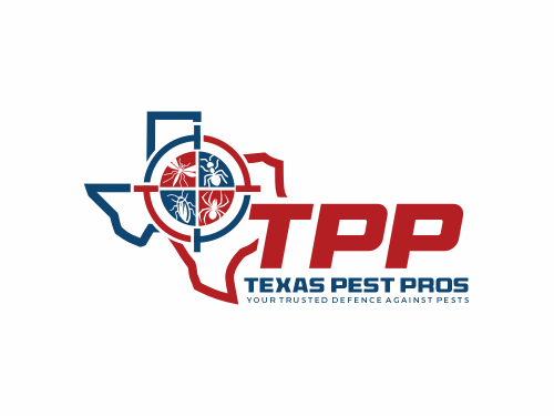
Shape & Outline: The base outline is the recognizable silhouette of the state of Texas, emphasizing the company’s local roots and regional service focus.
Icon: Centered in the Texas outline is a detailed insect graphic, representing the company’s core pest control services. The insect is designed in a stylized, bold manner to make it distinct yet not overly realistic, ensuring it feels professional rather than intimidating.
Typography:
"TPP" is set in large, bold red lettering to command attention and establish brand recognition.
"Texas Pest Pros" appears below in smaller, navy-blue block letters, creating a balanced visual hierarchy and reinforcing the full brand name.
Color Palette: The use of red and navy blue blends energy and trustworthiness—red for action and effectiveness, navy for reliability and professionalism.
Style: The overall style is modern and clean, ensuring scalability and clarity across all mediums, from uniforms and vehicles to digital platforms.
This design clearly communicates the brand identity: a local, trusted, and highly capable pest control service in Texas.