
Designs by SUKET DESIGN
For Contest: Logo for an ice skating rink
Discussion
 SUKET DESIGN
Designer
Sat, 02 Aug 2025 00:25:22 +0000
 SUKET DESIGN
Designer
Wed, 30 Jul 2025 23:52:15 +0000
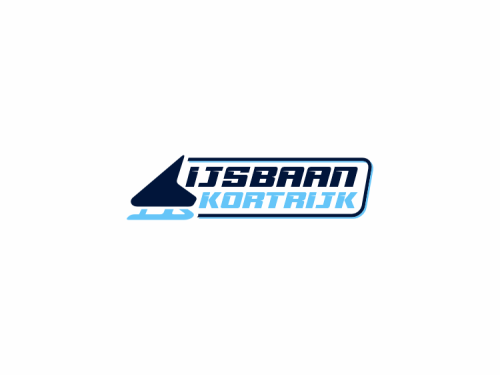
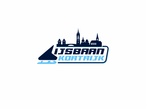
Design Option 3 ( #131 ) — a dynamic and modern logo concept for Ijsbaan Kortrijk that focuses on clarity, movement, and digital versatility.
This version takes a minimalist approach, using clean geometric forms and a bold horizontal layout, making it ideal for digital platforms like websites, mobile apps, social media banners, and signage.
Key Elements:
A stylized, abstract ice skate silhouette on the left captures the spirit of skating in a sleek, modern way.
The typography is strong, italicized, and sporty, suggesting speed, precision, and energy.
The color scheme combines deep navy with icy blue tones to evoke the feeling of winter, trust, and professionalism.
The enclosing rounded frame gives the logo a polished, contained look, ideal for consistent branding across various formats.
Unlike the previous designs, this version takes a more universal, flexible direction, without direct reference to specific landmarks — making it highly adaptable while maintaining a strong visual identity.
As always, I’m happy to adjust any elements or refine the direction based on your feedback.
Please let me know your thoughts — your input is essential to achieving the perfect result.
 SUKET DESIGN
Designer
Tue, 29 Jul 2025 12:52:00 +0000
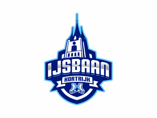
Design Option 2 for the Ijsbaan Kortrijk logo — a bold and modern interpretation that continues to emphasize local identity while enhancing visual impact across various media.
This version features the iconic Belfort tower, one of Kortrijk’s most recognizable historical landmarks. Positioned as the central figure, it not only symbolizes pride in place but also adds a distinctive silhouette that makes the logo stand out.
The structure of the logo retains a strong shield layout, suitable for everything from digital use (social media, website headers) to physical applications (signage, uniforms, merchandise). The sharp lines, gradient blues, and energetic typeface echo the dynamic spirit of winter sports.
As with Option 1, this design includes:
Ice skates at the base, representing inclusivity for various skating disciplines (family skating, hockey, figure skating, etc.)
A clean, professional color palette that suggests ice, clarity, and trust.
Please note:
????️ This design is not AI-generated.
Every element was crafted manually, with full attention to your original brief and with adaptability across print and digital formats in mind.
 SUKET DESIGN
Designer
Tue, 29 Jul 2025 06:34:29 +0000
Importantly, this logo was not generated by AI.
Every element was carefully designed by hand, based directly on your brief and with thoughtful consideration of how the logo will be applied across various platforms.
Every element was carefully designed by hand, based directly on your brief and with thoughtful consideration of how the logo will be applied across various platforms.
 SUKET DESIGN
Designer
Tue, 29 Jul 2025 06:27:33 +0000
Dear Klaas Devoghel,
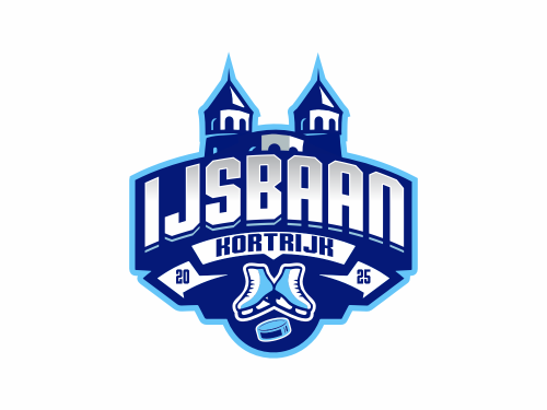
I’m excited to present the proposed logo design for Ijsbaan Kortrijk — a modern, energetic emblem that reflects both the spirit of ice skating and the unique identity of Kortrijk.
This logo blends:
The iconic Broeltorens, symbolizing the heart of the city,
Strong, athletic typography that echoes the style of community, team, and sports logos,
Universal skating elements (skates & puck), ensuring inclusivity for various ice activities,
A dynamic shield layout, perfect for use across social media, merchandise, and signage.
The blue palette was selected to evoke a sense of ice, clarity, and trust, while the bold shape creates instant recognition.
I’m fully open to refining or adjusting any part of the design — your satisfaction is my top priority. Please feel free to share any feedback, suggestions, or preferences, and I’ll be more than happy to revise the design until it truly reflects your vision.
Looking forward to hearing your thoughts!
Warm regards,
SUKET DESIGN
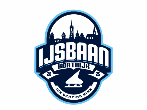
A stylized ice skate icon reinforces the ice skating theme, placed within a dynamic shield frame. The overall shape of the logo—rounded with a vertical emphasis—was deliberately designed to resemble the general form of an ice skating rink, symbolizing the smooth, continuous motion and flow of skating. The ellipse-inspired outline creates a sense of movement, unity, and balance.
The cool navy and ice blue color palette enhances the wintry and professional atmosphere.
Note: This is an original, manually crafted design based entirely on the client’s brief—not AI-generated.