
Designs by akgraphics
For Contest: Logo for Consulting Company
Design Entries
-
#42
-
#41
-
#23


Discussion
akgraphics
Designer
Fri, 02 Sep 2016 07:04:31 +0000
Check it font used arimo and make it as your feedback thanks
 NGE
Contest Holder
Thu, 01 Sep 2016 18:31:21 +0000
NGE
Contest Holder
Thu, 01 Sep 2016 18:31:21 +0000
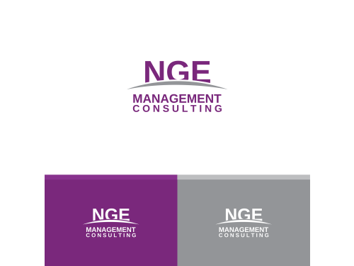
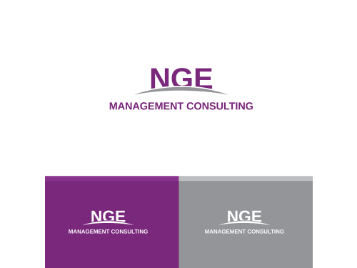
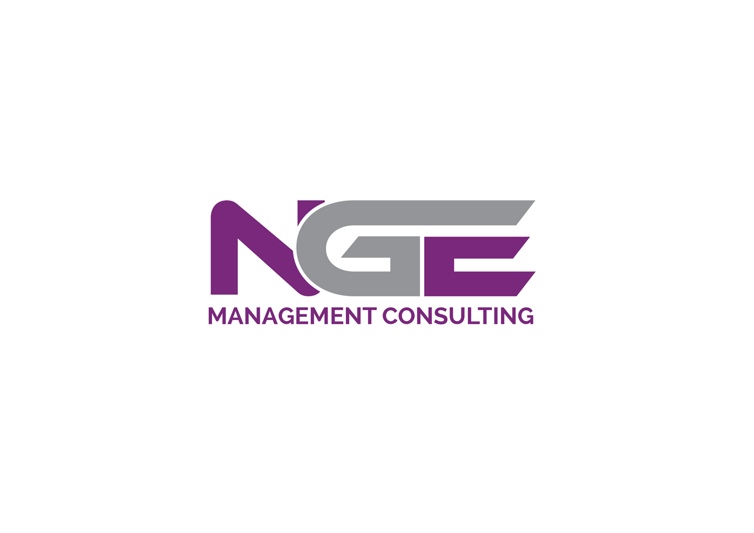
Hi akgraphics, #36 and #37 are getting very close! Did you choose a different font than in #26? I think I'd like a font that'S little wider. How about creating another version of #36 and #37 both with 1) font 'Arimo', 2) the gap between NGE and the arch a little wider, and 3) the arch moved down, just so that the lower left corner of the N and the right lower end of the E are fully visible (than comes the gap, than comes the arch). I hope my explanation is not too confusing :-) As for #28, I am still intrigued by the two swoosh lines... Can you think of a version in which they would not cover the text parts? Cheers, Nils
akgraphics
Designer
Thu, 01 Sep 2016 13:38:39 +0000
Check it
NGE
Contest Holder
Thu, 01 Sep 2016 12:52:24 +0000
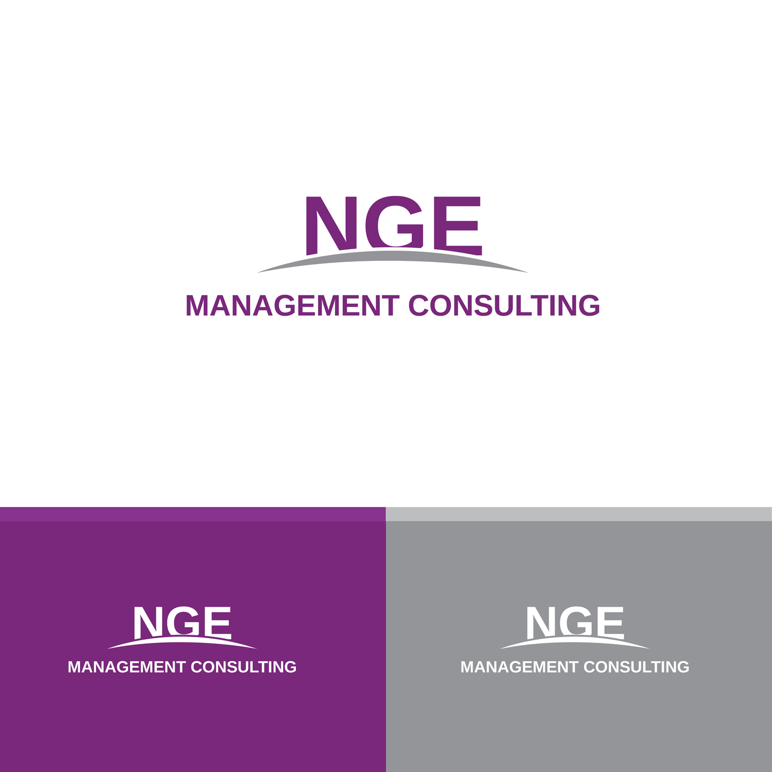
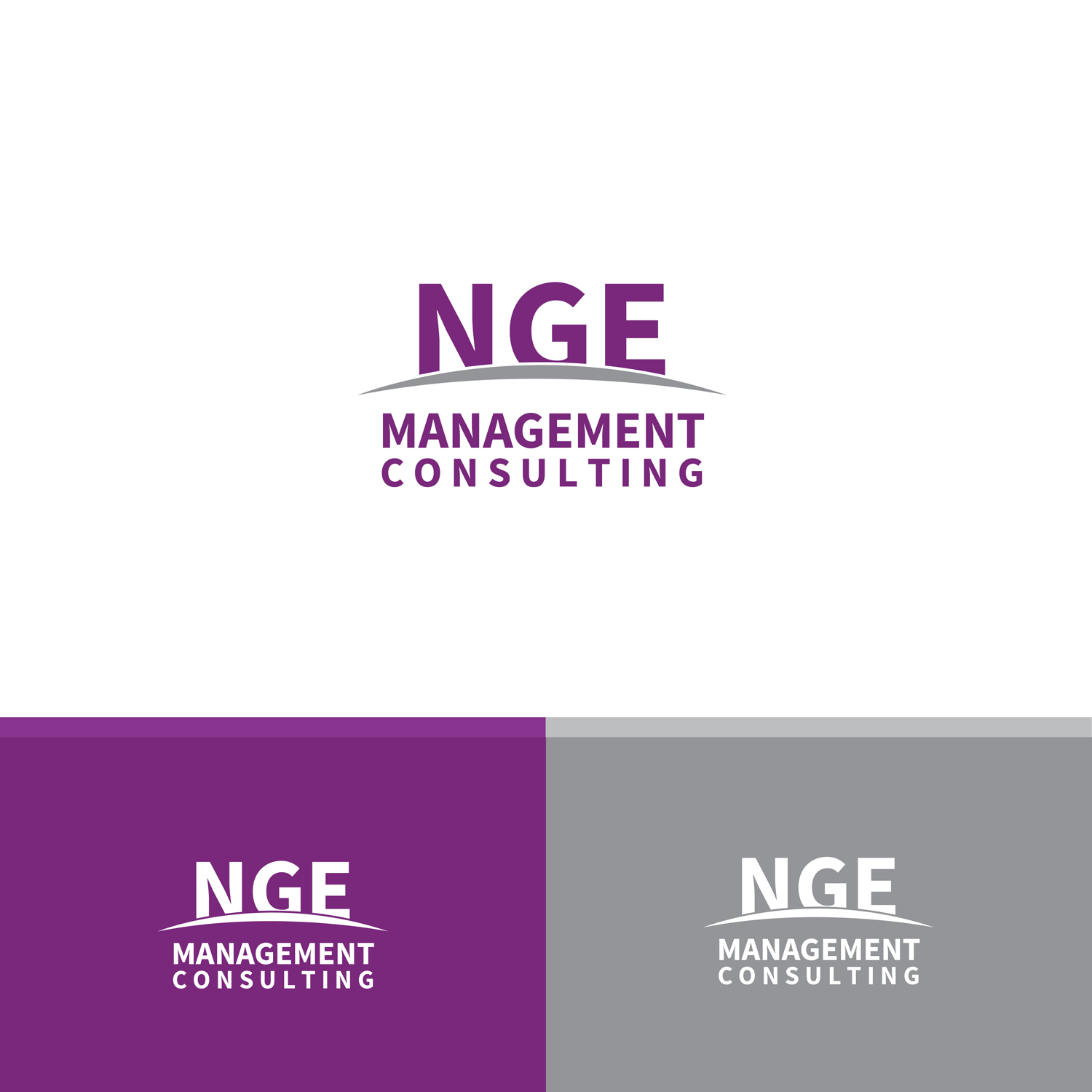
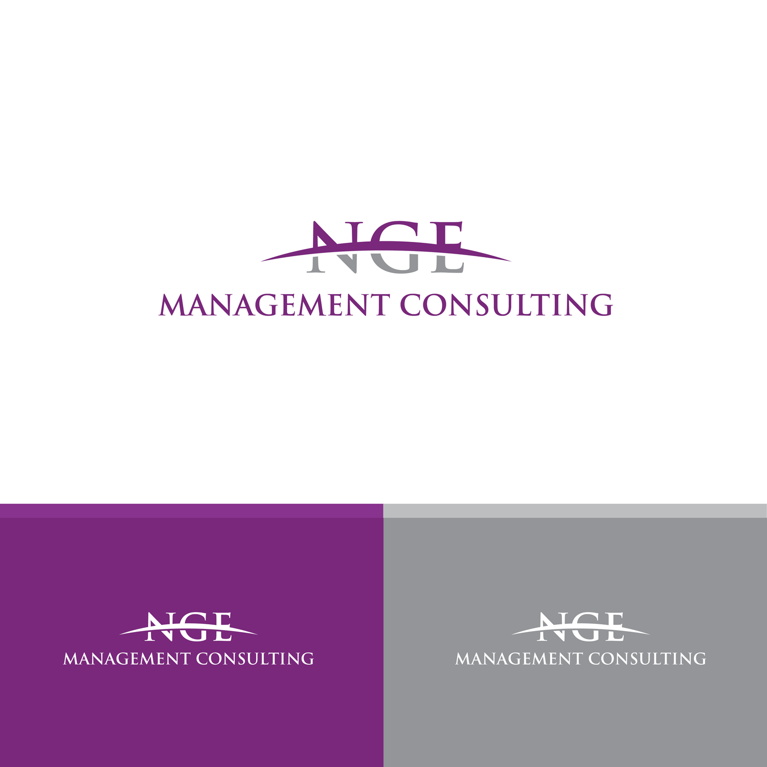
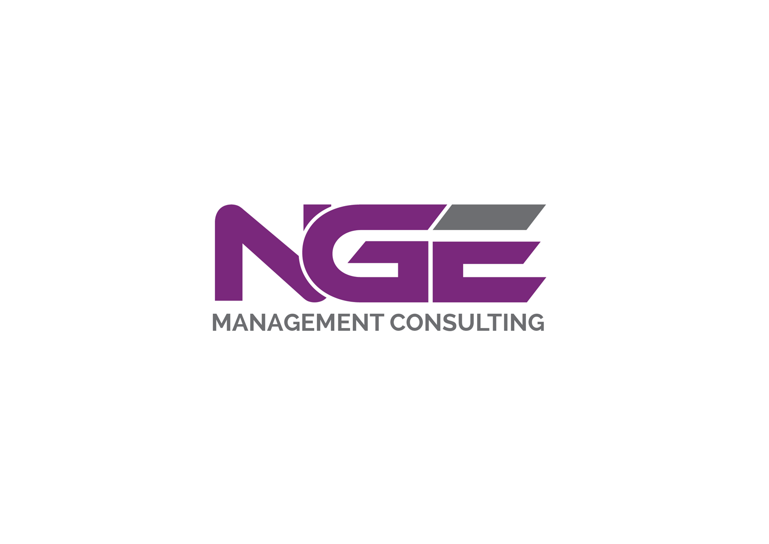
Another idea from my side regarding #26: how about making the G purple and the arch grey? And having the arch cover the text a little less... Just to see how it looks :-)
NGE
Contest Holder
Thu, 01 Sep 2016 10:30:12 +0000
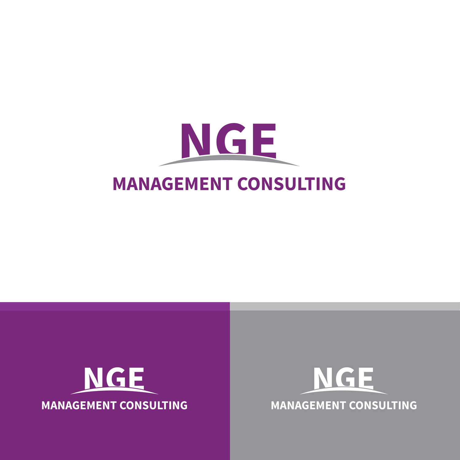
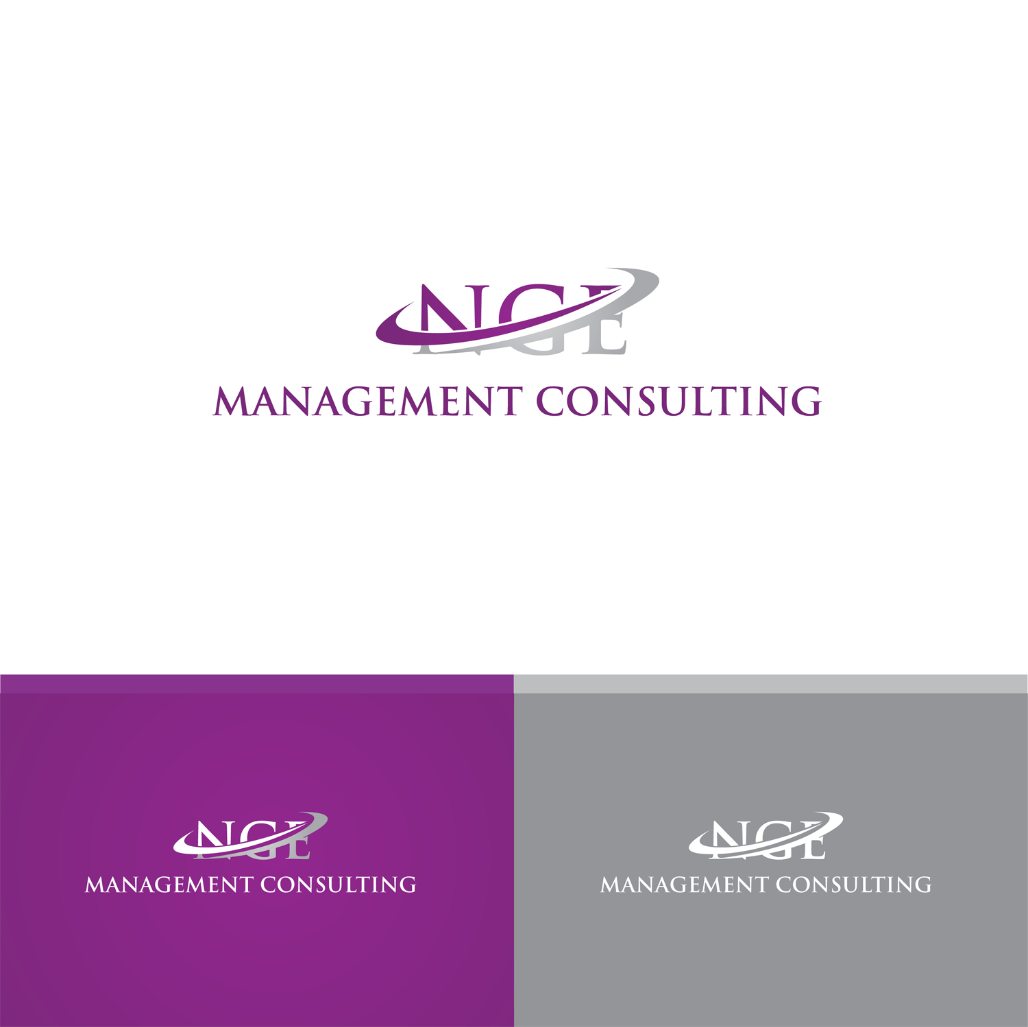
Hi akgraphics, I really like the new designs #26-28! Especially that you included a design on solid color backgrounds! I like the sanf-serif version a bit better than the serif ones. The arch should not cover the 'NGE' too much, since these letters are the main brand symbol. How about a version of #26 in which 'Management' and 'Consulting' sit in two rows...? Cheers, Nils
NGE
Contest Holder
Thu, 01 Sep 2016 03:22:26 +0000
Hi akgraphics, I like the new designs #9 and #10. Is there maybe a font that's a bit 'cleaner' than the one used? The G looks a bit like an arrow... How about putting 'Management Conulting' in two rows? Cheers, Nils
akgraphics
Designer
Wed, 31 Aug 2016 16:35:39 +0000
ok just wait...
NGE
Contest Holder
Wed, 31 Aug 2016 16:33:12 +0000
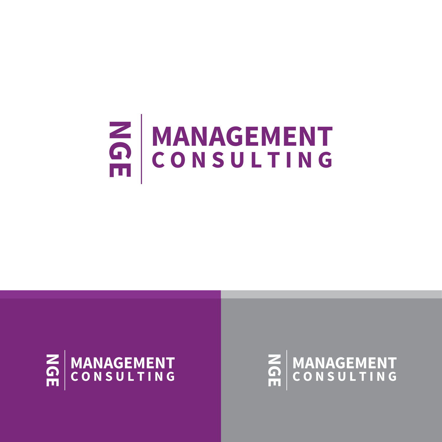
Hi akgraphics! You're the only one who got the color right so far, thanks :-) I like that 'Management Consulting' is good to read in #8, it seems a little too small in #5/6. The shape of 'NGE' seems a little too playful to me with the pointy E dashes. Would it be possible to make the 'NGE' a little simpler for a more professional, cleaner look?
Thanks again for your logos, keep up the great work! Cheers, Nils
Thanks again for your logos, keep up the great work! Cheers, Nils
akgraphics
Designer
Wed, 31 Aug 2016 10:14:21 +0000
Check it
akgraphics
Designer
Wed, 31 Aug 2016 10:12:42 +0000
Check it