Cool Manly T-Shirt Design
Prize → $180
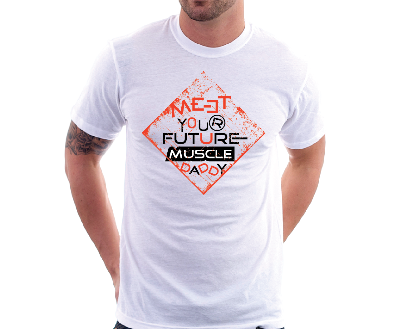
Contest Designs


Design Brief
| Contest title: | Cool Manly T-Shirt Design |
| Sub title: | Macho, Cocky, Self-Absorbed, Virile, Bold, Heroic |
| Category: | Clothing & Merchandise |
Brand Name: |
Cash Newman |
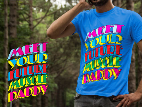
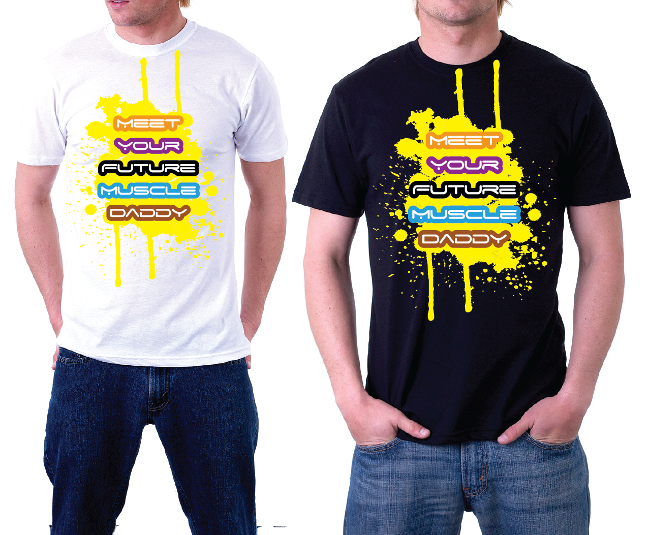
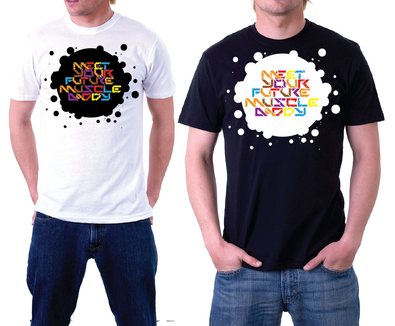
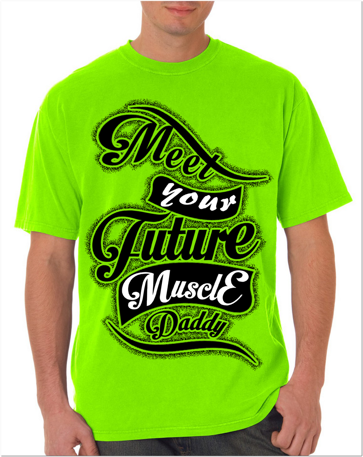
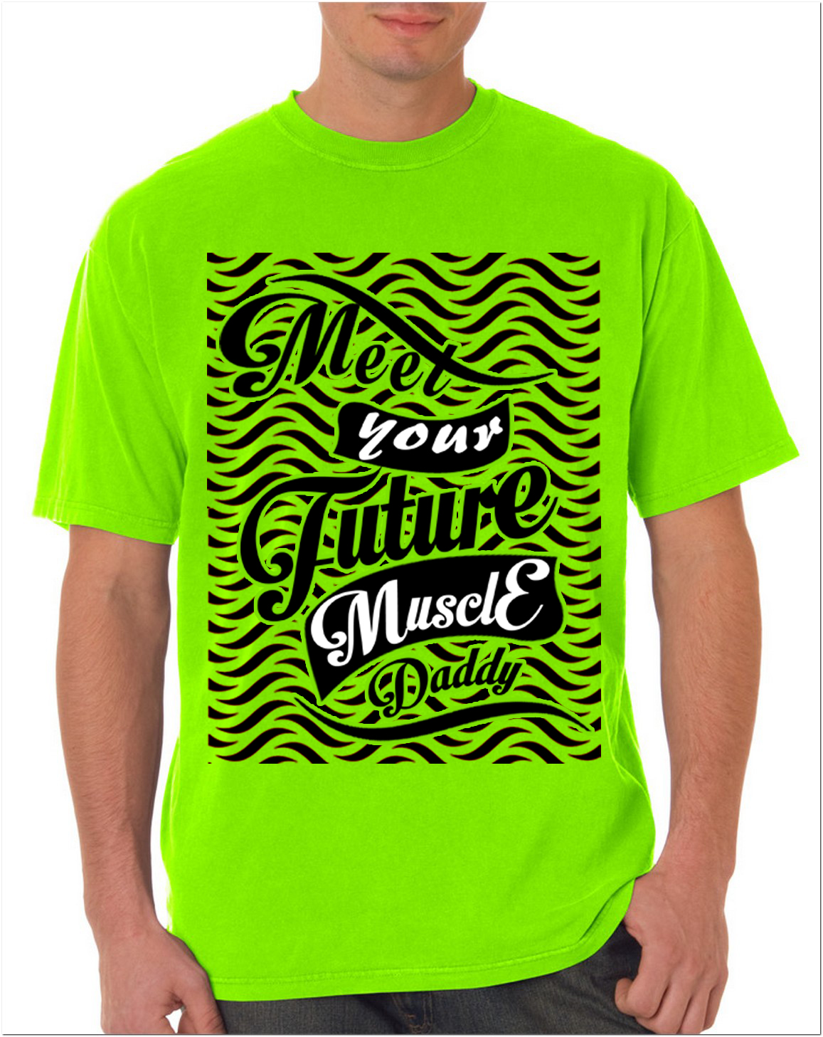
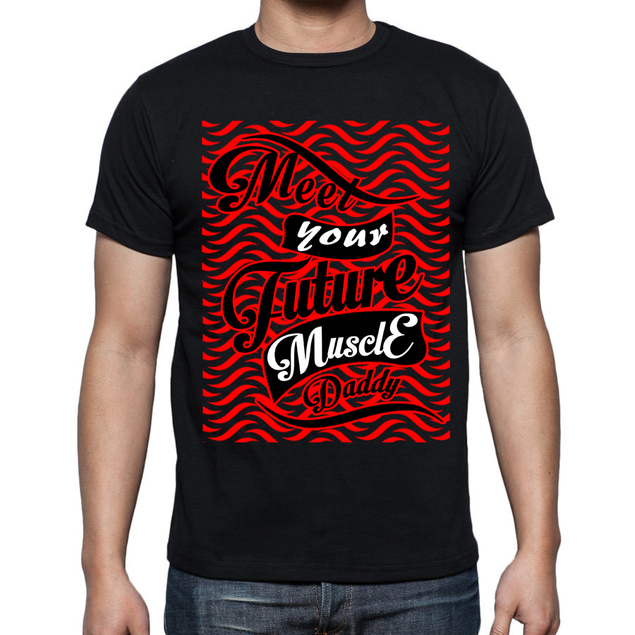
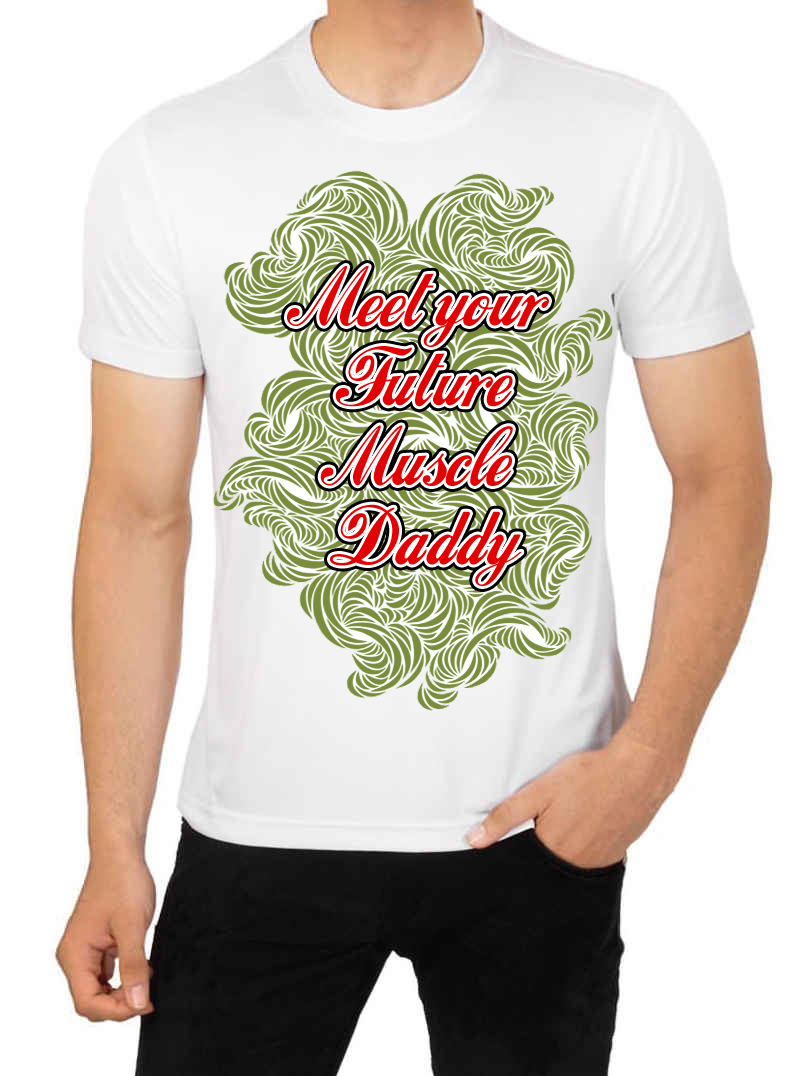
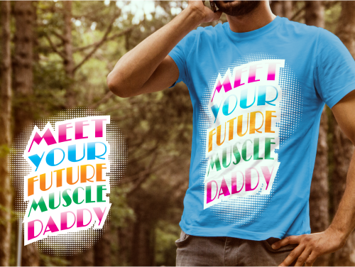
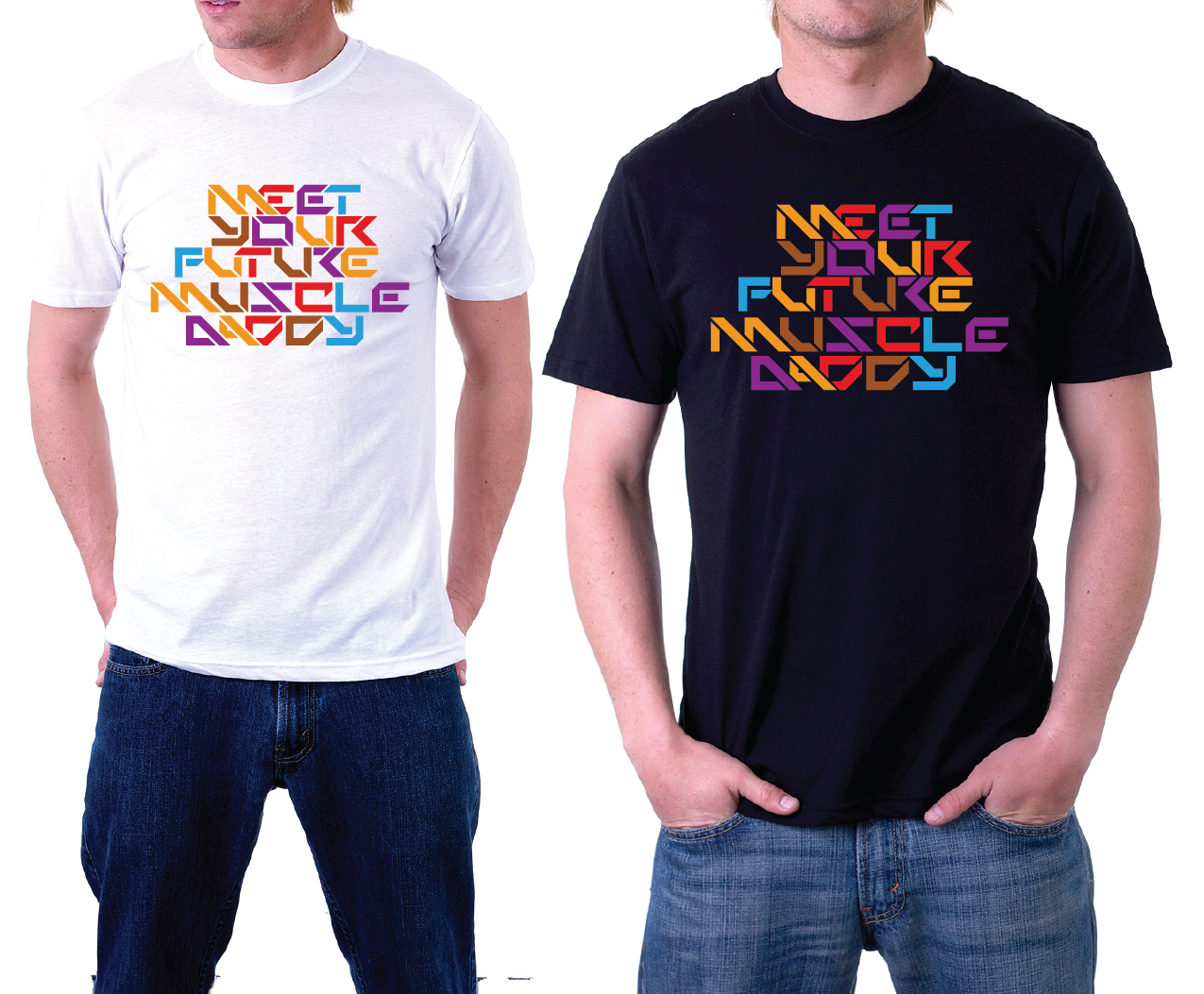
| Summary: | Tagline needed for t-shirt. It is: Meet Your Future Muscle Daddy The design needs to convey machismo, youth, and arrogance. The typography should look like ART! |
| Description: | Our demographic is college-age young men. Some of their characteristics include: - cool and always unbothered - life of the party - sexy - smart - edgy - athletic |
| CH Wants: | Designs with these characteristics will be given top consideration: 1. Bold use of colors that remind us of Miami during the mid-80's. 2. Creative use of typography that's eye-catching; almost hypnotic. |
| CH Don't Wants: | No cheesy ornaments. No cheesy banners. No random icons or graphics thrown in for filler with no cohesion to the tagline. No cursive typography. No run of the mill fonts. |
Contest Attachments
Contest material, sample files and attachments for the contest uploaded by Contest Holder.
No attachments yet!
About Contest
| Industry: | |
| Created on: | Sat, 04 Jul 2015 01:22:10 +0000 |
| Ends on: | Mon, 13 Jul 2015 01:22:10 +0000 |
| Status: | Closed |
Prize(s)
| 1st Prize: | $180 |
Comments
Showing last 10 comments - View All
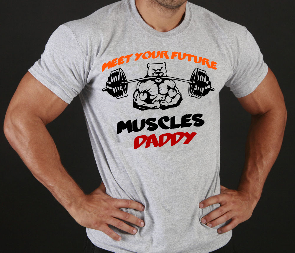
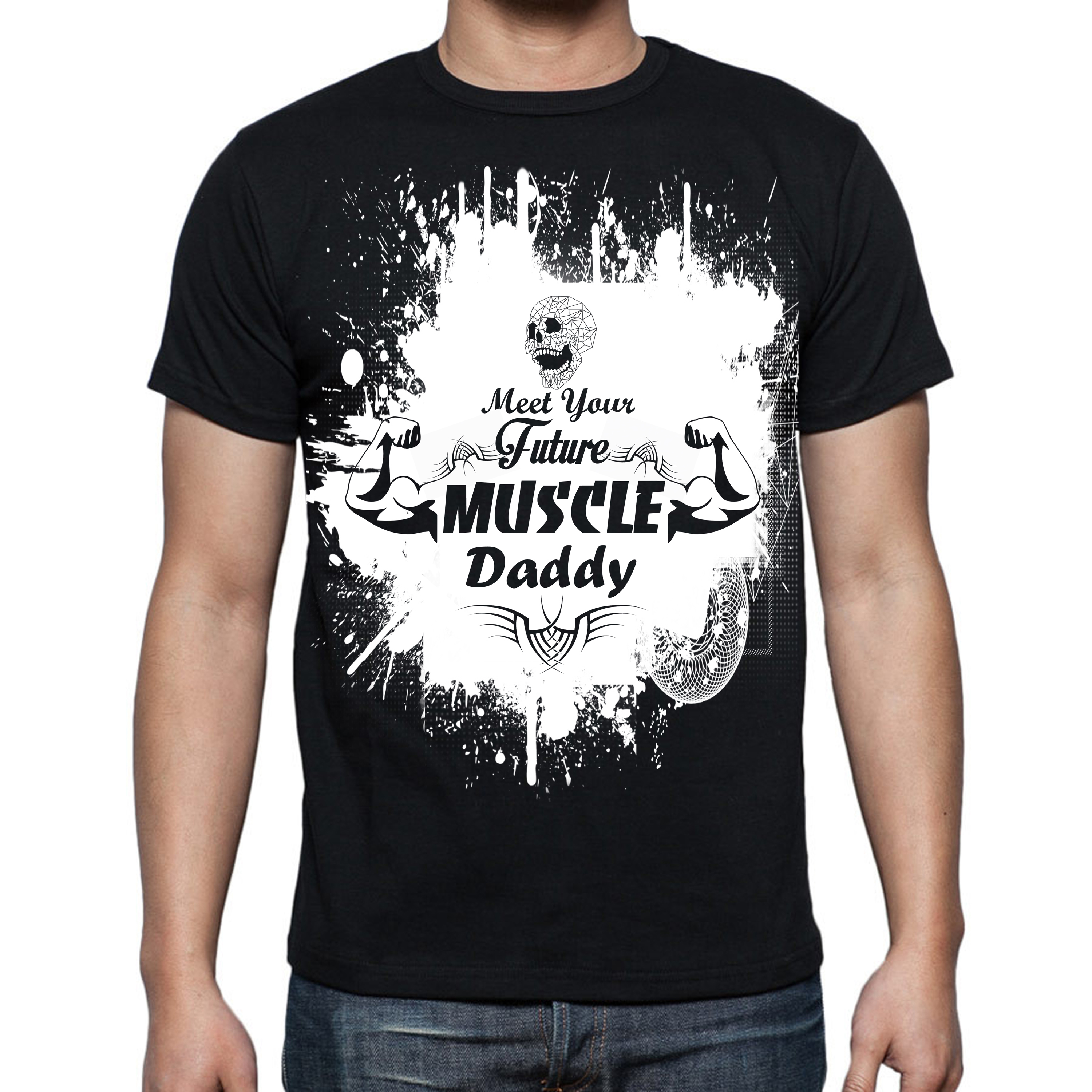
The graphic you added is a very good start to the overall design. But the typography is a miss for us. It would be great if you could get the graphic and typography to POP!
Pros
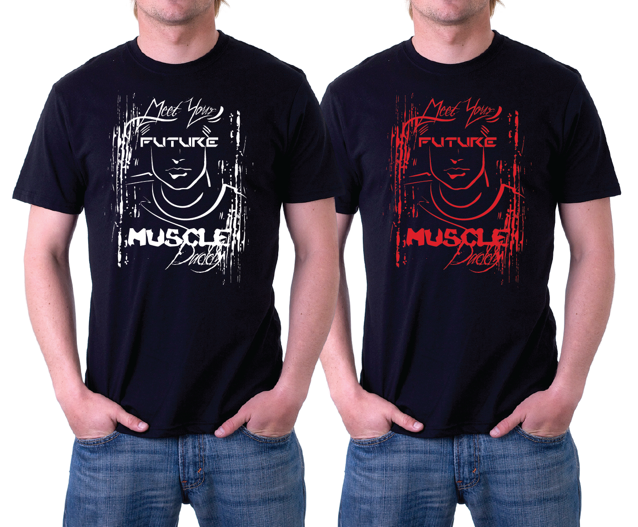
1. Based on the graphic you included, you understood the concept is related to fitness/working out (athletic).
2. Based on how you placed the barbell in the mouth instead of the hands shows creativity (edgy).
3. The use of muscles was a sexy addition to the overall design.
Cons
1. The head of the bear (?) needs some cleanup and work. It looks the head was taken from one design and placed on the body of another design.
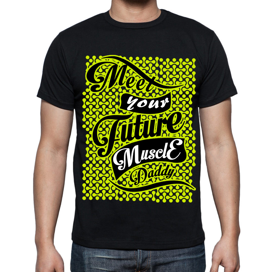
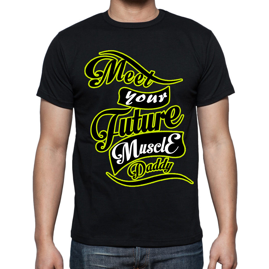
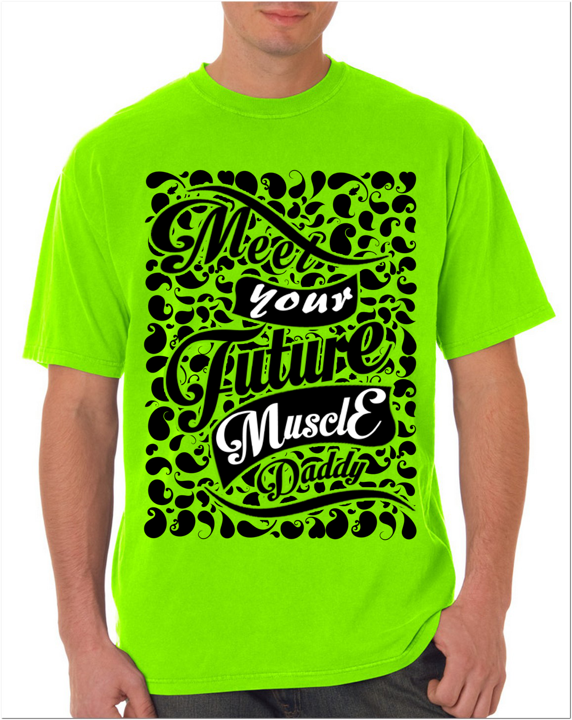
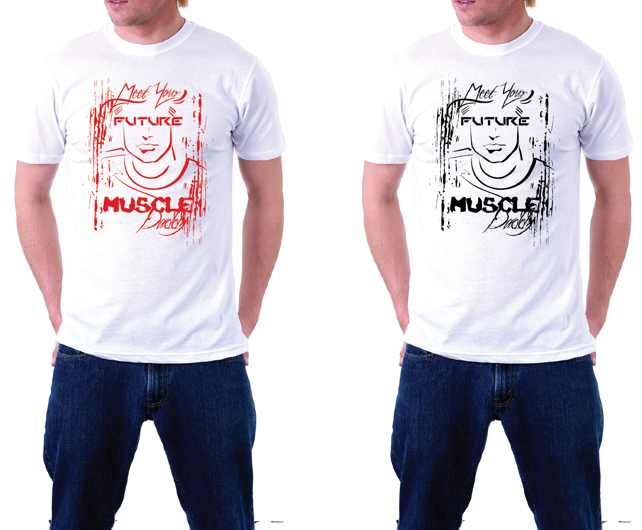
2. Specifically, the use of typography is not creative.
3. The colors used on the design are not bold as presented.
4. The word "muscle" should be singular; not plural.
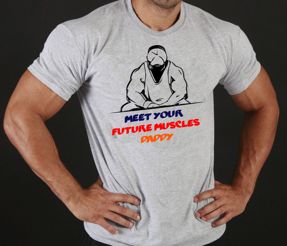
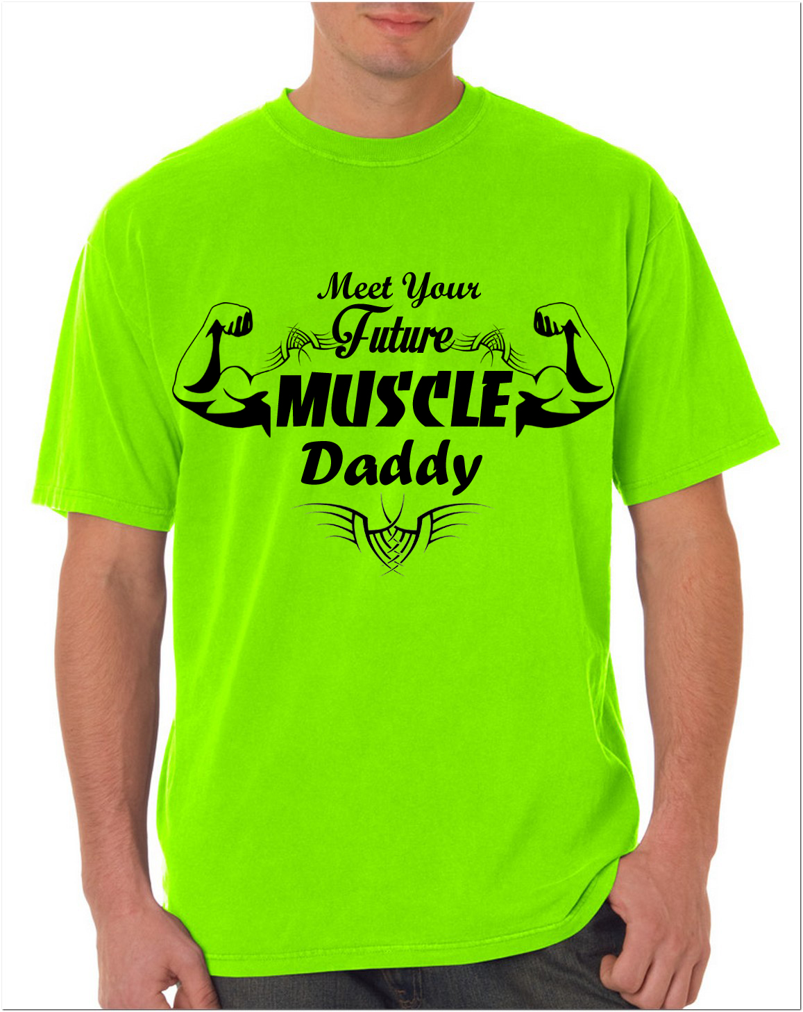
Good job. However, your design doesn't fit our requirements as stated in the brief. Specifically, you missed the mark on these elements:
1. The typography should look like ART!
2. Bold use of colors that remind us of Miami during the mid-80's.
3. Creative use of typography that's eye-catching; almost hypnotic.
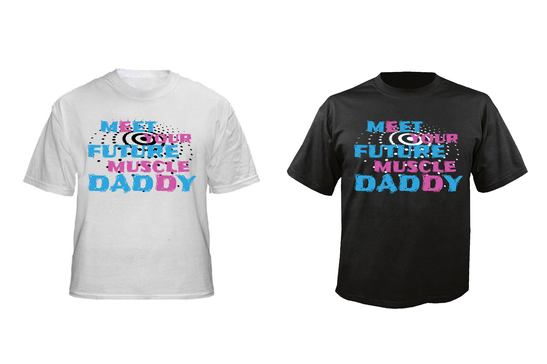
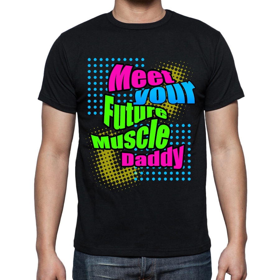
4. The use of pink and blue colors were not appropriate. This design is meant for men.
5. Adding in a "polka dotted bulls-eye" got our attention but doesn't fit in with our theme.
No additional designs are required.
Good job. However, your design doesn't fit our requirements as stated in the brief. Specifically, you missed the mark on these elements:
1. The typography should look like ART!
2. Bold use of colors that remind us of Miami during the mid-80's.
3. Creative use of typography that's eye-catching; almost hypnotic.
No additional designs are required.
Both were good design but not what we're looking for at this time.
Below are some of the reasons for eliminating both designs:
1. No bold use of colors that remind us of Miami during the mid-80's.
2. No creative use of typography that's eye-catching; almost hypnotic.
3. The typography didn't look like ART!
Overall, nothing about the design popped out for us. The font was okay. But had you incorporated some cool typography or added a graphic, it may have been satisfactory for consideration.
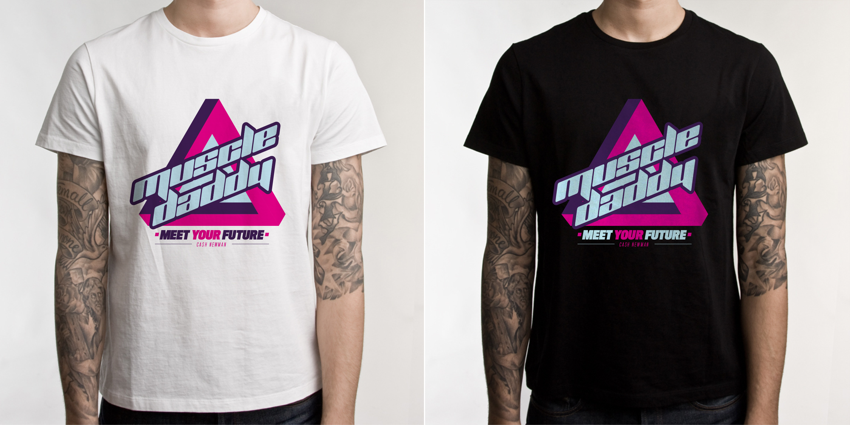
First, thank you for submitting your design. Second, thank you for submitting only 1 design and not a whole bunch more. It lets us know you put some thought into it and you weren't concerned with impressing us with how many alternatives you can "whip up" on the fly.
Pros
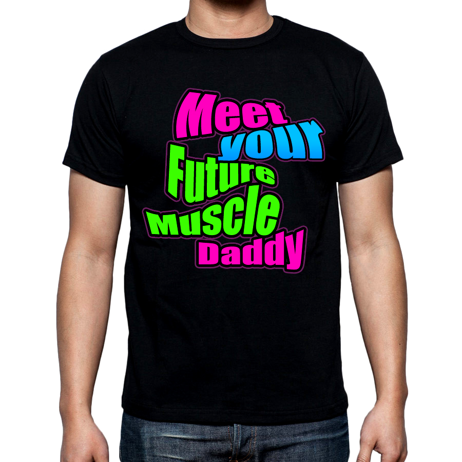
1. You took a chance and used pink and blue colors which goes against the brief. That was bold!
2. You used only 2 fonts. Normally we prefer 1 font for consistency. The two you used work well together. It still looks clean.
3. Slanting the words Muscle Daddy at an angle was very good.
Cons:
1. The arrangement of the tagline does not flow well when reading it.
2. The pink triangle appears random and out of place.
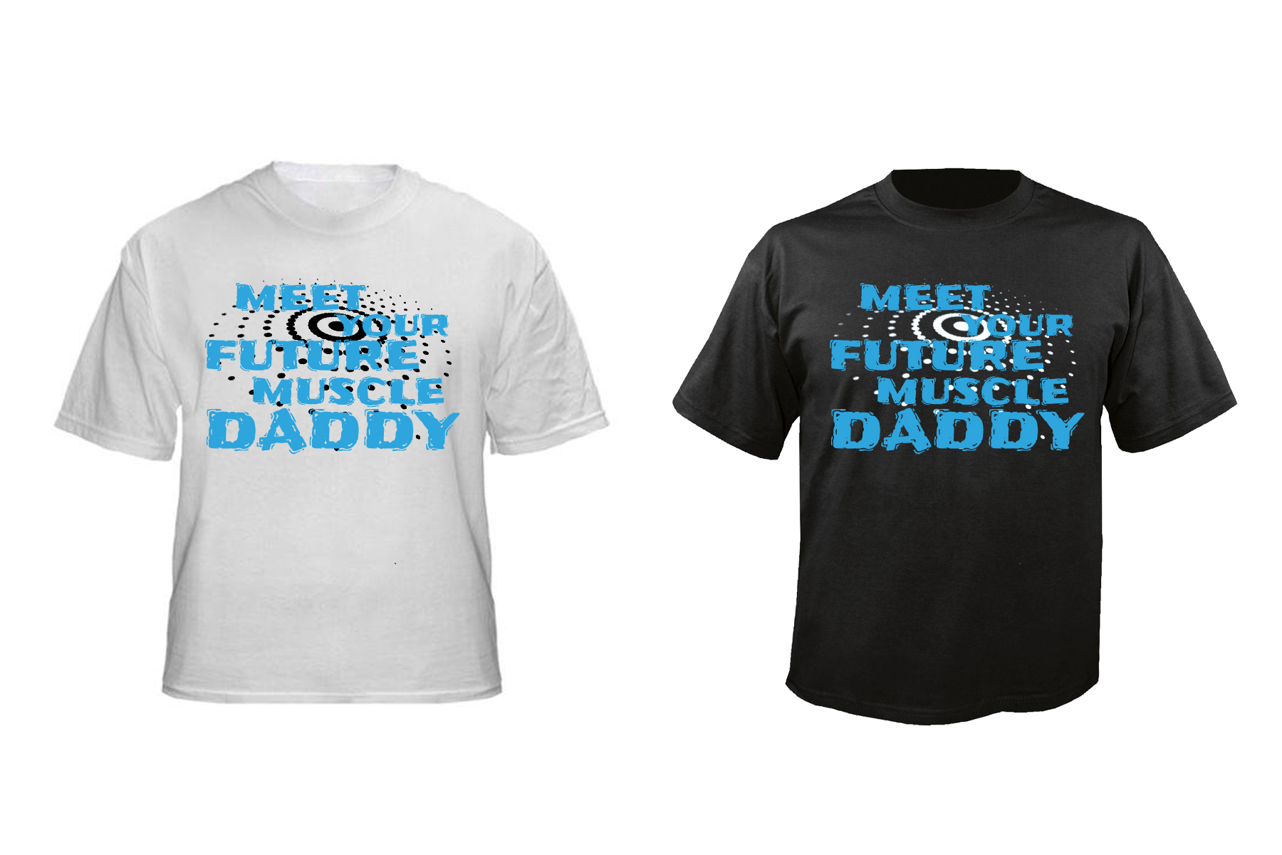
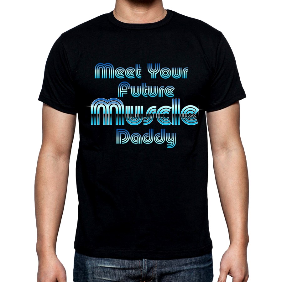
Visually, the thumbnail of your design got our attention. There were high hopes. It was neat and not too busy. But after closer inspection we realized it wasn't meeting our expectations.
These are some of the main requirements that we didn't find in your design:
1. Bold use of colors that remind us of Miami during the mid-80's.
2. Creative use of typography that's eye-catching; almost hypnotic.
3. The typography should look like ART!
No additional submissions are required at this time.
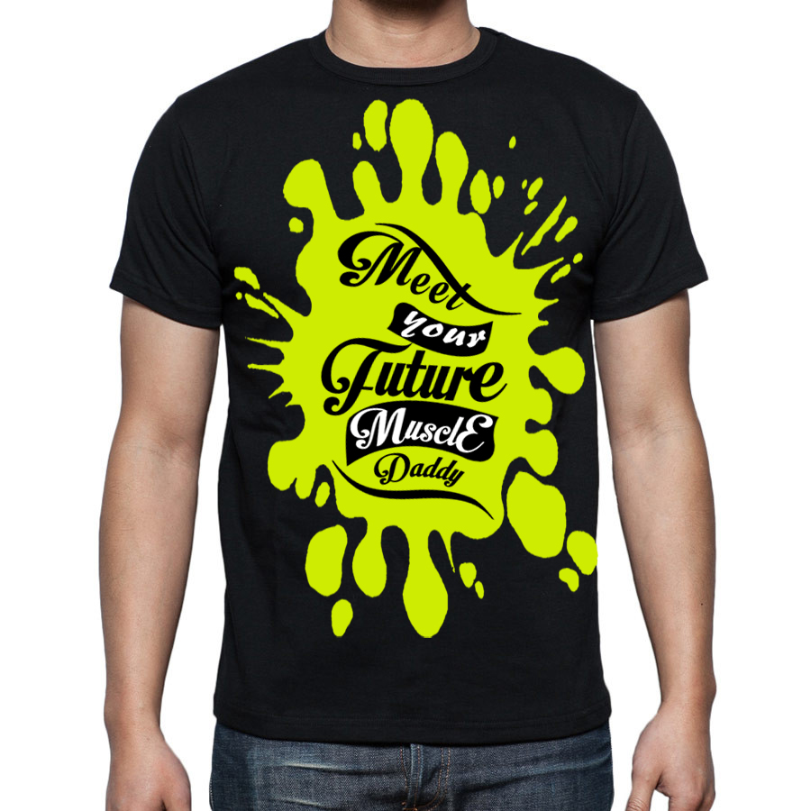
Thanks for submitting your designs. There were a lot of them. Most were good but not what we're looking for this time. Some of the background graphics were very nice. Overall, none of the designs reminded us of Miami or had typography that was artful and stood out.
Below are some of the reasons (stated in the contest brief) for eliminating them:
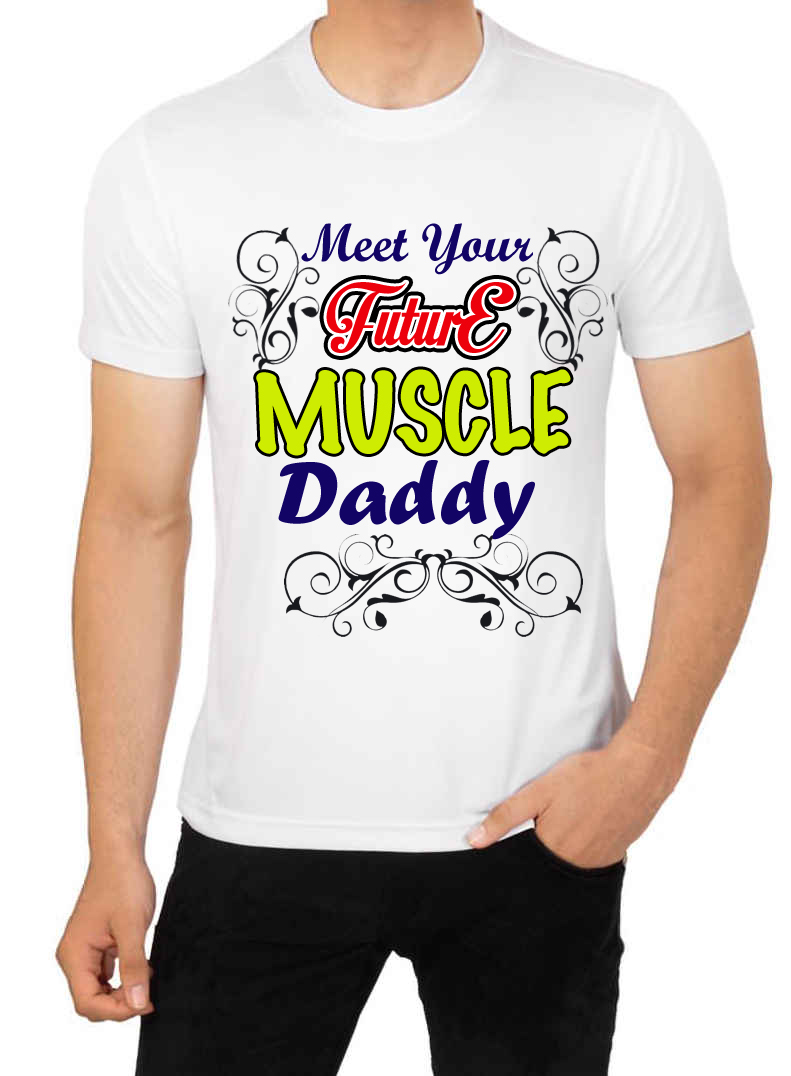
1. Cheesy ornaments.
2. Cheesy banners or shields.
3. Random icons or graphics thrown in for filler with no cohesion to the tagline.
4. Cursive typography.
It probably would have been beneficial had more time and effort been focused on perfecting 1 or 2 designs that met the requirements in the brief. No additional submissions are required at this time.