
Designs by SUKET DESIGN
For Contest: CONSTRUCTION COMPANY LOGO
Design Entries
-
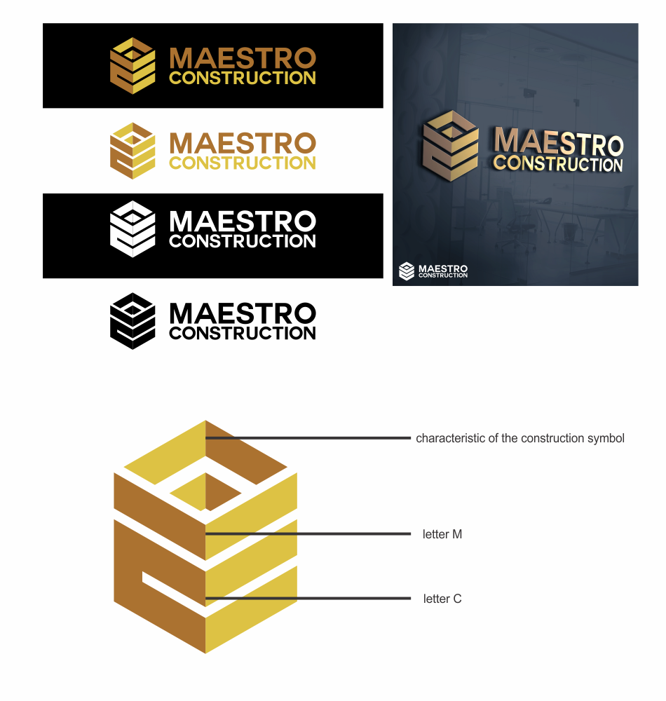
#17

-
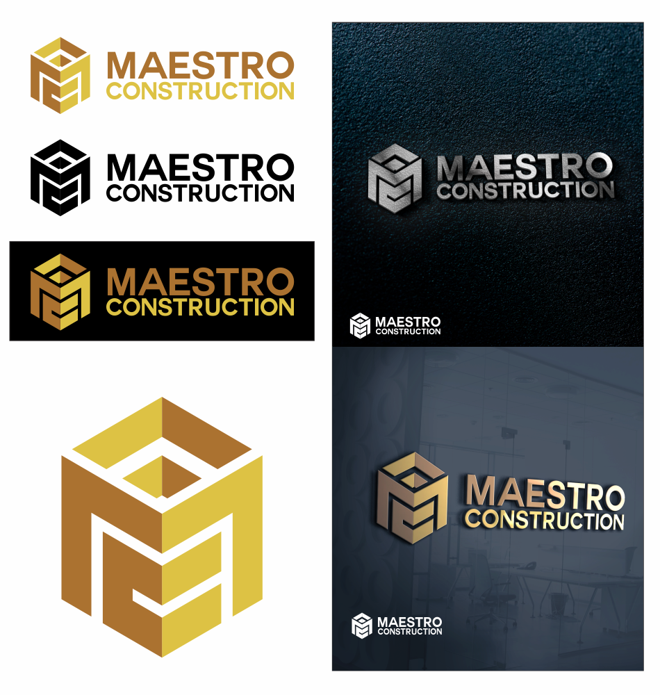
#81

Discussion
SUKET DESIGN
Designer
Thu, 15 Dec 2016 22:42:45 +0000
SUKET DESIGN
Designer
Thu, 15 Dec 2016 01:09:08 +0000
Thank you for your feedback. yes you are right, indeed the letter M look less obvious. I would also make the initial M can be seen clearly. I will submit a revised design as soon as possible. thanks and regards
 kevindc
Contest Holder
Wed, 14 Dec 2016 20:59:07 +0000
kevindc
Contest Holder
Wed, 14 Dec 2016 20:59:07 +0000
Thank you for your submission. somehow we can't really follow where's the M.
SUKET DESIGN
Designer
Tue, 13 Dec 2016 23:39:54 +0000
the initials, the combination of the letters M and C are formed as buildings that are characteristic of the construction company, using a golden color that gives the impression of elegance and expensive. with a modern font that looks simple and easily understood by the audience
this revision of the design by considering your opinion. I make the letters M to become more visible but not abandon the initial concept that I use. please provide feedback. thanks and regards