
Designs by JETZU
For Contest: Logo for Consulting Company
Design Entries
-
#24

Discussion
 NGE
Contest Holder
Thu, 01 Sep 2016 03:32:08 +0000
NGE
Contest Holder
Thu, 01 Sep 2016 03:32:08 +0000
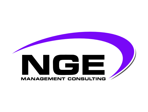
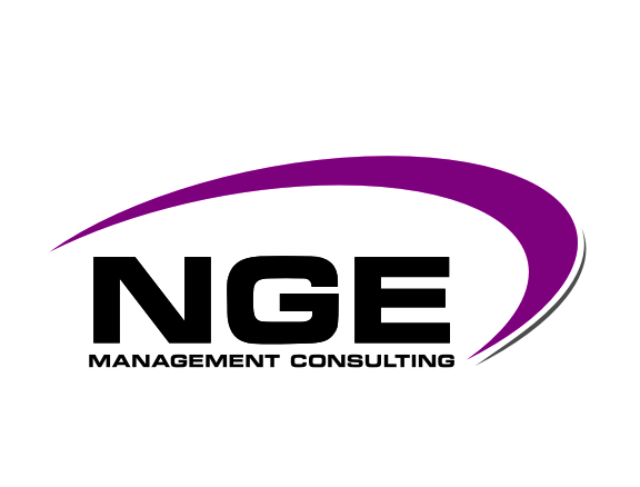
Hi JETZU, thanks for the new designs, you're making my choice difficult here :-) The color is still a little off, though. Could you try hex 7D007D for the purple? Cheers, Nils
NGE
Contest Holder
Wed, 31 Aug 2016 16:45:15 +0000
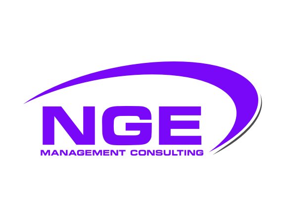
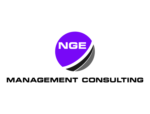
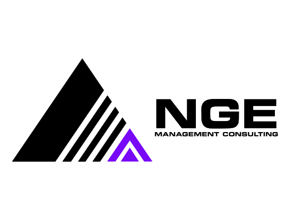
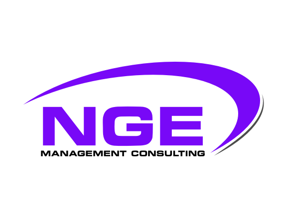
Hi JETZU! Thank you very much for your logo designs. I really like #4 with its dynamic shape, and it has the most professional look! In #1 'Management Consulting' is best readable, though. Maybe you could change the logo color to be our company purple (RGB 125/0/125). What about a version of #4 in which the text is purble?
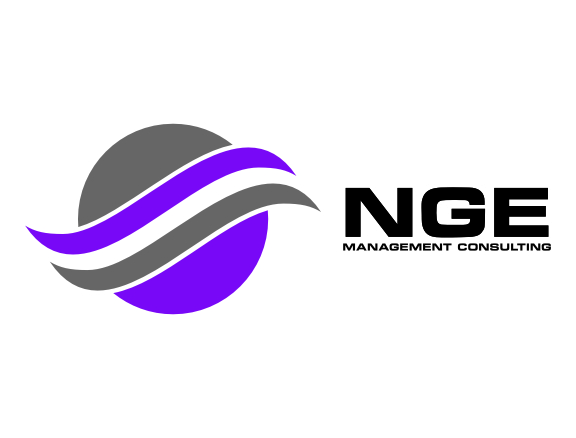
As for #3 and #4, both shapes are interesting, although the text seems somewhat disconnected from the shape. In #1 I like the circle shape that incorporates the 'NGE'. However, 'NGE' should be fully centered for a cleaner look.
Thanks again for your logos, keep up the great work! Cheers, Nils
As for #3 and #4, both shapes are interesting, although the text seems somewhat disconnected from the shape. In #1 I like the circle shape that incorporates the 'NGE'. However, 'NGE' should be fully centered for a cleaner look.
Thanks again for your logos, keep up the great work! Cheers, Nils